The slightly grey...
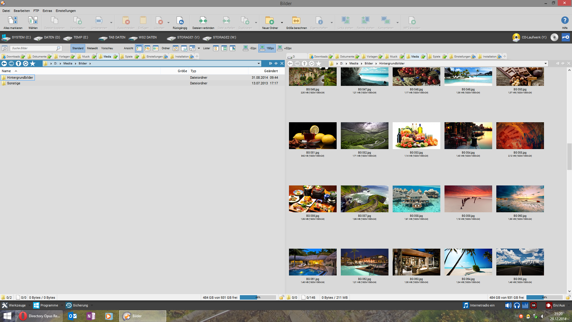
...and the dark:

Still can't decide 
That dark grey one looks really great! It makes those icons on top really stand out - did you make those? They are nice! =)
I like the dark grey theme a little more. They are both great. Any chance you could share your theme, please...
Any chance you could share how you made this theme or a dlt/ocb file?
That dark one looks like what I've been trying to achieve with far less success. I tried using a few I found on the forums, but they don't look right either.
I don't have it anymore, because as long textshadow is not editable, all real dark themes look ugly when nothing is selected in lister.
You can open the screenshot to fullscreen and copy all colors using the color-picker (in prefs > colors you'll edit most colors and a few in prefs > lister views). The shadowed toolbar-backgrounds are here: [url]S-Backdrop Sets].