It's common knowledge that users that know both Mac and Win prefer to have the option for "column view" in Windows file browsing. There's a reason, of course. It make sense, is efficient, and the most useful view of all requiring fewer clicks than any other mode. If DO has no interest in this, then... what's that supposed to tell us?
Every time I've used it on a Mac I've hated it. I think it's kind of like "list view" in Opus (and Explorer). A few people LOVE it, most people don't understand why anyone thought it was a good idea to invent it at all.
3 Likes
I totally agree, Jon. The tree structure of Directory Opus is so much more intuitive. Wish I could use Opus on the Mac. Have not found anything even remotely close for the Mac. Has there been any consideration to creating a Mac version of Opus?
For us to write Opus for OS X, we would have to use OS X. But we couldn't face switching to OS X because it doesn't have Opus. ![]()
1 Like
Most people don’t understand why anyone thought it was a good idea to invent it at all. Precisely.
While even I don't like it, I found it to be useful today when setting up google drive, they use the same concept. I guess it sort of makes sense as a simplified treeview, without requiring the user to remember more than several layers of the trees. I can see it's appeal in limited situations, though I wouldn't use it for file management tasks.

3 Likes
There is a way to do something similar to this. You can use a grouped flat view by right click on the "Flat View" button and choosing "Grouped". This will display all of your directories and files and folders within those directories.

so sad that this was never implemented. This app is almost perfect but like A LOT of people, I prefer column view as well.
What is actually that useful about column mode? You see a lot of things of no interest at any given time, which only take screen space.
If in some scenario you need extensive jumping across levels, you have breadcrumbs and tree for this, without taking screen estate.
And, btw, @Jon - small icons mode and list mode, both rather neglected with list mode dramatically neglected, simply allow to pack most contents onscreen, when the file name and file type bring enough information for files use and navigation. There is no other mode that allows for this.
1 click access to folders and out of folders, easily enter folders levels behind without having to click back a bunch of times first. Its actually much easier and streamlined to navigate folders, especially for creatives that are always jumping in and out of folders repeatedly. Just because you don't use it because you don't do anything that requires it doesn't mean it's not useful my man. This would be an amazing feature.
1 Like
In the same vein - just because you use something, it does not mean it's the best way to do your work. "Creatives" are about creativity, but not necessarily about efficiency.
If you require frantic jumping across differently nested elements it's the moment you should think about reorganizing your files, as they apparently do not match your workflow well.
Said that, you basically described navigation with a tree, where nodes stay expanded - you may look at plenty tree handling options DO offers.
Can someone provide an explanation or image of how this mode works? Perhaps it is possible to do with DOPUS through settings.
Ha! You're really out of touch. Creatives have to be as efficient as your next professional, probably even more so when it comes to digital files since we deal with hundreds (sometimes thousands) of them per project, and we even have to micro organize them by files types, so relax with your failed condescending tone.
With that said, trees are not as easy, they're actually quite hell-ish. A folder project's tree would be infinite going down just to find what I could've found with 5 clicks with the column view. Not only that, but it's unnatural for us to read from top to bottom, it's way easier to do it from left to right.
1 Like

Have you tried this?
It looks like this:
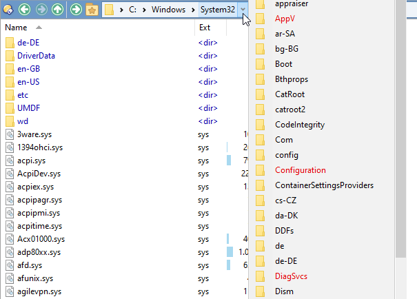
Unfortunately I think the closest you can get is saving a lister layout with the folder tree and dual display enabled. It's not really the same though.
For the purposes of viewing all directories, sub-directories, and files for a whole tree, the grouped flat view in my comment above will work. The only difference is that it's not side by side, it's a flat view.
I do use the column drop down that Ixp suggests, but it is not quite as easy to use as an actual column view.
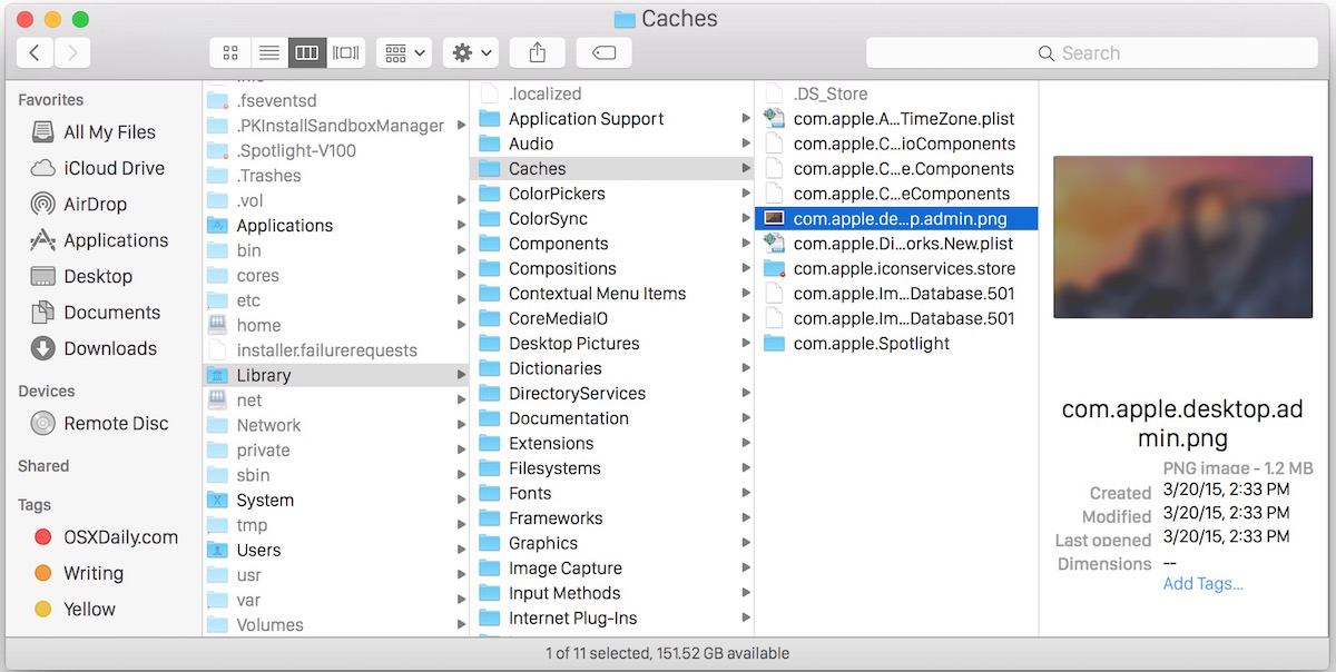
As for the usefulness of a view based on columns, I agree with the other points of view in this thread that we can get to everything with the current options available. But that said, the Mac community has had column view since I can remember many, many, many years, decades back and Apple still provides a column view. It is the view I use the most, when I use my mac. For usefulness, that file viewing style is hard to beat.
And for evernessince: The best example of how column view would work is the Apple MacOS Finder application or the PathFinder application for the Mac from Cocoatech.
There are windows file explorers with column view, but they do not offer anything close to Directory Opus for functionality. The best of the bunch is hard to find and no longer supported, since quite a few years back (sadly).
We're on the same boat, I think Opus is also the best explorer alternative there is, even though there are others that support column view. Just kinda sucks the devs seem to be close minded about this.
Breadcrumbs are only useful to see what folders came before, not any other folders. I can just use the back key a bunch of times too and it'll be the same as the breadcrumbs. Column view is much more powerful