Now that I am using custom menus for my Windows START Menu, I see several visual improvements that would enhance the generl look of menus.
COLOR...
1: Two-Color Shading for all areas of the menus...
a: General background (on the right).
b: Icon area (on the left).
2: Both Horizontal & Vertical color shade blending.
3: Change color of menu frames.
OTHER...
1: Rounded corners option.
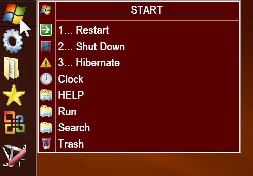
2: Add vertical bar on the left for area to add the name of the menu. All the text in this area should be turned 90 degrees counter-clockwise. Two-color shading should also be avaliable for theis new area. SEE: attached JPEG for sample.
3: Ability to add Titles to menus. SEE: the text (in red) on the attached JPEG.
4: Add wrap long menus option.
5: Drop Shadow option for the menu.
Well, the 90 degrees thing is XP like and useless in my opinion. I think lots of changes/enhancements will come automatically with the Metro-UI, esp. for Win8-tablets with touch-option. DO on touchscreen... could be cool to work with (selecting with finger and moving to 2nd lister...yeah!)
The Metro UI has no affect at all on Desktop applications, so nothing will change automatically for Windows 8. The Windows 8 visual style for Desktop apps is virtually identical to the Windows 7 one, unless Microsoft plan to suddenly change it in the final builds. (The main difference is the window borders are straight and narrower.)
(It's possible MS will change the visual style as the current one has some bugs/issues that perhaps indicate it is unfinished or even a placeholder -- e.g. the weird/ugly gray borders on the left/right of fixed-size dialogs -- but MS may also just fix those things while leaving the main button, menu, etc. styles looking like Vista/7, or they may even ship it exactly as-is, bugs included, based on past experience.)
Windows 8 is like running two very different OS side-by-side, and you keep having to switch between the two (plus some overlays from the Metro invading the Desktop from time to time as well, to make things even more inconsistent ).
I think DocLotus may already be running Windows 8, if I remember correctly from previous threads, which is why he's spent the last few weeks trying to make Opus act as his Start Menu instead of using the Win8 Start Screen.
ONLY for the first main menu; it does not work for any of the sub-menus; in fact, with it turned on (which is how I always had it until today) all sub-menus are strictly black text on a white background. At least I could not find nay way to change the color of sub-menus until I turned it off. Now i can change the main menu and the sub-menus independently so they can be either the same color or different colors. Problem is with it off we loose the ability to change shade but at least all my menus now have a common look and feel.
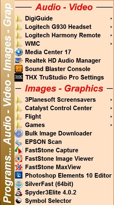
I'm running it on Win 7 & the Horizontal menu name is a standard feature of True Launch Bar which I have run for many years; as you can see from the attached JPEG, it is a feature that I really like... a lot.
Yes, I am running both Win 7 & 8 (I keep switching back and forth).
You are totally correct, Win 8 is like running two different OS side by side & yes I started all this because there is no START menu in Win 8. There is a START screen but no START button. Pressing the Win key on you keyboard simply switches between the Desktop and the last screen you accessed (START or ALL screens). As you pointed out, the underlying file structure is identical for both OS's, just no way to access the START file structure in Win 8 without some outside help like Opus..
Opus works VERY well for me in Win 8 (or Win 7) as a START menu system.
@Leo: As you said Win8 will run on Phone, PC and Tablets, so it's a question of time when Apps needs to be designed to run with "oldstyle" input and newer touch. Just compare the actual development for Android or Apple Phones and Pads (but I am happy that - for me - Metro-UI is the best, fastest and most responsive solution). I really wait for the first tablet running Win8 and which is fast enough to replace my Laptop.
But: While working on my own MUI-Iconset for DO I found out that DO is already flexible enough to "emulate" the look&feel and to use it for touch input or for bigger HTCP-screens .
Win8 startscreen: I miss the startbutton, too. The new startscreen is not bad, but losing focus because of its own screen is the problem for me.