Less bright theme for forum

Here's my two cents
It is great that you are moving to new more powerful forum engine and I think it will bring a considerable positive change to user experience here, but IMHO there is still a room for improvement. You see, I have a bad eyesight and it is difficult for me to distinguish between forum threads when they are just black text on solid white background without any kind of horizontal grid coloring.
Example:

On this screenshot forum topics are separated by slightly different colors, so they are easily distinguishable.
And a whole theme is just too bright for my eyes, it is even a little bit painful to look at some parts of forum because of the amount of white color(btw my display is set to only 120 cd/m2). So it would nice if you would add a less bright and a more distinguishable theme for people with vision problems someday.
Example:
(https://community.imgur.com/c/community)

1 Like

Already planned, but after we get fundamentals sorted out. Discussed here.

Thanks, take your time. :slight_smile:

It's fairly easy to change this yourself using the Stylish extension (in Firefox and Chrome anyway). Install the extension, and then search the list of themes on the userstyles.org website for one based on Discourse - I found this one which looks ok.

Install the theme, then click the Stylish button and choose Manage Styles to edit the installed theme. You need to change the URL it applies to from the default to resource.dopus.com.

3 Likes

I saw this answer too late, so I prepared php procedure to find and decrease brightness of every color from original css.

opus_darker.zip (270.9 KB)

Use Firefox Stylish to add new style and paste opus80_stylish.txt from inside archive.

I prepared also other brightness (from 70% to 90%). Just replace any of them inside that style in txt except first and last line (they're important). Someone can change it to work with Chrome too (if someone wants).

Effect looks like that:

1 Like

@Jon
@peterb

Thanks a lot.

The default background color is a bit darker now.

FAFEFF... I must using IrfanView to check if color even changed. :smile:

Thanks, Jon. I've installed it and it looks much better!

Still experimenting with colors. Here's the current experiment:

Much darker and things start to clash or become hard to read. A lot of text and buttons are set to fairly bright values that need to contrast with the background, and there isn't a way to shift them all at once, so I am staying fairly conservative in my changes. Doing a full mod is an option but time consuming and then means potential problems with add-ons etc.

You are doing a pretty good job with this, I'd say white background can't go much darker than current version without introducing contrast weirdness with some forum elements. I can already see how much darker the current background is in relation to pure white background of my browser's address bar. :+1:

1 Like

Just noticed in the Discourse 1.8 roadmap:

  • Let users select local color theme to taste (dark, light, etc)
3 Likes

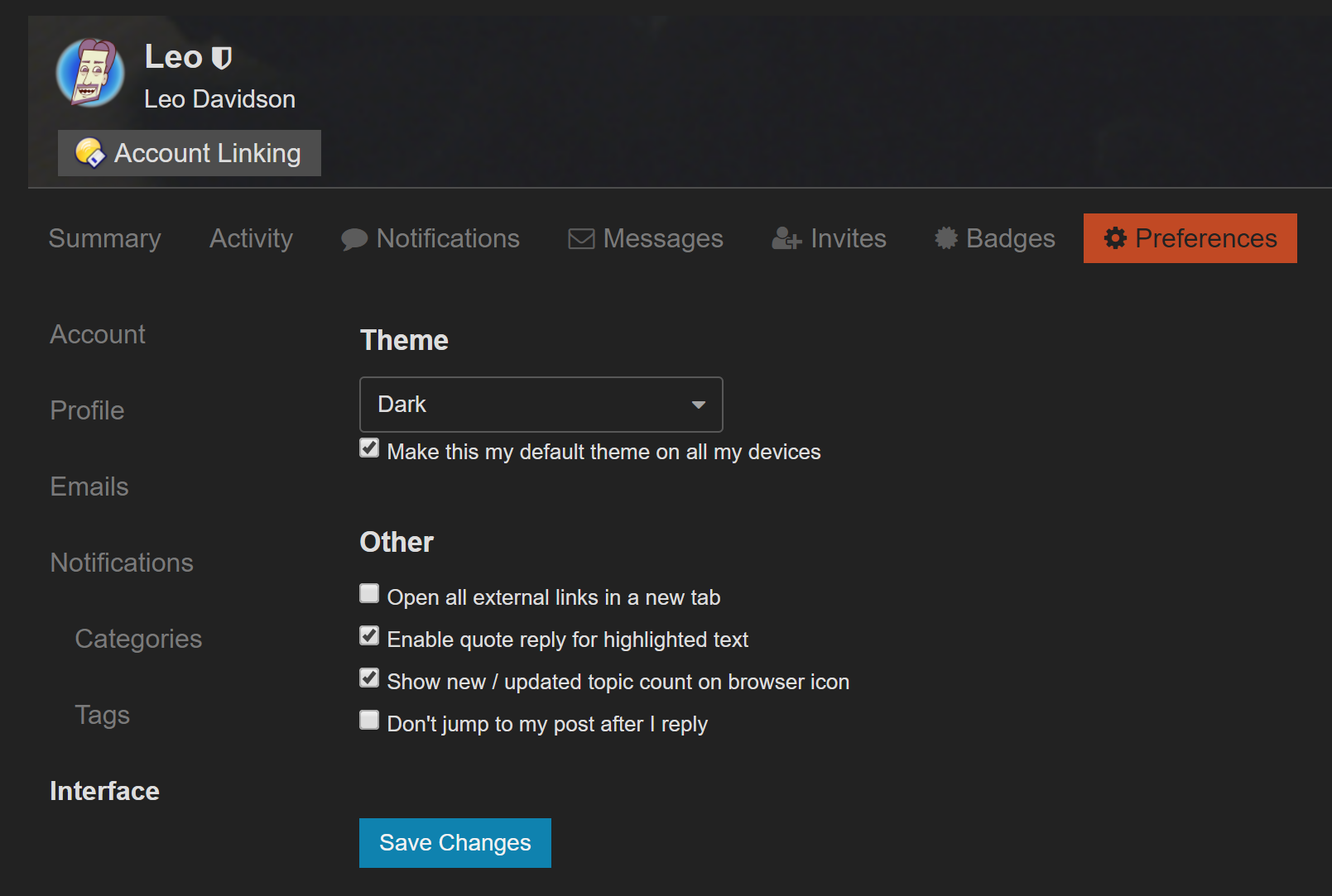
You can now select a Dark theme via https://resource.dopus.com/my/preferences/interface

2 Likes

Much easier on the eye! Thanks Leo.