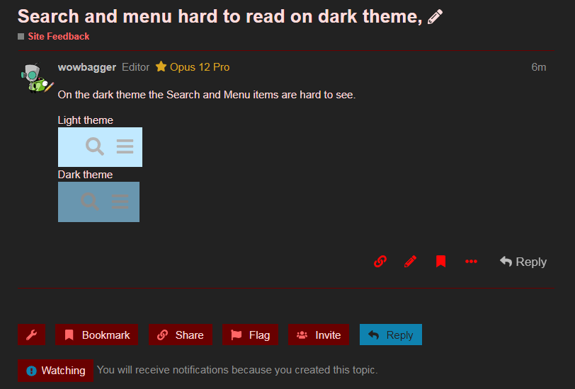
On the dark theme the Search and Menu items are hard to see.
Light theme

Dark theme

On the dark theme the Search and Menu items are hard to see.
Light theme
Dark theme
Should be better now if you F5.
nice one, looks good.
The CSS seemed to auto update as you changed it.
I thought my pc was possessed for a minute 
The category is similarly hard to read

Done some more tweaking.
It's difficult since there are only two color settings for the header, and everything else is derived from them, and it seems designed around light themes. On top of that, the Opus logo is black text, so the header can't be too dark or it becomes invisible.
Hopefully it looks "OK enough" now.
Not sure why, but the logo at the top started looking rather odd to me. Had to block it from loading.
The logo is black text on a dark background.
I'm not sure if we can have separate logos for each theme, but it doesn't seem that important since you know where you are by the time you've changed themes.