Currently, if a tab is showing the top level of a syncing service like Dropbox, a network drive, and even local special places like Downloads and Videos, the icon on the tab's label is distinctive. But when one moves down to a sub-folder within such a location, the icon goes back to being the plain yellow folder icon. I think you should show those distinguishing icons even when in a lower folder, or at least add an optional preference to have it display that way. I imagine this would be relatively simple to implement.
Example scenario: I'm a designer on a magazine, and the Dropbox folders where the editors share content with me have similar names to my own folders where I store the files I'm working on. I usually have tabs open for each, and I constantly get them confused. If the Dropbox one had a Dropbox icon, it would be very helpful.
I also have a drive letter assigned to a network drive and use it often, so it usually has one or more tabs open to folders on it. It would be nice to see which is on that drive and which is local without having to stop and think, "Hmm, where is that folder?" That would be great for inserted media and Network, too, and even local spots like Music, Videos, etc. Basically anywhere you currently have a special icon for the top level, it would be nice to see that icon on the tab when anywhere within that location. The folder name makes it clear that it's not currently in the top level.
We just show the icon for the folder that Windows provides. We don't specifically show a different icon for the Dropbox root folder, it's just that that folder (and none of its children) has a different icon.
You could use Folder Formats to configure a different tab color, background color or background image when in or below the Dropbox folder as one way to distinguish them.
You can turn on Preferences / Folder Tabs / Options / Display drive letter in tab label to see drive letters in tabs.
Thanks, Jon. Those were both features I didn't know about. I turned on "Display drive letter in tab label" and saved a blue label color for Dropbox locations (to match the blue Dropbox logo - being a designer, color associations work well for my brain). Those two actions definitely help.
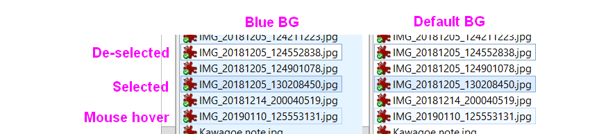
I also experimented with using a very light blue background for the files pane when in Dropbox. I haven't decided if I like that or not, but in the process, I discovered an unintended consequence you might want to know about (off-topic, but simplest to just mention it here). No matter what the color of the background, the color of a file/folder that is the "current" one but not selected (I'm not sure of the right term, but it's the top file/folder in the list when you first navigate to a folder, or a file that was selected and then de-selected by Ctrl-click or by clicking elsewhere in the pane) is still white - it does not follow the color of the background. In my case, since coincidentally the color of a selected file is light blue (presumably that's set by the Windows color scheme), I had the odd situation where the current-but-not-selected file stood out more than a selected one (and hovering was the exact same shade). See image below if I'm not describing it well. It's the user's problem if they choose a color that's too similar to the selected/hovered colors, but if you can get the current-but-not-selected file to be transparent instead of opaque white (I don't know if that's hard or easy, since many of the visuals are straight from Windows), that would probably be good, since I assume the original intent of the white was to match the background and only be distinguished by the outline. Just a thought.
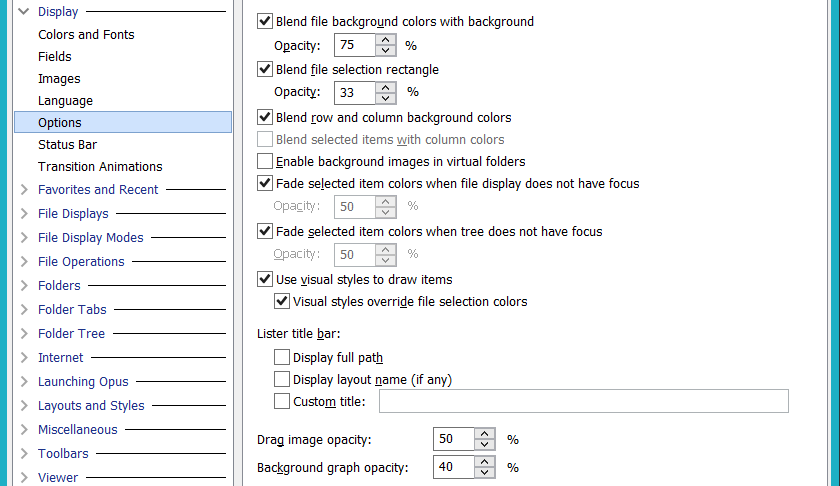
I don't know, which probably means I'm using the standard one, right? Here is what Display->Options looks like on mine - I assume these are the default settings, since I've never seen this page of settings before:
I played around with the checkboxes just now (unchecking them one by one, hitting Apply, and looking for an effect). Reading the "Blend..." ones, I thought I had an idea what they meant, but I didn't notice anything different turning them off. But I could see what the "Fade..." ones do, and the dramatic changes when unchecking either of the ones about visual styles. I kinda like the situation with "Use visual styles to draw items" checked but "Visual styles override file selection colors" unchecked - selected files and hovering are much more obvious in that mode, and the current-but-not-selected file matches the background. Not sure I like what a selected item (folder in the tree or files in the list pane) looks like when that pane doesn't have the focus (white text on a medium blue-grey - not much text contrast), but I'll try it for awhile and see.
Which version of Windows are you using? Just from the screenshot of your Preferences dialog, it looks like a different visual style to the standard Windows 10 one. It's very similar, but also has some differences in colors and styles, particularly how dark the outlines are.
If it's just Win7/Win8 then that may explain it.
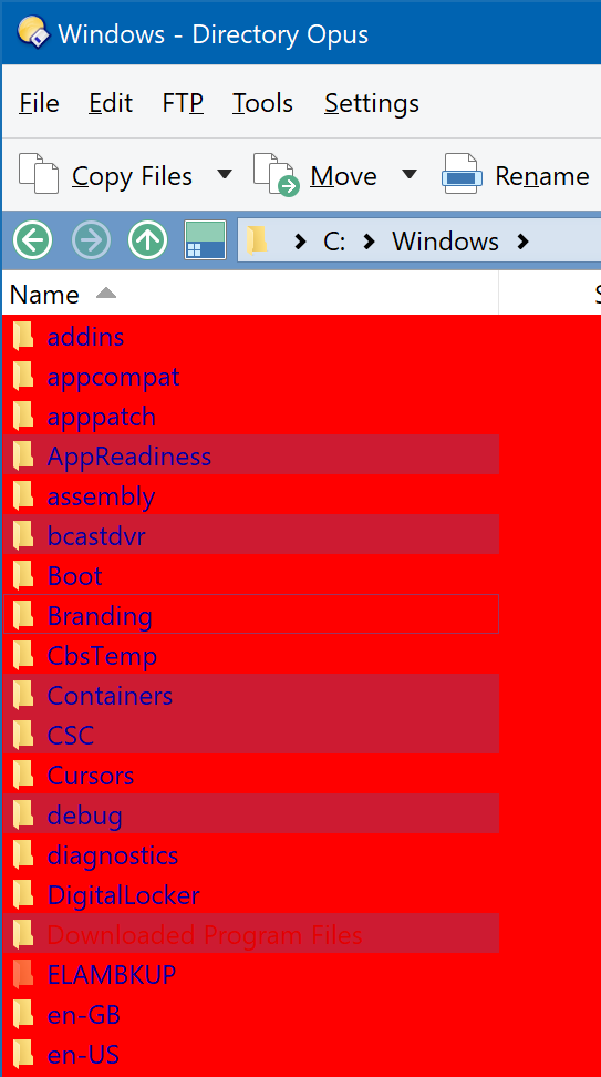
At least on Windows 10 (and I'm fairly sure Win 7 was the same, but less sure about Win 8), the standard visual style won't draw white behind an unfocused item. See the "Branding" folder in my screenshot here:
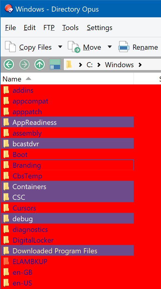
If you turn off Preferences / Display / Options / Visual styles override file selection colors then Opus will draw the selection/focus boxes itself, instead of the visual styles drawing them:
(The color(s) it uses in this mode can be configured under Preferences / Display / Colors & Fonts, but the focus-only rectangle will always have a transparent background if Opus is drawing it itself, and AFAIK also if the standard visual styles are drawing them.)
Oh, I didn't realize it was the theme doing that - that explains it. I do have Windows 10, but I use the Aero Lite theme (hidden by default, but many tutorials explain how to activate it) for one glorious feature: It brings back window borders, without which I would be constantly clicking on the wrong thing. (You can see them in my previous screenshot - the cyan lines on the left and right are borders on all windows, just like in previous versions of Windows.) Since it's essentially an old theme from Win7 or Win8, I'm not surprised that there are side effects like opaque backgrounds on unselected items.
I tested with the default Win10 theme, and indeed, the filenames did not have white if the BG was colored. So the mystery is solved. But I would put up with many side effects to be able to keep window borders - I don't know why MS thought removing them would be an improvement.
Thanks again for opening my eyes to many more features of Opus that I did not know about. It's an inexhaustible treasure trove!
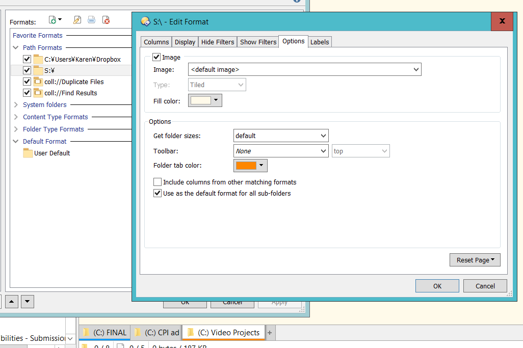
I'm running into an intermittent issue with Folder Formats. Sometimes (I haven't determined exactly when), once a tab has a tab color and background color applied because of my settings, it stays that way for all folders that are not assigned to a different color. I have two locations defined with color options: Dropbox (blue) and my network drive S:\ (orange). Nothing else should have any color. But right now, as you can see in the screenshot, the third tab is looking at C:\ but is colored like S:. It was no doubt looking at S:\ sometime in its past, but then it got "stuck" as orange. If I navigate that tab to Dropbox it will turn blue, but when I then go anywhere else, it will become orange again - it will never again be white. If I close the tab and create a new one, it will behave for awhile and then get stuck like that again. I can't figure out what causes a tab to start thinking that anything except Dropbox should be orange.