Simple Windows 10 Dark Theme

More than likely it's Rainmeter

1 Like

Hi HoffY,
It's called Traffic Monitor. GitHub - zhongyang219/TrafficMonitor: 这是一个用于显示当前网速、CPU及内存利用率的桌面悬浮窗软件,并支持任务栏显示,支持更换皮肤。

1 Like

What's the theme?

1 Like

Thanks

1 Like

I love the theme! I'm only having one issue.

My drive icons text are in .. Black .. so they are almost impossible to read against the dark background?

The "C: G: H: X:: at the far left just above 'Location'
Snag_4e39c1

All the Other text is .. White .. so I'm not sure how to fix this?

This is the 'original' appearance before using this theme?

Snag_4e9e86

Your drive buttons must be overriding the normal text color, since the other buttons are readable. Edit them (or the button that's generating them, most likely) and you should see the color being overridden there.

Yes - I did Customize -> then selecteced each of the two button objects and changed the background color from transparent to . White.

Perfect! Thanks!

Changing both text and background to transparent (i.e. no override) is the way to get them to look like normal buttons, if that’s the aim.

I just realized one other element is missing?

The tiny right arrow to the left of folders that contain other folders .. and the tiny down arrow at the very top of the folder tree to the left of the H: drive name?
Snag_313aa07
Snag_313c1c5

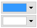
Preferences / Display / Colors and Fonts / Folder tree / Glyph, and Glyph Hot.

These work well with a dark theme:

RGB 51,153,255
RGB 255,255,255

Clipboard Image

Thanks! Those colors would work well!

However .. unless I move the mouse Over the folder tree, I still don't see any glyphs?

That's normal, not anything to do with light or dark themes. The tree in File Explorer is the same.

There are some other tree style options in Preferences, which always show expandera but also look different. If you need more info, please start a new thread and let us know what you need.

Again .. thanks! Just an Amazing program that's so customizable and does so many different things .. Well!!

If you ever develop a MacOS version .. I'd snap one up on day one as I rather hate 'Path Finder' the one I pay for on the Mac.

I've started to use Maui to develop IOS/Android apps and it comes with MacOS output as a side-benefit. If you're using C++ you might be surprised at how easily you'd pick up C#?

1 Like

I love this theme but I made some modifications to suit my use case better and I'd thought I'd share it here. I changed the file group header to white so I can better read the text when using tile view and grouping items by type. I also made some changes so the active (selected lister) appears much lighter than the destination lister. I was having trouble distinguishing which lister was the source and which was the destination and changing those colors slightly made it much more clear for me. This is an example of what I modified:


Windows 10 Dark Mode - Modified by mackid1993.dlt (160.4 KB)

1 Like

Have been using this great theme for years, so I really have to thank tnaseem again.

Since the theme is included in the configuration backup and now that I'm about to try DOpus 13, it'd make sense to remove it first. However, I am not sure what is the best way. In Settings/Lister Themes there is nothing - no themes found.

Any suggestions? Thanks.

edit: It's been a long time, but I'm pretty sure a .dlt file was used to install it. I still have it actually. I just also seem to remember that is was not (ever?) listed in Lister Themes.

1 Like

Hi there,

as before on DOpus12 I made a quick update of my version of Naseems nice Dark Theme to feel at least as smooth in the great new v13 DOpus edition! It's a basic version, will keep refining it by increments...

regards, staefn!

Naseem-DarkTheme_based_edit_for_DOpus13-W11_bySTK_v1.0.dlt (1.7 KB)

2 Likes

You don't have to. Colors and themes will be carried over to Opus 13, with automatic detection of whether they are dark or light so they go into the appropriate mode's color settings.

Resetting the theme is easier after installing Opus 13, if you still want to do it. See Plain / Default Theme.

1 Like

Seems dark mode has just become popular in the last 5 or so years. I don't recall it ever being requested or talked about 20 years ago. Some websites in the 90s used black backgrounds but applications had light themes. If a dark theme was offered, it didn't look right.

Maybe we can put that down to most of us using bigger screens nowadays and spending more time looking at them and being affected by the glare of the white backgrounds.

it was definitely requested 20 years ago (mid 2000s) and its been popular for at least 15 years, and decent for over a decade. The 1999s was 24 years ago my man.

2 Likes