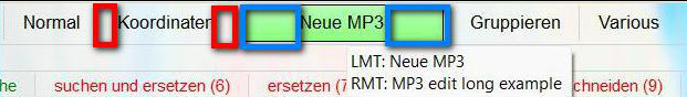
Recently i made a new button in my main menu, and noticed, that the padding was much wider than with the other buttons, with extra space at the left and right. I found, that the RMB menu was causing that effect, with the description being wider. As i shortened the RMB description, the button now looks normal.
My suggestion is, that three way buttons would be adjusted to the LMB/main button text rather than MMB or RMB ones.
Edit, you can see what i mean in my example, where i exaggerated the RMB text to make it clearer.
Edit 2, i have re-edited my screenshot to show, which part i meant by being too wide.
I don't mean the info tip content, but rather the state, when i don't hover over that button. For the info tip it is necessary, i agree. But otherwise it doesn't look so good to have a menu button, that is unnecessarily broader than it has to be.