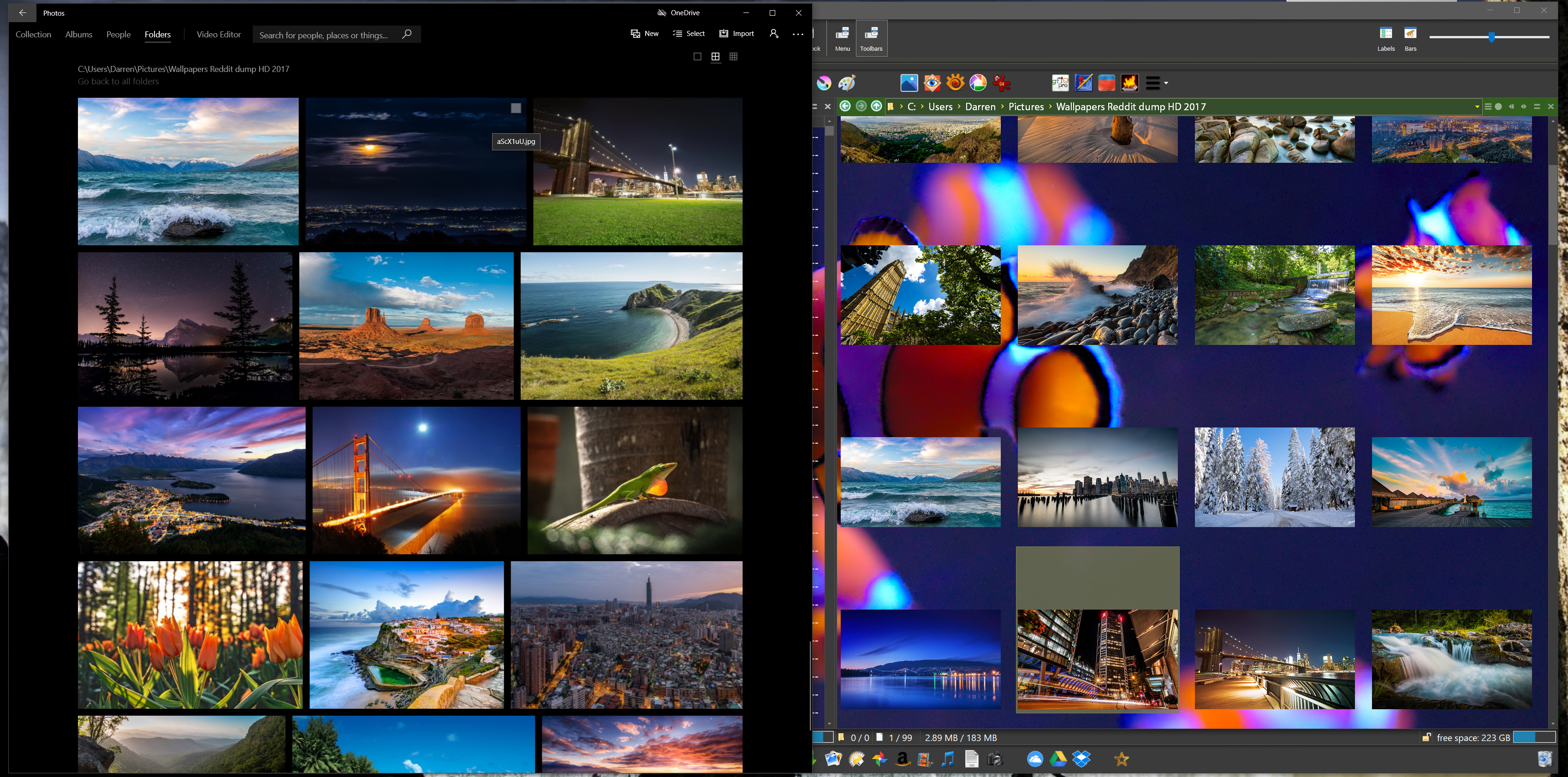
Can we have a thumbnail view without large gaps please.
The screenshot show windows photo viewer on left and dopus on right.
If you set the spacing to zero in Preferences, they will be similar to your left example.
Note that if there is extra space in the window then it will be spread out between all the thumbnails (instead of all being on the right after the last thumbnail on each line), so you'll only get the tightest spacing if the window/panel is the proper width, but the extra space then would be wasted whatever the layout.
The windows photo viewer has all thumbnails same height and adjusts width. Then I think its resizing the thumbs slightly to fit the width of the window.
Which gaps are we talking about, the ones at the sides or the top and bottom ones?
Opus will always use a grid view, not variable-height lines (otherwise things jump around a lot when things are added/removed, and more calculations are required to work out where things are, which can be slower). But you can set the thumbnail dimensions to be whatever you want; they don't have to be square, or a fixed width either.
Those horizontal gaps are just sharing the extra space on each row, spreading it out instead of having it all on the right.
You would need to either change the window size or the thumbnail width to remove it (assuming spacing is already set to zero).
Resize the window by the right edge and you'll see what I mean.