Is there any way to hide/disable the "expand" icons, usually a + or a >
at every branch that has a child folder?
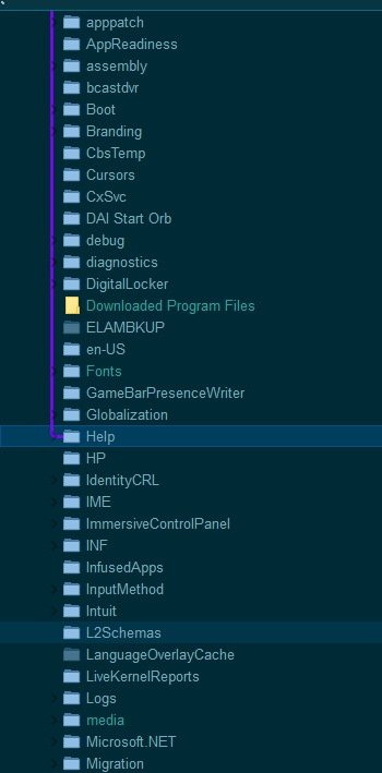
As you can see with the theme I am creating the dark markers or not useful in any way. In fact I would think that with the purple line, whatever the color, I don't see those markers being useful.
But I cannot find an option or combination of options that allows me to turn them off!!! Kinda shocked actually. And not in the positive way that I am usually shocked by DO
If you get the current beta version (12.9.1), you can change the colors of those glyphs via Preferences / Display / Colors and Fonts / Folder tree.
The purple line only shows you where the current folder tab is. You still need the glyphs to be able to expand and collapse branches of the tree, and to see if a collapsed branch can be expanded or not.
So then, no, there's not a way to hide/disable that "glyph"?
That's unfortunate.
As for "still need"(ing) them to expand, let's just leave that one be as I'm pretty sure we won't agree on that! Yes I know programmatically having a "thing" to click on etc... but from a purely visual/UI standpoint I derive exactly NO benefit from being forced to SEE those little visual cues and would rather they be optional - so that the people who need to see them can, but those minimalists like me aren't forced to.
Really IM[!]HO there is only something to benefit and nothing to lose by making these things options for the power users! It's already there as an option to select a color, right? Why not make transparent an option?!
I'm not a fan of hidden UI elements either... I see double clicking on a treeview branch the most intuitive way to expand it. The glyphs I consider unnecessary screen clutter, like a lot of other stuff I see on the screen.
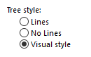
They should if you're using Preferences / Folder Tree / Appearance / Tree Style: Visual style, and the mouse is not over the tree, and the tree does not have keyboard focus.
Doesn't this sound just a tad "over spun" and too complex to be useful? I don't see this condition happening, no focus, no mouse over - it seems like it would NEVER be valuable - as a user.
"Overly-complex" is something I see in the forums quite a bit.
I guess the conclusion on this "show it or don't show it" - is just that is CANNOT be hidden. Not REALLY. Not realistically - for the average user, or even power user.
Sometimes the complexity of DO makes it damn near impossible to do something that should really be very simple. I don't mean this as an insult. Lots of software products that have been around as long as DO experience the same sort of thing, and the users, the same sort of frustration.
I'm surprised this is a surprise, unless you always have the mouse or keyboard focus over the tree and never use any other part of the program.
This is how the tree in both File Explorer and Opus has worked for about 10 years, and no one else has had a problem with it, so it can't be that bad.
The other two modes (Lines and No Lines) do not fade the glyphs in and out, so you can always use those if you don't like the "complexity" of things fading out.
With all due respect, I think we both have bigger fish to fry!

 It's already there as an option to select a color, right? Why not make transparent an option?!