Given that the new beta added "over 700 configurable colors and related options", it's even more improtant that it's easier to set those colors. However, the current RGB approach in the color picker is awful since those components don't map in any way to how we reason about colors.
The better approach is to use HSL/HSV, where you actually select a color (hue) and then adjust how saturated and bright it is
But an even better approach is to use Okhsv and Okhsl, which is an improvement over the regular Hsv/Hsl in that it uses a new color space that allows you to change saturation without any effect on brightness that you would get in the regular HSL/HSV
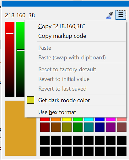
Or do you mean the Box that is hidden behind the extra menu on the screenshot? Than no, I meant being able to have explicit values I can copy&paste from/to and adjust rather than have an infinite canvas
Isn’t that mainly useful for copying values defined in other apps/tables, all of which include RGB (at least in my experience)?
I don’t think many people think about colors in terms of raw HSL numbers. (While many do think about raw RGB numbers, or at least remember raw RGB color values, as it’s so common and what the web tends to make people use.)
Actually the opposite, for copy&paste I don't care as much as any format would do. But usually I edit the colors to my liking, and with RGB it's unnatural and hard. So usually I use that proper OKHSL/V color picker, then copy&paste the values. But then it's a lot of friction without live feedback I'd get if DOpus had a proper color picker
But all of them think in terms of HSL concepts: how colorful a color is, how bright it is. You don't need to think raw numbers for it to be useful. Like, I have no clue what the difference between 80 and 85 of saturation is for some red color, but I do know that if I increase that slider, I get a "purer" red. And I'd be certain that it has no effect on how light it looks, which is especially important for the great looking Dark/Light themes so you could maintain similar levels of lightness for similar group of elements by just changing colors (or do the opposite, use different levels of light to emphasize an active tab vs. an inactive tab while being certain that the colors are the same).
I'd have no clue how to achieve that with meaningless RGBs
Exactly, you remember a few colors the awful coding practices forced upon you in other contexts, but that's about as useful as a copy&paste via a wetbrain buffer. Unless you're some color-adjacent professional, you can't really think in terms of RGBs