Here's an adaptation for Directory Opus that may be of interest to anyone looking either for a replacement of, or an addition to, the classic directory tree. Edit: I added an importable *.dop file you can download and double-click to import.
Why did I create this?
As there are many folders on my drive that I rarely visit (only nerds go regularly to "Program Files", "Windows", etc. but there's a lot of other rarely used folders) I began to wonder what all this scrolling up and down the directory tree is good for. I began using favorites to go quickly to my most useful folders. I started using the F8 toggle to open and close the tree view when I needed it - which gave me much more space. Finally I got the hereby described idea for a folder tree alternative that responded to my needs.
It's a nice illustration of the flexibility of Directory Opus, and although most people probably won't use it, I'm certainly very happy with it.
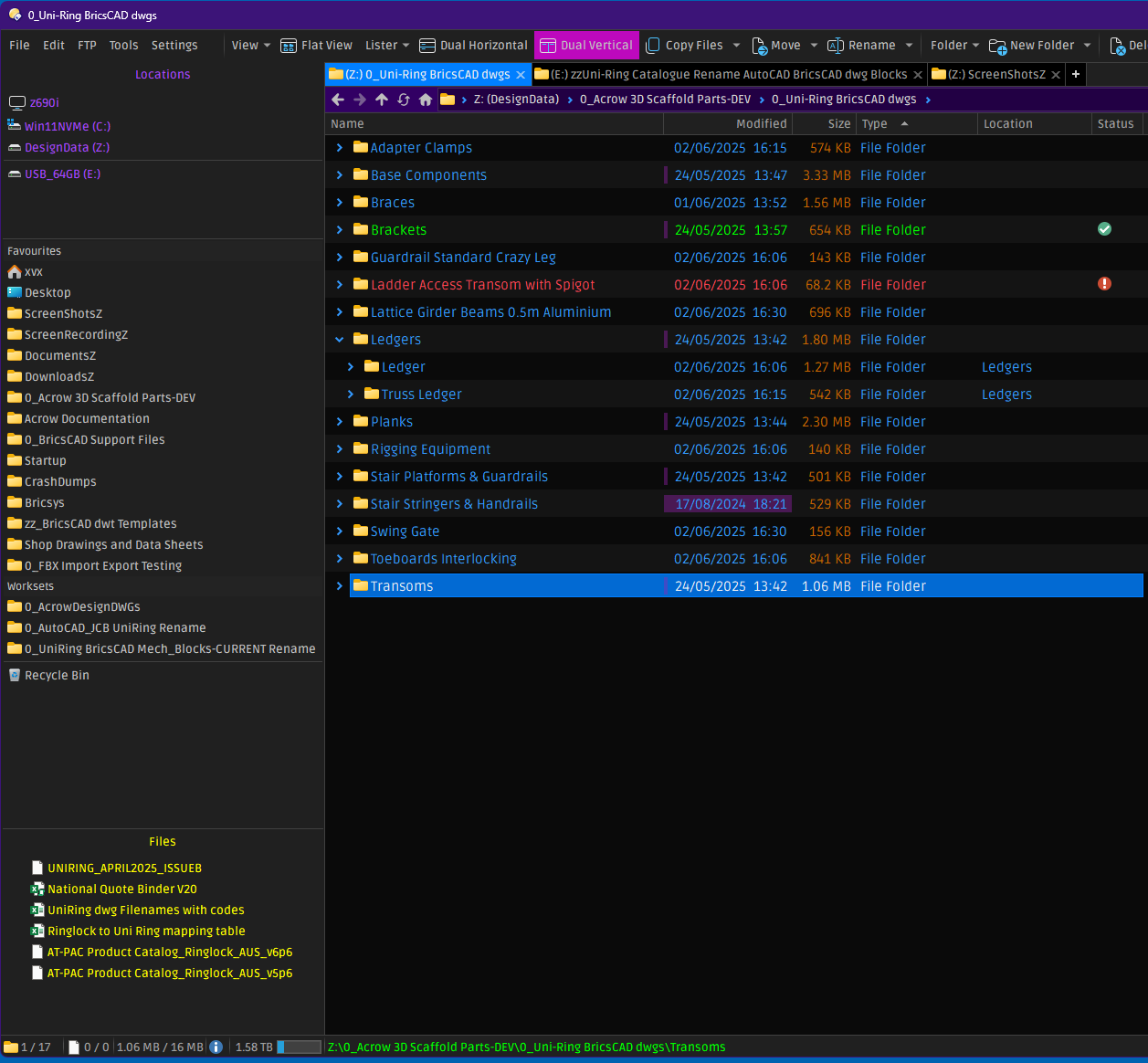
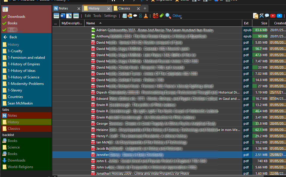
Here's a screenshot to tell it all at once:
(Ps. The blurs are just meant to reduce distraction)
EDIT: days after publishing this tutorial, I made a more colourful version. I've added a new screenshot at the end of the tutorial - for lovers of more colour.
Short description of the screenshot above
The directory folder tree (standard on the left) has been disabled. Instead you see something else, which in fact is a vertically positioned toolbar, locked to the left side of the so-called "files and folders" panel. The toolbar looks like and works like a browser tree but you need to go through the view by clicking on folder names, or turn back by using the back button. In reality this is not a window but just a 'panel' - although that really doesn't matter. Maybe it's also a bit of good luck that it works so well - it certainly surprised me. I couldn't even find this sort of solution on this forum when I was searching for something like this. Maybe it's the first time a vertically positioned toolbar is being used to mimick a browser experience?
Now let's look at the technicalities.
How to to it
You could start with hiding the folder tree window, which in standard setup is on the left side. You can do that by hitting function key F8 (on a Windows machine at least). Hitting F8 again will again show it - it's a toggle.
Then you create a new toolbar (Settings > Customize Toolbars and Keys > New) and give it a name, e.g. "My Tree". Then activate it, and DRAG IT TO THE LEFT SIDE OF THE FILES AND FOLDERS WINDOW - or left of the dual view (source & target window). If you did not yet hide the folder tree window, make sure you don't attach it there, because that's the frame we want to hide, in favour of the new tool. So we now have a VERTICAL toolbar sticking like a file-browsing panel to the left side of the files and folder window.
Now we need to populate it with buttons to make it optimally useful. We add buttons from top to bottom.
At the top: some fixed command buttons
The first one, which I called 'Tree' (and using the #foldertree icon) toggles the default directory tree on & off - just in case I need to temporarily use it. It just contains the command:
Set TREE=Toggle
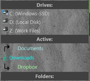
The next 3 buttons (which I gave 'check' icons) let me go straight to 3 main folders I use a lot. They all use a simple command and a path, like this:
GO "C:\Users\username\Downloads"
Then there's a small spacer to separate the second part, which shows the subfolders of the folder where I just decided to go with one click.
Next: our alternative "tree view"
On top I first put a fixed "back" button in this section - that's a standard DOpus-button you can pick up via the Default Toolbars in the settings - it may already be on your default toolbars (in customize mode you cannot copy it though, but you can move it). You can also create a new button and enter the following command:
Go BACK USEQUALKEYS
but it is recommendable to pick up the standard button, because that one has the advantage that you can right-click on it, to see the 'back history' through the folders, and quickly go back to one of the last visited folders.
Then there's the real thing. It's a normal button, but because of what it does, they call it a "dynamic button" - because it automatically expands to a series of elements - such as a file list or a folder list. What we want is a folder list - what you actually see in the screenshot above. What we want is to see the folders inside the 'current' folder. The command used for that is the following:
Go CURRENT FOLDERCONTENT="showempty,noparselinks,norecurse,nofiles,maxdirs=30,maxwidth=30"
This was the important part. This is not a 'tree', but you can click through each folder on the left (and you only need to click once) in order to get down in the folder structure. The dynamic button will instantly show the deeper set of folders, and on the right you will see its content.
UPDATE: In the meantime (Februari 2026) I have exchanged this Go GURRENT FOLDERCONTENT… dynamic button implementation with a “programmed dynamic button” which shows the same thing, but offers more control over how to display the folders - for instance I can now show pinned folders (folders with a “pinned” Opus label) on top of the other folders in the vertical toolbar. This solution is described in the AltFolderHandler page. It is a more complex way of doing it (you need to install the additional script) so you may not need it at all.
AN OPTIONAL DETAIL: I also happen to hide folders in the files & folders panel, especially in structures where I store books, or videos or music files. (This is not the place to explain it, but you can confirure this in DOpus for whole substructures of your file system). This seems the logical thing to do in this setup, because the folders in this 'toolbar-treeview' are always already expanded. Normally, if in the 'toolbar-treeview' you click on a folder that has, say, 10 subfolders, you will immediately see those 10 folders in the toolbar, and also exactly the same 10 folders in the files & folders window on the right (followed by the files). Which is pretty useless and a waste of precious space.
I also added a few more things.
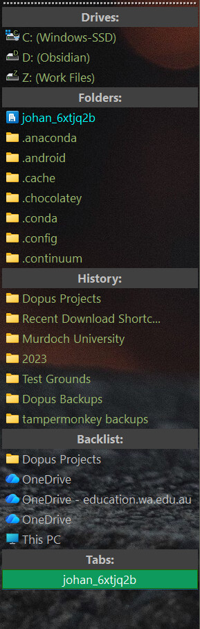
List of open tabs
After adding another spacer, another dynamic button serves to show the list of open tabs. This dynamic button has the following simple instruction:
Go TABLIST="icons,namesonly,maxwidth=30" HEADING="--Tab list--"
Folder history
Finally, after another spacer, I added a 'history' a.k.a. 'back list'. It shows the same thing that I can also see if I right-click on the regular "back" button from Directory Opus (if you use the standard button that comes with DO - as I described above). So this is duplicate information, but its always in sight on the left side of my screen (unless there are so many subfolders that those last sections are pushed out of sight).
Here is the command for this 'history' dynamic button:
Go BACKLIST=namesonly HEADING="--History--"
Some other remarks
When there are more folders than fit on the toolbar, a small stripe will appear at at the bottom of the bar, which you cen click to show you the remaining folders, and they're also clickable... that's a standard function of the toolbar! Magic.
When I made this toolbar I was not even considering dual pane file view, but it turns out that the toolbar does not duplicate in the target window, it just shows up next to two dual listers - similar to the standard behaviour of the standard directory tree view. Again, magic. It all just works fine.
Another nice thing is, that this functionality shows different information in every tab you use - which was of course to be expected (the original directory tree of DO also repositions itself when you change tabs) - but still: very nice. Everything works just great.
That's it.
There are examples on the forum from people who use dynamic buttons that show folder information in a drop-down listing when you right-click on it (this requires the creation of a 'menu button', and then within that a normal button, in which you put the GO FOLDERCONTENT or similar commands, in the same way I've described above). I happened to use this, but it didn't satisfy me at all, to always click on a button to see subfolders, or files. With this toolbar, all of that suddenly made sense.
One small issue
The toolbar has no parameter to fix its size, so it's width varies while you browse through your folders. The parameter "maxwidth=30" in the dynamic buttons should cut off long names after the first 30 characters. This did not work correctly, but it has been solved (in version 13.16.2) for the "Go FOLDERCONTENT" instruction. It still does not work for "Go BACKLIST", so if you include that one in the toolbar, you may get a too wide toolbar once you visited a folder with a very long name.
It would perhaps even be better if Directory Opus would offer a setting to fix the width of a vertical sidebar. But this is solvable already. The maxwidth parameter limits the width to (in my case) max. 30 characters, and you can enforce a minimum of 30 characters, for instance by adding a button with no other function than displaying its name, and you fill that name with, for instance, a number of underscores (you need to experiment a bit in design mode, because characters have no fixed width in the toolbar - you need to find an approximate fine minimum width). And you set the text colour of that button to the background colour of the toolbar, in order to make your trick 'invisible'. (In my toolbar I did it by adapting my first button, the 'Tree' toggle).
Finally: aesthetics
A few days after writing this, I created a more flashy version, but this required no change of the code, just working with the layout settings within all the included buttons - especially background colours - and also the use spacers between the sections has now become less than useful. So here's a new screenshot, for the lovers of aesthetics:
PS. There is an additional button in this version: just below the back button on top of the folder list, I added a dynamic button to show nothing but the name of the current directory. The instruction is like this:
Go CURRENT FOLDERCONTENT="includestart,norecurse,nofiles,nodirs,maxwidth=30"
It improves my sense of orientation when I always see the name of the folder I'm in, right there. And just to see the difference more clearly, I gave the colour of the text of that button a soft grey.
For those who want to import it and try: the toolbar is called "Browser" (rename it during import if you already have a brower with that name). You may then need to activate the toolbar and also drag & drop it somewhere to the right of your lister, as a vertical task bar. It will not be the exact same as in the screenshot above, and does not include the scripted button solution “AltFolderHandler”, but it has the basic parts described above.
Browser.dop (2.1 KB)