Hey there!
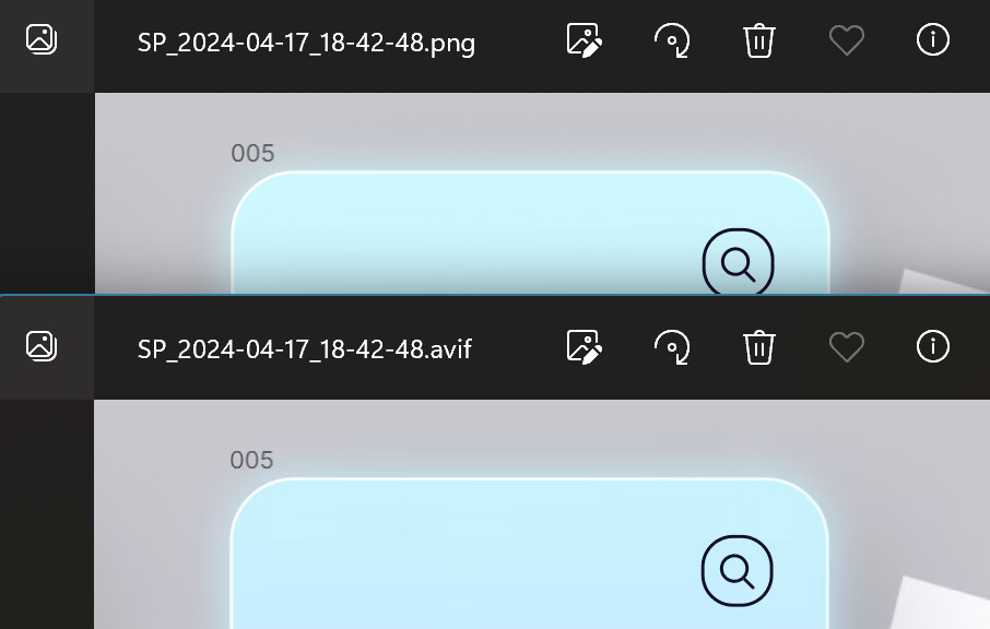
I've been playing around with AVIF images in Directory Opus and noticed something a bit off. Both my PNG and AVIF images are essentially identical in content, but when I check them out in Directory Opus, the AVIF seems to have a darker cyan color, especially noticeable in the top left corner. Interestingly, this doesn't happen when I view them in Edge or XnView MP; they look just the same there.
files: avif before after.zip (1.1 MB)
I'm thinking there might be a little hiccup with how Directory Opus is rendering AVIF images. Would love to know if there's a way to tweak this or if it's something on the radar to be looked into. Really appreciate all the hard work you guys put into making Directory Opus awesome, and looking forward to any insight you might have on this!
Thanks a bunch!