I use a narrow monitor, since it is in portrait mode.
The new breadcrumb in the display leaves me no room to click to make a lister active.
It happens when I make a large manual selection in the source, switch to destination, to do a last rename or delete, and want to go back to what used to be source. I used to click on the bar where the breadcrumb is now. Now there's no more room.
The workaround is to ctrl click and ctrl reclick just a folder in destination, to make it source again. I don't like that.
What is the best way to make a lister active, source again?
You could create a button in the lister-header (toolbar) for this, it creates a place to click onto without doing anything but toggling focus. If you use a blank icon and disable "hightlight" border for it, you gain "real empty" click-space.
Currently I use this button myself, it should reflect the listers state (source/destination) in its icon, but it kind of not works.
You can change the border/toolbar behaviour to not react on first mouseclick to toggle the focus as well, but this is something I got not used to, as it does not fit my former dopus experience. Additionally there's no other place in a lister which "swallows" a click, so to me this behaviour was some kind of bump in the otherweise smooth GUI ride. o)
FWIW, it's not a new concept; it's always been an option for the file display border and can now be applied to the new file display toolbar in Opus 11, for those who want it.
I know this topic has been kind of "stretched" recently, so let me just add, that the new toolbar is different to the old file display border, in that it is very likely to be full of controls, so you have harder times not hitting those and kicking-off some action. The old border wasn't that stuffed, so you always had some space left to click it and got easily away without that swallow thing. I think that's the main point, when it comes to "it behaves just like before", so why is it you are having trouble with that? It surely acts as before, but it is though different to use because of the mentioned changes.
I got very used to the new bar and like it very much now, didn't thought so at first.
Manually adding some space to be preserved for a "click here to focus"-area, does the trick for me perfectly to avoid activating the click-swallower-beast-thing. o)
This post might interest you How to activate other side in dual lister.
Options
[ul]
[li]Click the new location bar in file display tool bar. link[/li]
[li]You can use tab Link[/li]
[li]Click the file file display border/Status bar [/li]
[li]Create a button link[/li][/ul]
Although this query is not 'directly' related to the topic of this thread but 'is' related to breadcrumb bars, so not created a new topic for it.
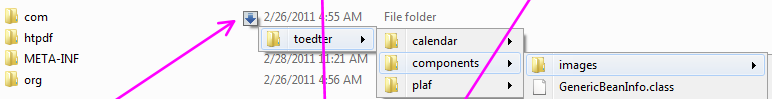
On clicking at the 'little triangle' button in the breadcrumb bar, it expands 'a list of files / folders' INSIDE THAT FOLDER
Bread-crumb bar has 'little triangles' on each level of hierarchy, but on clicking on the triangle - in the drop-down below it shows the contents OF ONLY ONE LEVEL and does not allow us to parse through the DEPTH of CURRENT 'IN-QUESTION' DIRECTORY STRUCTURE (for that folder) -> (While in a simple program like QtTabBar - it is possible to travel upto the depth of the directory structure just from Breadcrumb bar, ELIMINATING THE NECESSITY TO OPEN MANY FOLDERS),
say for example, we have 1 -> 2 -> 3 -> 4 , if we click on the triangle of '2' in the drop-down bar it shows the contents of '2' BUT there 'in that drop-down' there is NO TRIANGLE in front '3' so that we can go more-levels down the hierearhy using the bread-crumb bar
Also clicking the triangle in the breadcrumb bar does not show ALL filetypes in the opened drop-down list (for example .msi and .exe files are NOT shown in the list), is there a way to show all type of files in it
i'm sorry, it seems, i could not interpret completely / correctly,
Please suggest,
does it mean that AT PRESENT there is NO OPTION available (or there IS some option available) in Opus, to ENABLE 'the showing of sub-(sub)-folder structures' from the breadcrumb-bar OR FROM SOMEWHERE ELSE (as in the screenshot above (posted by me) there appears a small icon, just in front of the INDIVIDUAL FOLDERS)
As tbone said, that's how it is right now. There is no option to change it.
Navigating nested folder structures via menus quickly becomes very fiddly, from experience using the Windows XP start menu.
It also requires some way to differentiate between selecting a folder because you want to go to that folder and selecting a folder because you want to expand its menu.
While we support a few ways of doing those things in user-defined menus, with the Go FOLDERCONTENT command, it's not something the breadcrumbs location field can do at this time. The breadcrumb menus are just for jumping between sibling folders, and the file display or folder tree are better suited to navigating through nested directory structures.