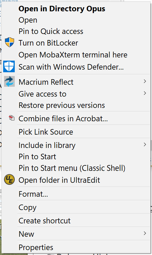
The line spacing in the context menu I get when right-clicking on a folder in my tree view is much narrower than what I get when doing the same in a regular folder pane:
Here is the one in the tree view:
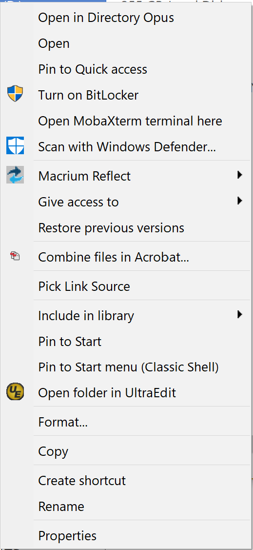
One more, strange detail: I get the tight line spacing in the context menu only when right-clicking on a drive in the tree view. If I click on a regular folder, the line spacing is the same as in other places.
Menus for drives are displayed by the Windows shell (since most custom Opus commands won’t work on drive roots) while menus for files and directories are displayed by Opus (to let you customise them).
Microsoft keep changing which themes and spacing they use to render things, and we aren’t really fans of the more spaced out version as it fits fewer items on screen. (One of many cases where they’ve made things worse for mouse users with changes meant to cater to a small minority of touch users, while not actually making a touch UI that’s good enough to want to use. The worst of both worlds.)
The thing is, Windows Explorer does show the context menus with the same wide spacing no matter what item I'm clicking on. Oh well, it's a minor cosmetic issue.
All menus Explorer shows are rendered by the Windows shell. They all have the larger spacing that the drive menu has in Opus, which is also rendered by the Windows shell.