Iv'e tried searching the forums for the answer to my question however I'm not sure what to even search as I'm finding it hard to phrase into english what it is I'm looking at.
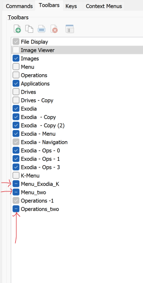
Anyway... what is the difference between left clicking opposed to right clicking on a toolbar's selection box? I see that a left click results in a cross however right click results with a flat line inside of the check and I can't seem to figure out what that flat line represents or results in?
It doesn't mean anything very important. The line is Windows 11's way of showing the checkbox is in an "in-between" state where (potentially) it's on for some things but off for others.
(Every other version of Windows uses a filled box to represent this state, but Windows 11 changed it as part of its wonderful new look & feel.)
I'll make a note to look in more detail at why right-clicking causes that state, as I'm not sure myself either. (It's also something that no longer happens in our long-term dev branch, as we're adding a context menu there in the future. So it's more a piece of history/trivia than anything worth caring about.)
Ahhhh..... that explains it... I legit thought I was going nuts when I first noticed it because I hadnt seen it before and I spent a good 15 mins clicking it then going back to the lister to see if anything had changed haha... btw just throwing an idea out there as I find it a bit inconvenient going between preferences and toolbars to make adjustments.
What if the in-between state or half fill (right click) on the toolbar instead of adding it to the active toolbars it sends it to the Folder -> Border -> Display as Toolbar ---- Because that would make it much easier for when you remove the Toolbar from the border then having to go back to Toolbars and re-enable it... that or the half state right click makes the Toolbar float instantly so that way it doesnt mess up positioning of existing toolbars.
Just food for thought as it's a redundant feature and you're investigating as it is.... p.s I'm excited for this so called context menu ;D more stuff to click on for the ADHD procrastinator is always good <3