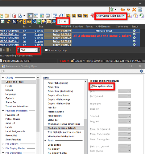
I've been using a dark theme (pretty sure it's @tnaseem's theme) for some time, with a few changes.
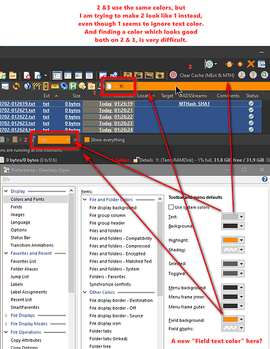
For "toolbar and menu defaults", if system colors are used, everything looks as expected. If custom colors are used, the text color seems to be set inconsistently, as you can see below; the path bar stays legible even though it ignores the text color and quick filter becomes illegible. Tnaseem's original theme uses dark background for fields, so this problem does not get noticed.
Would it be possible to split "text color" into two, so we would have one "text color" for 3 and a new "field text color" for 1 & 2? Maybe initially it could default to the same value as text color, so as not to break any existing theme. What do you think?

