NOTE: When using Directory Opus 10 or above, there is no need to install this icon-set. A completely redesigned version of this icon-set is built-in to the program.
I just realised that these icons look much better (at least to my eyes and on my monitor) if you disable the highlight effect:
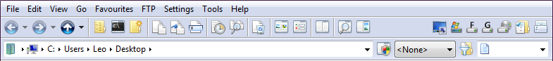
Go to Preferences - Display - Toolbars and set Image highlighting effect to None.
The Glow option that I was using before desaturates the icons slightly except for the one under the mouse which gets a slight increase in saturation. This works well with the default icon set, since those icons are very bright, but I think it spoils Chris's Vista icons as their colours are more subtle and desaturating them makes them look washed out, as Rhywun describes.
The difference between Glow being on and off may be hard to see and will depend a lot on your monitor but try turning it off and see for yourself, or using the screenshots below. I think turning it off improves these icons by making the edges stand out better and making the folder/desktop/UAC icons in my screenshots more distinctive from the other icons.
Tweaking the Gamma slider down to 28% (from 50%) in the NVidia control panel also made the icons (and just about everything else) look more crisp and well defined.
You'll probably all look at the pictures below and think "they look the same" but if you flick between the two it does make a difference, at least with my monitor setup. YMMV!
actually the glow option should make the icons brighter than the original when mouse is over it...but what it actually does is that it lowers the brightness/contrast(whatever) from the orinal icons and during mouse over it turns it to original color settings.So in normal condition the icons actually look a bit dull....i think that needs to be changed
It's done on purpose. The icons are made slightly dimmer when the mouse is not over them and slightly brighter when the mouse is. Otherwise the icons would have to be made really bright when the mouse goes over them for you to notice any difference and that can cause problems (e.g. if the icon is already very bright already then you can't make it brighter).
In the new version they will look sharper and less washed out.
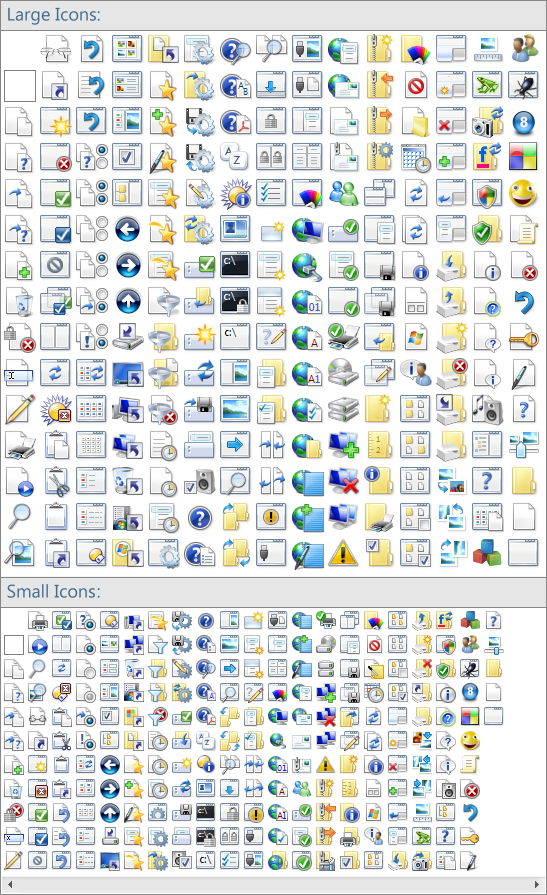
I will also add more color and I will remove a lot of 3D Vista elements (toolbar icons are 2D icons).
Hi Christiaan, many thanks for the updated icons, I use your previous set and will be updating as soon as these are released.
Just wondering, have you taken a look at windows 7 at all? Just wondered how the icons look on there and if you have any plans to do a win 7 icon set? Windows 7 is almost at the RC stage now so its very nearly finished, only a matter of months away.
On a side note I hope we won't have to wait to long for a windows 7 build of opus.
The icons in Windows 7 still seem to be in a state of flux. The reports on what's changed between build 7000 (the public beta) and build 7048 mention several icon changes so it might be worth waiting until the RC for anyone who wants to match their style, though it's probably possible to get an overall feel for it now.