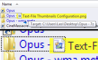
I asked this several versions ago. I have looked in the latest version of DOpus, but I can still not find any way of changing the display of a folder in a lister to which one drags one or more files.
Presently, and as far back as I can remember, the drag-to folder is marked with a thin broken-line box.
I wear glasses, but even with my best computer ditto, I have to strain my eyes to see this box. Is there any way to improve this? (I drag and drop constantly.)
Yes, it would certainly simplify my life. And I have to assume that many, many others drag and drop a lot.
Also, it would be great if the red box "lit up" even if one dragged a file or folder anywhere on the row of the drag-to folder. Then, the red box would be clearly visible, that is, the highlighed drag-file/folder would not cover the red box.
Many people do drag & drop a lot but they seem to find the current tooltip + higlight okay as I think you're the only person who has complained about it (at least as far as I can remember).
Leo, most people do not complain. A blessing, I guess. Most people also do not react well when you ask for an improvement of their product. My guess is that it has something to do with self-confidence (or the lack thereof), available time (or the unavailable time), and/or an inability of most software developers (in my experience) to really understand the needs of users.
I can count on one hand the number of times the response to a suggestion I have made has resulted in a change. But once in a blue moon, I get "Yes, you are absolutely right – we will change that."
Now, another question is if every request for an improvement is a complaint. Although I must admit, that when people respond with, in essence, that an almost invisible indication – which is also to 75 % covered by the highlighted drag file – that one has focused on the correct folder is something that one should just accept and shut up about, makes me a little testy, and thus, my request might sound like a complaint.
As it were, I think that if one is willing to put in some work, DOpus is miles ahead of anything else I have come across. I also know that Jon and Greg must care a lot about their product, and must be putting a lot of time into it. But regardless of that, I believe that when someone points out such a self-evident need for improvement (making virtually invisible lines visible), it should be met with "Yes, you are absolutely right – we will change that".
Rats, I had just typed up a great big ol' long post here on how we could maybe talk Jon and Greg into doing this when Jon beat me to it. lol
In a nutshell I was going to suggest when dragging and dropping from one lister to another, that it highlights the same way it does now if we drag from a lister pane to the folder tree.
As a follow up to my last, (and as long as it is the Christmas wish list season ), it would also be nice if drag and drop operations from one lister to another, could have full row selection (highlighting) when dropping on the desired folder in the other lister. DnD to the folder tree does that now, but not from one lister to another.
(I know I can submit a feature request for it, but as long as we're on the subject here I thought I'd toss the idea around)
You could have knocked me over with a feather, Jon!
Not for the reason you might think. The reason is, as I implied, I am so unused to see those words, that when I see them, I just don't believe it at first.
That those words come from you is not surprising. I was not brown-nosing when I said, earlier, that you and Greg seem to care a lot (and I mean a lot) about your product (and, by extension, your users). And this is just another example of that.
[quote="JohnZeman"]As a follow up to my last, (and as long as it is the Christmas wish list season ), it would also be nice if drag and drop operations from one lister to another, could have full row selection (highlighting) when dropping on the desired folder in the other lister. DnD to the folder tree does that now, but not from one lister to another.
(I know I can submit a feature request for it, but as long as we're on the subject here I thought I'd toss the idea around)[/quote]
John, I sometimes do go through the rigmarole of dragging to the folder in question in the folder tree rather than the direct route of the folder in question in the same lister.
[quote="JohnZeman"]As a follow up to my last, (and as long as it is the Christmas wish list season ), it would also be nice if drag and drop operations from one lister to another, could have full row selection (highlighting) when dropping on the desired folder in the other lister. DnD to the folder tree does that now, but not from one lister to another.
(I know I can submit a feature request for it, but as long as we're on the subject here I thought I'd toss the idea around)[/quote]
Yes, John, I think as long as Jon is participating in the topic, it should be okay.
I will have to find where to submit feature requests. Must admit that I do not know there was such a place, although I should have known.
Probably true (as in <50% of people say anything), but a lot of people do still send in feedback, as the thousands of forum threads show. Some of those are questions but a lot of them are suggestions.
Open the Opus release notes in the Program Files folder. 63 pages covering thousands of changes, and that's just for Opus 9. Some of it is things the developers thought of themselves but a large amount of it is responses to user feedback.
Of course, not all user requests result in a change. There isn't the time or resources to do everything everyone wants, some changes/ideas are mutually exclusive, and some requests are impossible or not good ideas or just not the direction that the dev's want to take the product. Most of the time, with Opus at least, it's the time/resource factor.
The tooltip makes it clear which folder you're dropping into.
FWIW, and despite that, I still agree that it would be nicer if the target folder was higlighted selection-style instead of the dotted lines. But I also don't think it's that big a deal and I can understand why a) it hasn't been changed yet and b) doesn't seem to be something that lots of people have taken the time to mention.
There's a link in my signature and also on the front page of the forum in the note under the Help & Support section (where it says "Note: For official help or to make feature requests use the GPSoftware support page", though in a very small font so it's easily overlooked).
[quote="leo"]...FWIW, and despite that, I still agree that it would be nicer if the target folder was higlighted selection-style instead of the dotted lines)...[/quote]Dotted lines? What dotted lines?
I have never seen any dotted lines on DND target folders. I have just now tried an experiment, dragging to a folder in the file pane, and looked very carefully. Is it something that can be turned on or off? Or could it just be my colour scheme?
Having said that, what you've never had, you don't miss. I just rely upon the highlight on the file I am dragging, which stands out quite well.
 ), it would also be nice if drag and drop operations from one lister to another, could have full row selection (highlighting) when dropping on the desired folder in the other lister. DnD to the folder tree does that now, but not from one lister to another.