Would be great to have an option to crop the actual thumbnails to a ratio of 1X1, 16x9. etc. More tidy look. And have less spacing between images.
(The image viewer software Nomacs does this beautifully in thumbnail mode)
Would be great to have an option to crop the actual thumbnails to a ratio of 1X1, 16x9. etc. More tidy look. And have less spacing between images.
(The image viewer software Nomacs does this beautifully in thumbnail mode)
Spacing between images is mainly a factor of the configured thumbnail dimensions and how much extra space there is in the window (which is spread out between the columns, instead of all after the last column).
If you're mostly taking square or portrait photos, you can change the thumbnail dimensions to suit. Resizing the thumbnails and/or window can also reduce the slack space that's spread out between columns.
Cropping thumbnails doesn't make much sense to me, since there may be important details in the cropped area and it also makes it impossible to tell the aspect of any images. I guess it could be an option but it's one I've never really understood (and I hate the way social media tends to crop things, for example, often losing the most important context from an image).
Agree. But if it was an option/toggler I would have used it a lot.
Inflexible layouting of thumbnails is one of my bigger gripes about DO. I am not even saying about image walls, adaptive grid or some fancy stuff, but just efficient use of space.
What do you wish was different?
See the image:
I think years ago I proposed something more creative, but since then I hardly use DO for image browsing.
Generally I like adaptive layouts for graphic browsing (not using fixed grid).
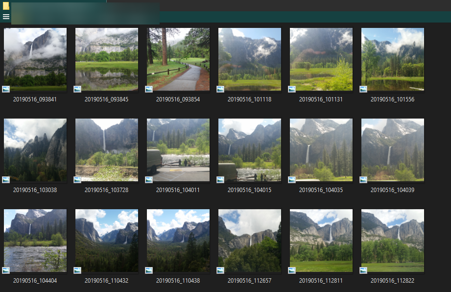
They can be packed more tightly horizontally than that. Resize the window width.
If there is excess width (i.e. not enough to fit another column of thumbnails) then it will be spread out between all the existing columns. That's all that's happening there, and it looks better (IMO, at least) than having all the thumbnails pushed to the left and a big empty space on the right. File Explorer does the same.
Each row will be the same height regardless of whether any images in that particular row need the height, which can waste vertical space sometimes. But if most of your images are a different aspect ratio, changing the thumbnail dimensions to suit can remove that wasted space. And it does make movement more predictable, and means things don't move around as much when files are added/removed, or the window is resized. (It's a lot faster and easier to calculate, of course.)
That must be cropping the images to get them like that, and won't everything move around a lot more if you rename a file so it changes position?
I have a labels on/off button, so would turn labels for a rename.
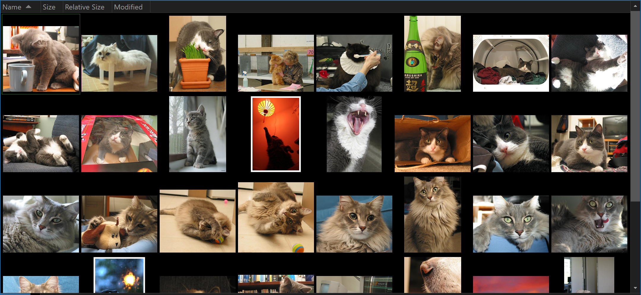
I agree that in your screenshot it looks almost OK - but this is probably the "best case". In case of some other image arrangements immediately there appear some layout "inefficiencies".
I suspect that clinging to easy-to-program fixed grid/fixed size layout and considering the possible need to reshuffle after image rename (especially this) limits improvement choices a lot.
So:
With the current layout engine I think a simple improvement would be decrease row gap in case no thumbnail in a row reaches thumbnail bounding box height.
An extra - similarly for columns and width.
The above comes down to determining row height/column width basing on the highest/widest image in row/column - this is half-fixed layout, where each image has the same space as other images in its row/column, just rows and columns do need keep the same height/width.
Another fast improvement would be to left-justify thumbnails, not spread them evenly in a row.
And another step forward would be dropping fixed grid altogether and have single thumbnail height setting to achieve "image wall" effect where each image takes exactly the space it needs - the @galaxyhub screenshot. (Maybe use cropping a bit to have the wall fill the full width of the display - it would be hard to notice in case of thumbnails.)
Or just use the proposed fixed cropping to have another "image wall" view.
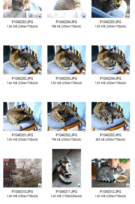
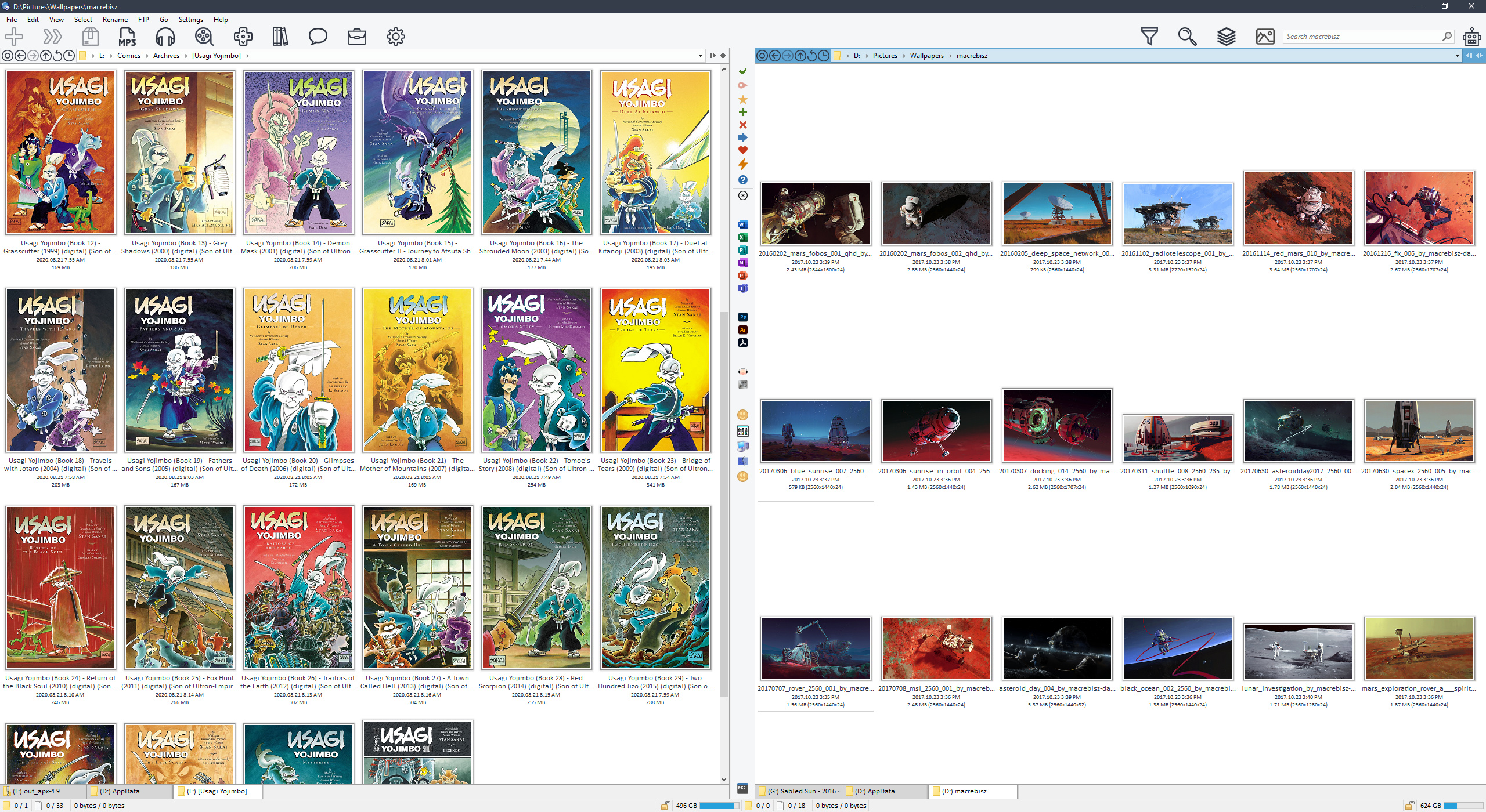
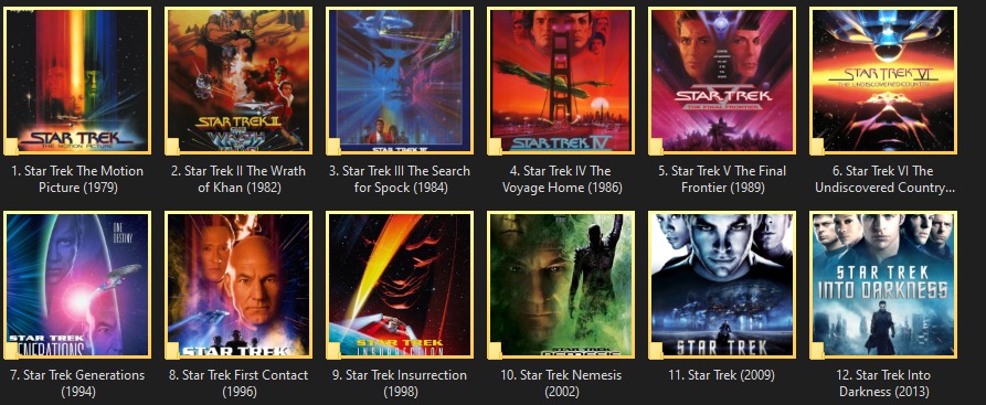
You can get them to look good for 1:1 aspect ratio images
This only works though because all the images here are the exact same aspect ratio. When you add in different aspect ratio images spacing increases. This is especially obvious with images that are further from 1:1 aspect ratio. I have designed my Lister to look good in my work folder as shown but when I go to look at my Blu-ray collection there is a lot of spacing in between each item.
Not to mention windows is also limiting me to a max size of 256 x 256 thumbnail size, which is a problem the further you get from 1:1 images.
I don't think a new view mode or image wall mode is needed. Just add additional options (users above are making some very good suggestions) to the current view modes (thumbnails, tiles, ect) and make them per folder configurable. That way people can format their files visually in the way that best suites them.
In the new Beta. Is this related?
Added DOpus.LoadThumbnail method, allowing a script to retrieve a thumbnail (which can be displayed using a static control in a script dialog).
That's for scripts that want to display thumbnails in their own dialogs.
Thumbnail size/spacing should be dynamic. Having to define the aspect ratio of thumbnails just doesn't make any sense.
Mine are optimized to look good with portrait-oriented images since I most often use thumbnail view in my comics folders, but that means my wallpapers folders look awful.
Take a look at the screenshots for LaunchBox - spacing adjusts depending on content being displayed. If displaying a mix of portrait and landscape then spacing is based on a 1:1 aspect ratio, but otherwise spacing adjusts based on the images.
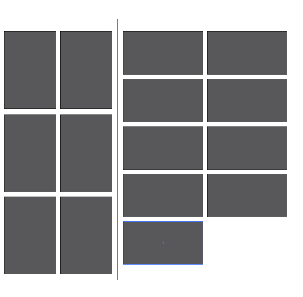
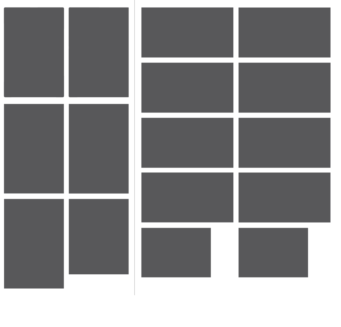
What about something like this:
Imagine this is a folder and the grey shapes are files / folders with a picture thumbnail (folder.jpg).
In this example no aspect ratio is chosen, instead opus would group files / folders by their thumbnail aspect ratio so that each can have optimal spacing. The best part about this is that you don't need to crop anything and it divides files into logical groups that make surprising sense.
For example, the items on your left can be portrait photographs, bookcovers, manga covers, ect while the items on your right can be landscape photographs, art from your manga, landscape format book scans, ect. For TV series you'd have the seasons on the left hand side and specials, movies, and art on the right hand side.
Do note that this is a perfect example with each group having the exact same aspect ratio. There can be cases where you'll have a mix of aspect ratios greater than 2. The solution to that is to simply sort all items with aspect ratios greater in length than height to the right and all items with aspect ratios greater in height than length to the left. For example:
For any items with an aspect ratio of 1:1 that fit neither of the above criteria, you should be able to choose to add them to their own group or add them to the end of the last group (right hand side).
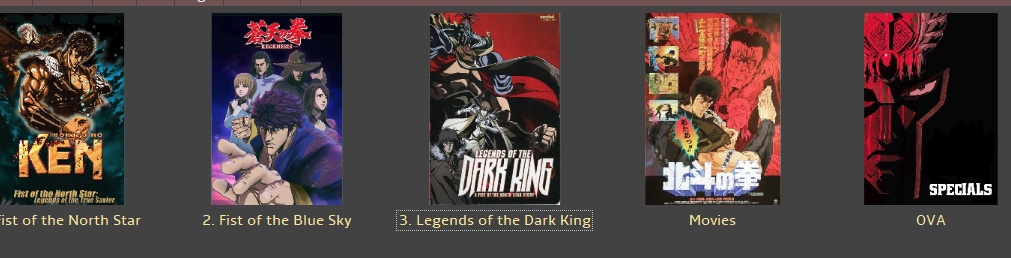
One solution that 1) makes thumbnailing look neater and 2) makes thumbnail spacing arguably more efficient is to zoom into the image or video frame to fill the thumbnail at a 1:1 aspect ratio. Here's a screenshot from Xyplorer with "zoom to fill" enabled.
It also does the same for folders in the thumbnail view mode (filling out the folder)
It's a nice option to have, and in my opinion it makes thumbnails more effective at giving the viewer an idea of what is in the image since it zooms toward the center of the frame, enlarging the focus of the pic.
Samsung, Apple, etc. does this on their cellphones as well.
+1 request
Another +1