When selecting a file or folder in the small icons view, if the name of the file/folder is long, the name of the next one overlaps and becomes invisible. I'm looking for a solution so that either the name is not fully displayed during selection (similar to the unselected state), the name is shown in a shortened form, or it is displayed on two lines
Displaying it on 2 lines would just obscure the thing under it instead of the thing to the right of it.
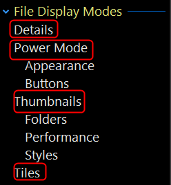
We have options to turn off expanding the item with focus to show the full label, but only for Thumbnails and Tiles modes, not for Small Icon, Large Icon or List mode at the moment.
(Mainly because those modes have no other options, so there was nowhere to put it. We might add an option in future.)
Making the columns wider so they don't need to expand to show longer names is one option. Personally, I would use another mode as Small Icons mode isn't very useful in general, IMO.
Sorry, do you mean by this line that this is possible, or are you referring to something else? Because I tried this in the Small Icon view, and it didn’t seem possible.