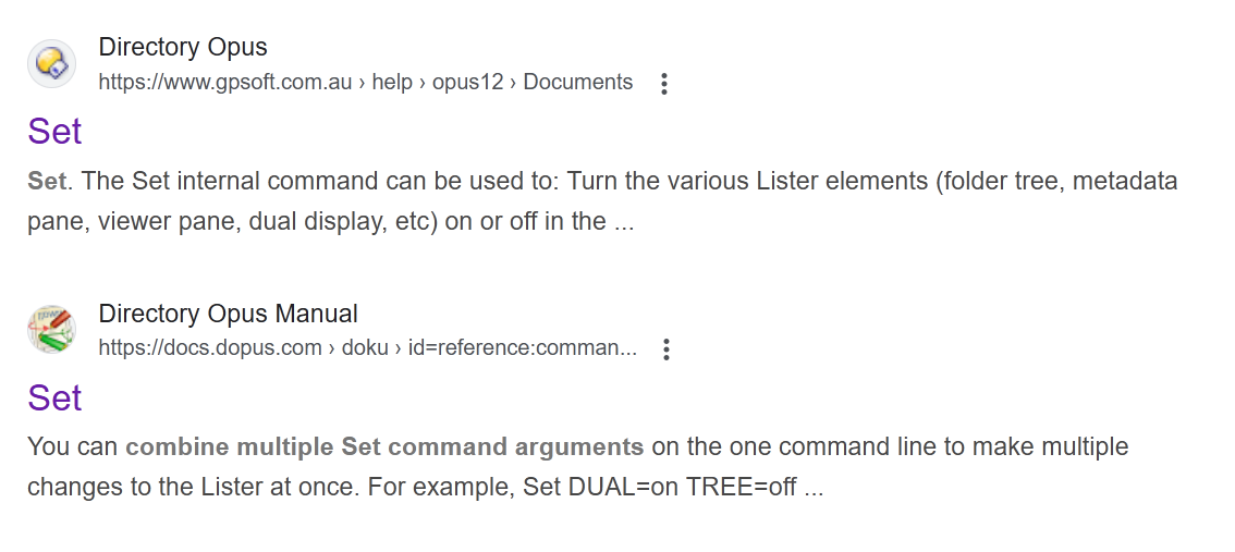
The first result has a modern-looking icon and links to old documentation for v12. The second result has an old-looking icon and links to the current documentation.
The current documentation seems to inherit the https://www.dokuwiki.org/ icon for some reason, but only in Google search results, and not when visiting the page.
Ideally, the documentation for older DOpus versions should also be readily distinguishable in Google search results by showing an old-looking, unappealing icon for those results. I think I already saw search results for v10, v11 and v12.
So, there's something you can do. A Google bug is, I suppose, somewhat improbable in such a case.
The favicons for the old documentation pages could also just be changed to something else than your modern icon, so that even when you don't get them out of the search results (or ranked lower), these results become less distracting.
DOpus made the impression on me to come from guys with an eye for detail.