Hello Dopus'ers,
in my system I changed the standard symbol for the drive letters. However, I used a plain symbol without drive letters. In my Directory Opus I placed the dynamic button "Drives" on two places. I now let Directory Opus add the drive letters.
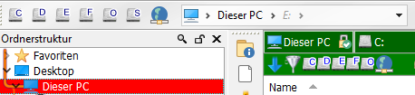
The alignment of those drive letters is quite irregular, which does not look nice.
![]()
Is there any solution for this problem?
josinoro

