In the latest 12.23.3 beta, there has been a bugfix addressing an issue I had mentioned in my longer feedback post:
This has been fixed in the mentioned UI areas (thank you!), however the File Display still has issues (though only related from a user's perspective I believe) which was part of my original bug report. It may just be that this hasn't yet been fixed, however I thought I'd supply a couple screenshots to help illustrate the problem in case it was overlooked or forgotten about. Like the bugfix, text cannot be read when the foreground and background colour are the same, but in this case, because the background colours aren't being blended with the background:
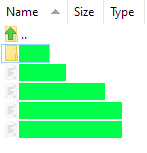
How it looks in Details view (also works in Details + Thumbnails, Power, and Tiles view):
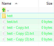
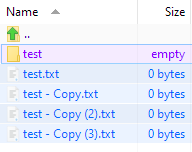
And this is how it looks in List and Large Icons view (as well as in Small Icons, and Thumbnails view):
Thanks!
Edit: Fixed in v12.23.4 Beta.
- Directory Opus v12.23.3 Beta x64 Build 7752
- Windows 10 v20H2 OS Build 19042.870
I'm not sure it really makes sense to choose the same color for your text and background. Blending doesn't apply to all modes, but even in the blended mode this doesn't result in very easy to read text.
(This isn't a bug either, so I've removed that tag. You get the colors you choose, and blending only applies to some modes. Don't choose colors that are unreadable.)
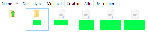
The same colour is chosen because the file blending capability results in (what I think is) a pleasant and functional effect. Maybe my green wasn't the best example (I use it to indicate recent changes and maybe it's been set too bright), but you may agree that my other colour combinations are much easier to read, for example:
It's easy for a user to mistake this for a bug due to the blending functionality working in one view and not the other, without any distinction given that the modes differ in some aspect. As far as I can tell, your argument against my choices contradicts the fact a bug fix was made to solve the previous issue of the same/similar colours for fore- and background colours. Shouldn't the response have been to use colours that contrast more, rather than to provide a fix?
In any case, it's unfortunate this is only supported in some of the views.
I missed that aspect of the report (this is one of the problems with dumping hundreds of issues into one big list). I can see your point - it would make sense for the modes to behave the same.