The right half could be made more compact but it's the left half that determines the minimum height.
A dynamic layout could work, but then you'd have to keep scrolling or resizing the panel when turning options on and off, which might be a pain. (Advanced mode is already like that, of course.)
The labels are much wider in some languages, which the layout has to cope with.
Comparing 12 and 13, the layout in 13 is actually smaller than the one in 12 if you set it to use the 8pt font that 12 used, despite there being more in the new panel.
13 defaults to a 9pt font, which makes it about 1 line of text taller than before (but packing in a lot more things than before as well). That font size change is the biggest factor between the two versions. (At least at 200% DPI scaling. I haven't checked other scaling where fixed-size borders may be more of a factor.)
I would also like to see an improvement.
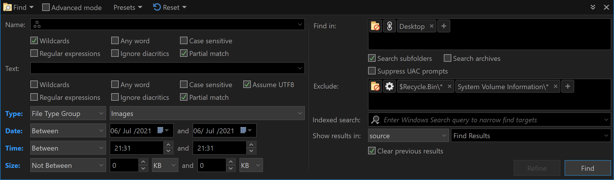
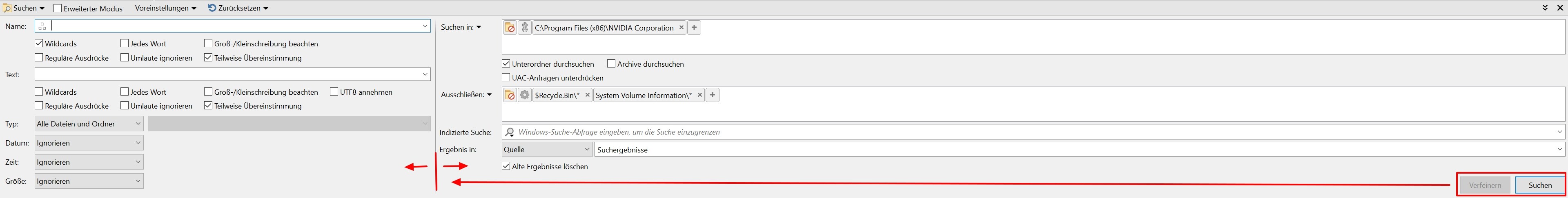
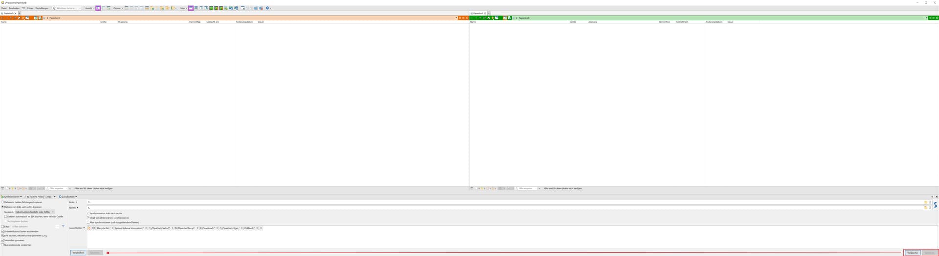
In all 3 functions (search/sync/dub) the confirmation button is anchored on the right for large monitors
it would be better if it were next to the movable separator.
The right part really needs to be made more compact, laterally speaking. The old way worked just fine, if I remember correctly, and I didn't have to widen the lister window to get to the "find" button.
Yes, but when I drag the splitter as far as it can go to the left, I still need to keep a very wide lister just to see the find button. The "Name" and "Text" field on the left don't need to be that wide, most of the time. There's be some room to gain here. My lister, with the Find button visible, looks like this.
is moving in the 3 options for the buttons still on the improvement list?
(see my post above for one monitor)
depending on the application, both monitors are now required to display all information.
so it would make sense to move them to the left.
