Hi, I have been using Opus for the last 15 years and have seen its UI and level of customization improve over the years. Few things that I am still looking for after so many years are:
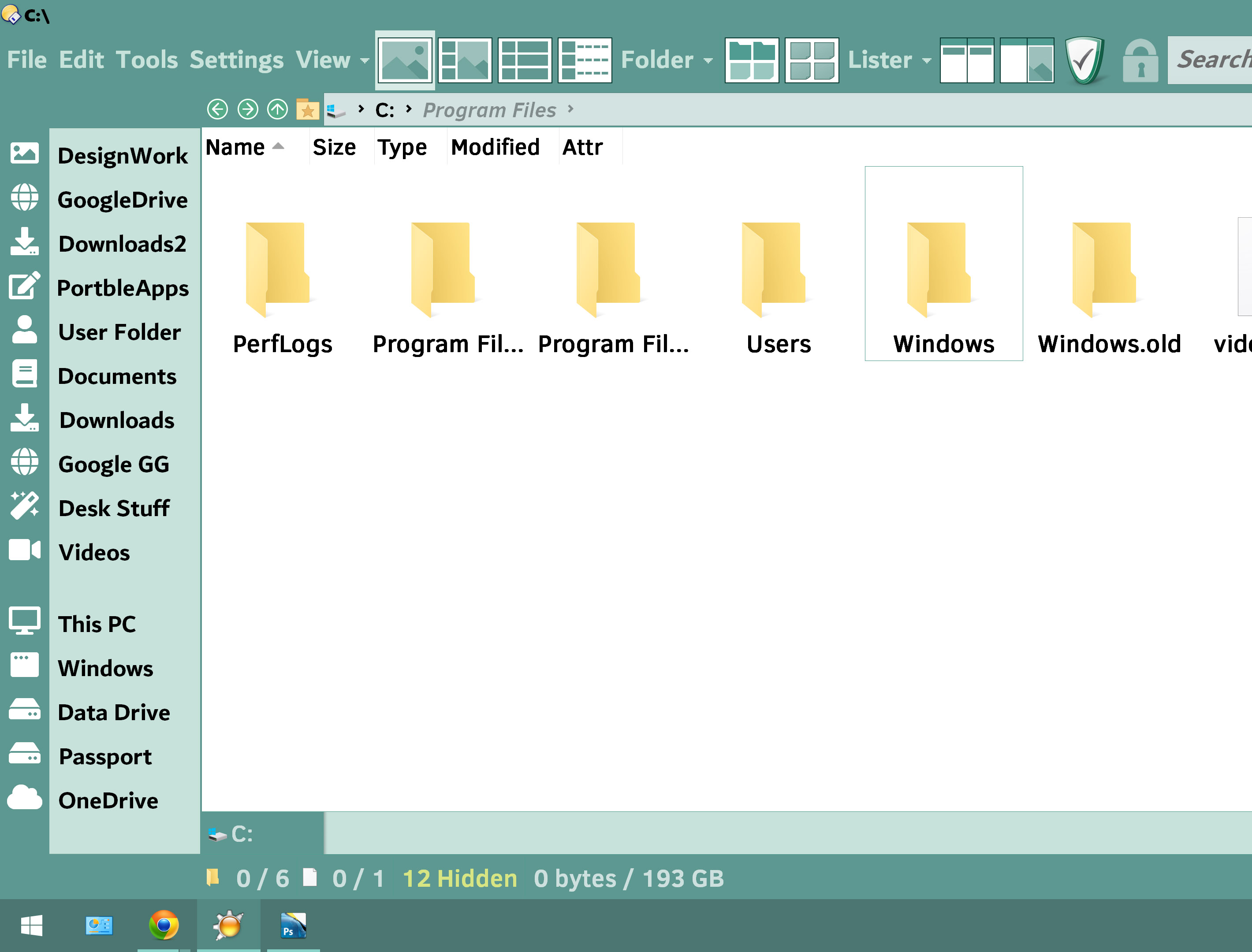
- Folder tree customization: Too many things are fixed or dependent on Windows.
There are plenty of options to hide stuff that is not required but why can't we have mode where only fixed user selected links are shown with no indentation like this. Plus the ability to set left right margins, space between Icons and labels , size of icons.
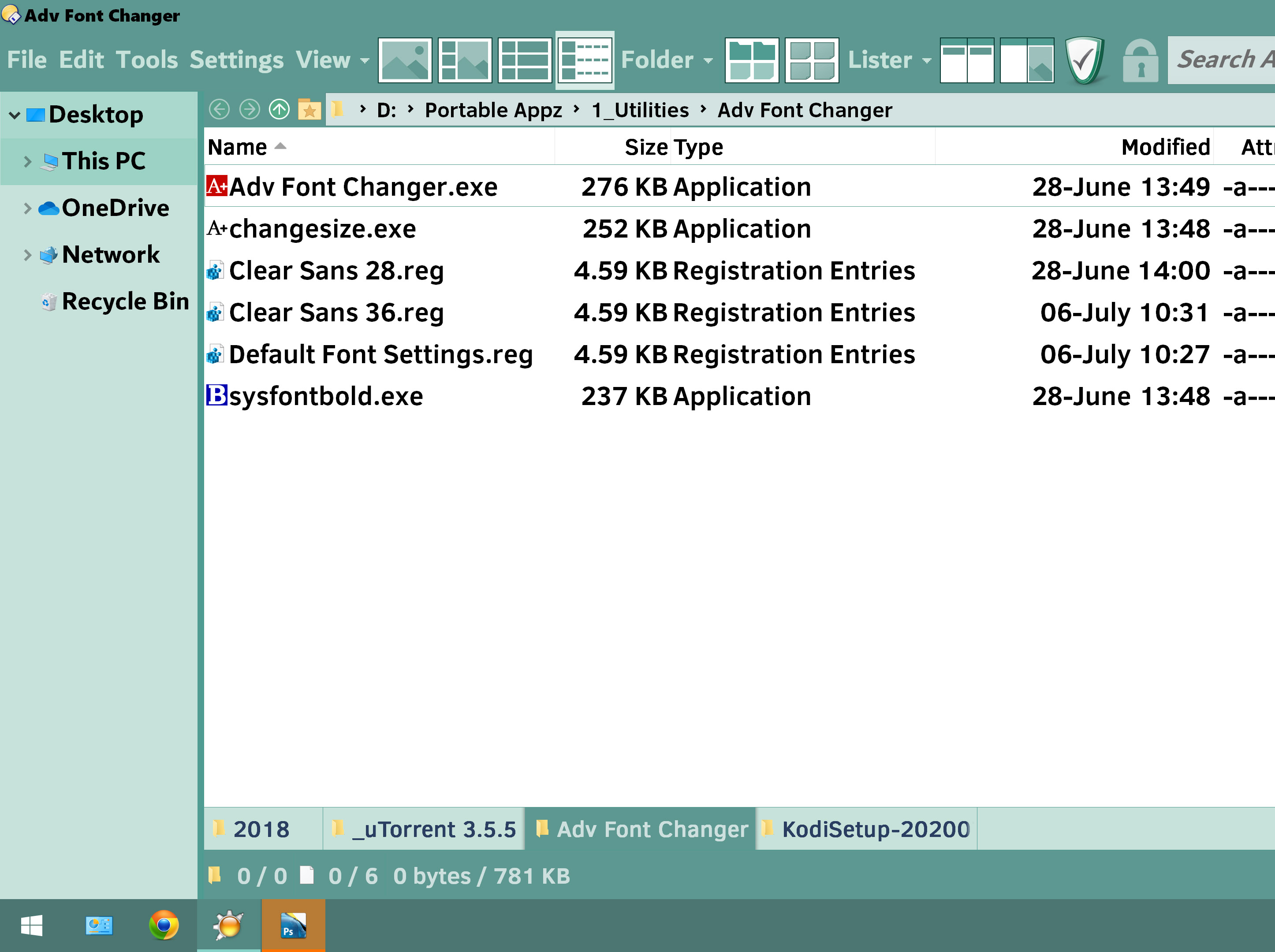
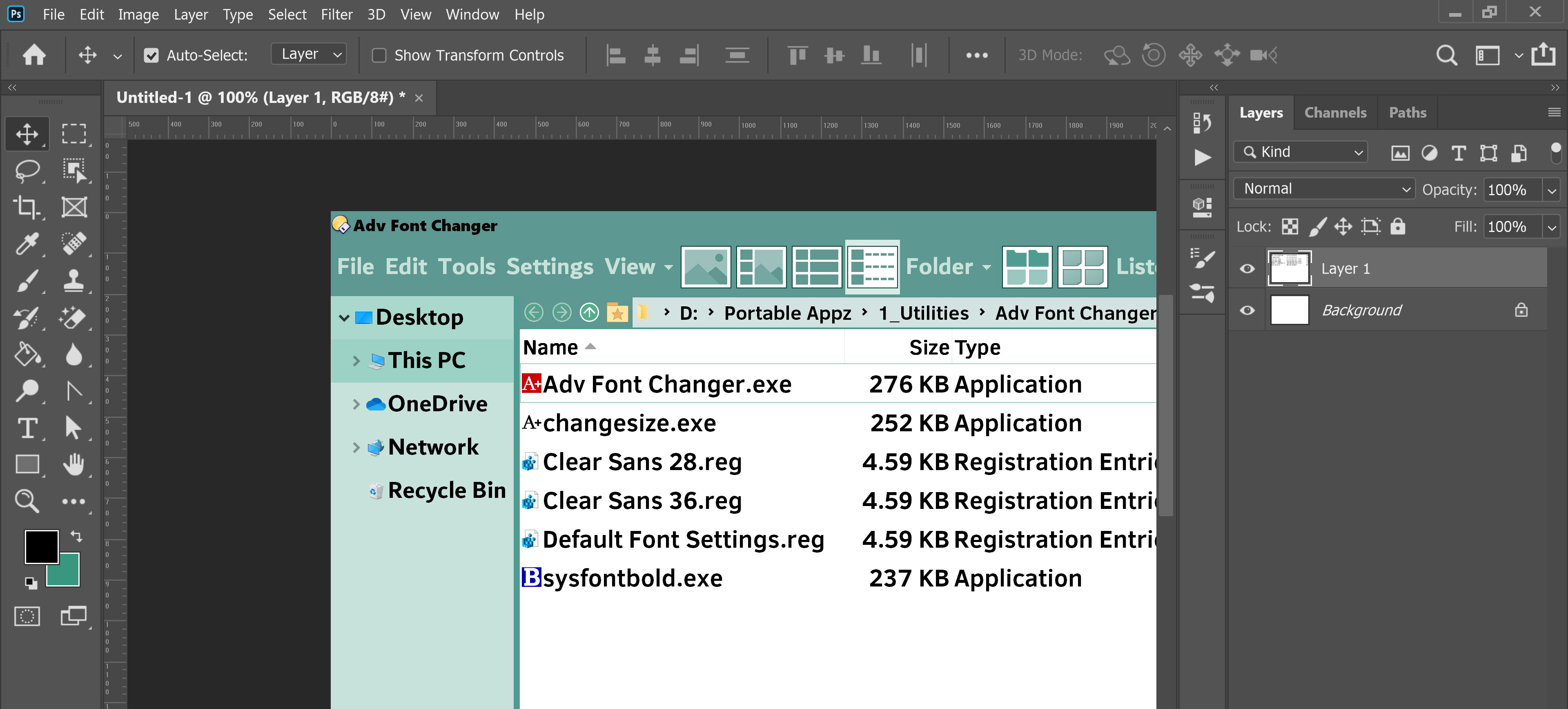
- Title Bar: Presently the title bar is just lost space. Why Opus can not have a custom title bar with option to show the main file menu as in the above screenshot. Plenty of applications have custom title bar for example Photoshop
These customizations can can help recover so much screen real estate. I work on so many different screen like 4k Monitor, 4k TV at about 15feet and even Ipad. There are scenarios where big fonts are required and lack of these customizations leave very little working space.
1 Like
Its just not about one line, its about productivity.Theres a reason some of the most used softwares such as photoshop and Excel have custom bars.
Anyhow thanks for the first issue, it turned out great even if it lacked the tree capabilties. Some issues though which I would be posting in seperate threads.
No, moving Photoshop when the window is narrow is horrific and I won't inflict that on our users.  (Not just to gain a single extra line, at least!)
Vertical screen real estate is precious, a "single extra line" is no small thing. Have you considered how Firefox handles moving its window? It works around the possibility of not having any clear titlebar space to click 'n drag by letting the user click any clear toolbar space to move the window. Works great in my experience.
Otherwise, you could make using a custom titlebar optional, and/or (optionally) reserve some titlebar space next to the Opus icon. This is just off the top of my head, I'm sure there are other ways to satisfy everyone.
One vote for leave things alone. Too many of these kinds of changes in too many programs just to change something, I guess.
(I already know that those who want this won't agree with that characterization).
 (Not just to gain a single extra line, at least!)