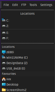
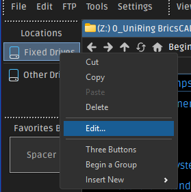
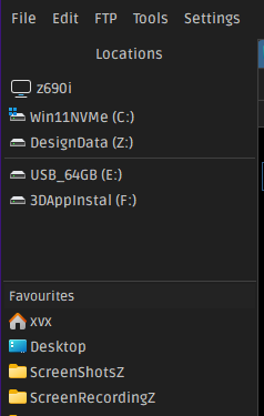
Here is a toolbar that can be used as an alternate tree.
-Alt Tree Example.dop (67.7 KB)
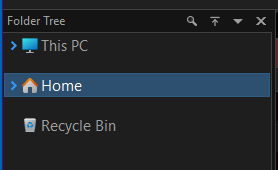
It looks like this set vertically on the left like the Folder Tree.
See also:
Here's an adaptation for Directory Opus that may be of interest to anyone looking either for a replacement of, or an addition to, the classic directory tree. Edit: I added an importable *.dop file you can download and double-click to import.
Why did…
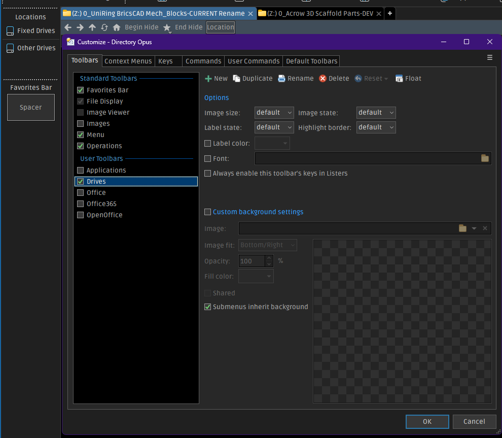
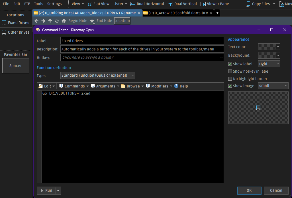
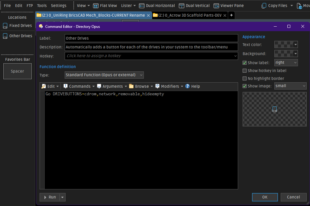
Here is the code for the toolbar:
<?xml version="1.0" encoding="UTF-8"?>
<toolbar>
<image_settings fill="none" fit="1024" image="/dopusdata/Images/File Display Images/Claude Monet - Waterloo Bridge at Dusk 1904 - (MeisterDrucke-139105).jpg" inheritable="yes" opacity="50" use_custom="yes" />
<font dpi="150" face="Segoe UI" points="11" size="-22" />
<buttons backcol="none" child_icon_size="small" child_icons="on" child_labels="off" display="label" textcol="none" type="menu">
<button 3dborders="no" backcol="none" display="both" icon_size="large" label_pos="right" separate="yes" textcol="none">
<label>Left Folder Tree Toggle\t<kbd>F8</kbd></label>
<icon1>#foldertree</icon1>
<function type="normal">
<instruction>Set TREE=Toggle</instruction>
</function>
</button>
<button 3dborders="no" backcol="none" display="both" icon_size="large" label_pos="right" textcol="none">
<label>Back</label>
<icon1>#goback</icon1>
<function type="normal">
<instruction>//Go BACK USEQUALKEYS</instruction>
<instruction>@keydown:none</instruction>
<instruction>go up back</instruction>
<instruction>@keydown:shift</instruction>
<instruction>GoEx SIBLING=previous,wrapauto</instruction>
</function>
</button>
<button 3dborders="no" backcol="none" display="both" icon_size="large" label_pos="right" separate="yes" textcol="none">
<label>Down</label>
<icon1>#goback</icon1>
<function type="normal">
<instruction>Go BACK USEQUALKEYS</instruction>
</function>
</button>
<button 3dborders="no" backcol="none" display="both" dropdown_glyph_slim="yes" icon_size="large" label_pos="right" popout="right" separate="yes" textcol="none" type="menu">
<label><b>Drives</b></label>
<icon1>#JEG_Icons_(32px_&_24px):Hard Disk</icon1>
<button 3dborders="no" backcol="none" display="label" icon_size="large" label_pos="right" popout="right" separate="yes" textcol="none" type="menu">
<label>Attached Devices</label>
<icon1>#Hard Disk</icon1>
<button 3dborders="no" backcol="none" display="label" icon_size="large" label_pos="right" textcol="none">
<label>List of Devices</label>
<tip>List of Devices</tip>
<icon1>#Hard Disk</icon1>
<function type="normal">
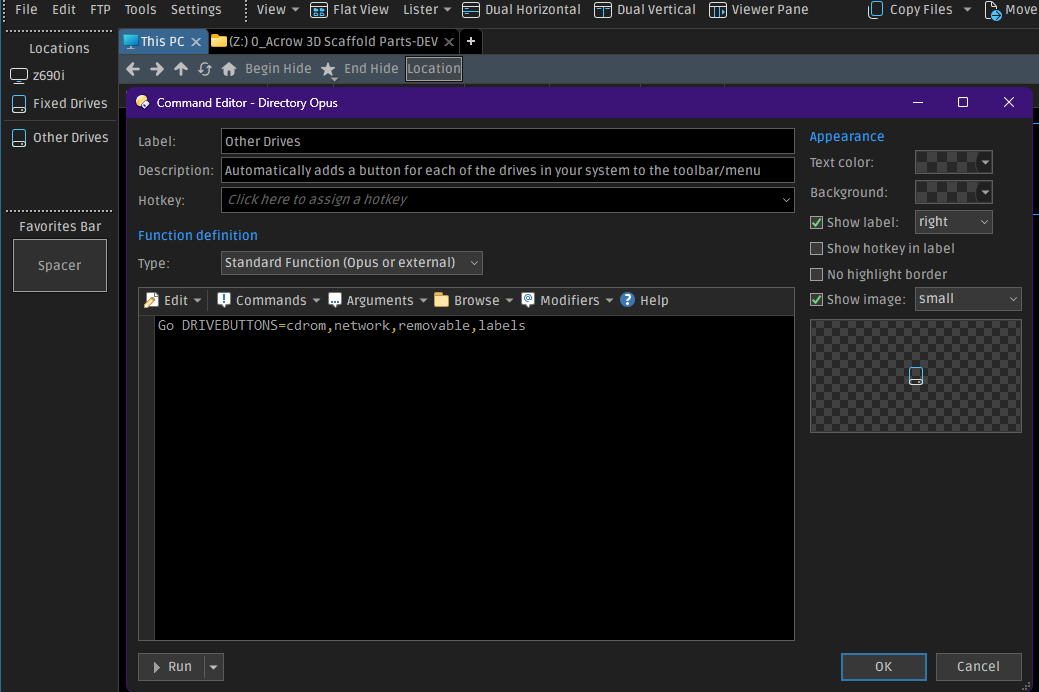
<instruction>Go DRIVEBUTTONS=lettersbeforelabels NEWTAB=findexisting HEADING=Attached Devices</instruction>
<instruction>//[%windir%\Explorer.exe /e, {sourcepath$}]</instruction>
<instruction>//@async:"/home\dopusrt.exe" /acmd /utils\Nircmd_64\nircmd.exe sendkeypress Alt=X</instruction>
<instruction>//[Go TABCLOSE=force]</instruction>
</function>
</button>
</button>
<button 3dborders="no" backcol="none" display="label" dropdown_glyph_slim="yes" icon_size="large" label_pos="right" popout="right" textcol="none" type="three_button">
<label>C: Folder Options Alias c</label>
<icon1>#HDD-System_C</icon1>
<button 3dborders="no" backcol="none" display="label" icon_size="large" label_pos="right" popout="right" textcol="none" type="menu">
<label>List C: Folder</label>
<icon1>#folder</icon1>
<button 3dborders="no" backcol="none" display="label" icon_size="large" label_pos="right" textcol="none">
<label>List C: Folder</label>
<tip>List C: Folder</tip>
<icon1>#folder</icon1>
<function type="normal">
<instruction>Go C: FOLDERCONTENT=dblclickmenu,nofiles,includestart,"maxwidth=45" NEWTAB=findexisting</instruction>
</function>
</button>
</button>
<button 3dborders="no" backcol="none" display="label" icon_size="large" label_pos="right" popout="right" textcol="none" type="menu">
<label>Copy Selected Items to the C: Folder</label>
<icon1>#Copy File 2</icon1>
<button 3dborders="no" backcol="none" display="label" icon_size="large" label_pos="right" textcol="none">
<label>Copy Selected Items to the C: Folder</label>
<icon1>#Copy File 2</icon1>
<function type="normal">
<instruction>Go PATH=C: FOLDERCONTENT=nofiles,copy,includestart,"maxwidth=45"</instruction>
</function>
</button>
</button>
<button 3dborders="no" backcol="none" display="label" icon_size="large" label_pos="right" popout="right" textcol="none" type="menu">
<label>Move Selected Items to the C: Folder</label>
<icon1>#Copy File 2</icon1>
<button 3dborders="no" backcol="none" display="label" icon_size="large" label_pos="right" textcol="none">
<label>Move Selected Items to the C: Folder</label>
<icon1>#Copy File 2</icon1>
<function type="normal">
<instruction>Go PATH=C: FOLDERCONTENT=nofiles,move,includestart,"maxwidth=45"</instruction>
</function>
</button>
</button>
</button>
<button 3dborders="no" backcol="none" display="label" dropdown_glyph_slim="yes" icon_size="large" label_pos="right" popout="right" textcol="none" type="three_button">
<label>F: Folder Options Alias f</label>
<icon1>#HDD_F</icon1>
<button 3dborders="no" backcol="none" display="both" icon_size="large" label_pos="right" popout="right" textcol="none" type="menu">
<label>List F: Folder</label>
<icon1>#folder</icon1>
<button 3dborders="no" backcol="none" display="label" icon_size="large" label_pos="right" textcol="none">
<label>List F: Folder</label>
<tip>List F: Folder</tip>
<icon1>#folder</icon1>
<function type="normal">
<instruction>Go F: FOLDERCONTENT=dblclickmenu,nofiles,includestart,"maxwidth=45" NEWTAB=findexisting</instruction>
</function>
</button>
</button>
<button 3dborders="no" backcol="none" display="label" icon_size="large" label_pos="right" popout="right" textcol="none" type="menu">
<label>Copy Selected Items to the F: Folder</label>
<icon1>#Copy File 2</icon1>
<button 3dborders="no" backcol="none" display="label" icon_size="large" label_pos="right" textcol="none">
<label>Copy Selected Items to the F: Folder</label>
<icon1>#Copy File 2</icon1>
<function type="normal">
<instruction>Go PATH=F: FOLDERCONTENT=nofiles,copy,includestart,"maxwidth=45"</instruction>
</function>
</button>
</button>
<button 3dborders="no" backcol="none" display="label" icon_size="large" label_pos="right" popout="right" textcol="none" type="menu">
<label>Move Selected Items to the F: Folder</label>
<icon1>#Copy File 2</icon1>
<button 3dborders="no" backcol="none" display="label" icon_size="large" label_pos="right" textcol="none">
<label>Move Selected Items to the F: Folder</label>
<icon1>#Copy File 2</icon1>
<function type="normal">
<instruction>Go PATH=F: FOLDERCONTENT=nofiles,move,includestart,"maxwidth=45"</instruction>
</function>
</button>
</button>
</button>
<button 3dborders="no" backcol="none" display="label" dropdown_glyph_slim="yes" icon_size="large" label_pos="right" popout="right" textcol="none" type="three_button">
<label>G: Folder Options Alias g</label>
<icon1>#HDD_G</icon1>
<button 3dborders="no" backcol="none" display="both" icon_size="large" label_pos="right" popout="right" textcol="none" type="menu">
<label>List G: Folder</label>
<icon1>#folder</icon1>
<button 3dborders="no" backcol="none" display="label" icon_size="large" label_pos="right" textcol="none">
<label>List G: Folder</label>
<tip>List G: Folder</tip>
<icon1>#folder</icon1>
<function type="normal">
<instruction>Go G: FOLDERCONTENT=dblclickmenu,nofiles,includestart,"maxwidth=45" NEWTAB=findexisting</instruction>
</function>
</button>
</button>
<button 3dborders="no" backcol="none" display="label" icon_size="large" label_pos="right" popout="right" textcol="none" type="menu">
<label>Copy Selected Items to the G: Folder</label>
<icon1>#Copy File 2</icon1>
<button 3dborders="no" backcol="none" display="label" icon_size="large" label_pos="right" textcol="none">
<label>Copy Selected Items to the G: Folder</label>
<icon1>#Copy File 2</icon1>
<function type="normal">
<instruction>Go PATH=G: FOLDERCONTENT=nofiles,copy,includestart,"maxwidth=45"</instruction>
</function>
</button>
</button>
<button 3dborders="no" backcol="none" display="label" icon_size="large" label_pos="right" popout="right" textcol="none" type="menu">
<label>Move Selected Items to the G: Folder</label>
<icon1>#Copy File 2</icon1>
<button 3dborders="no" backcol="none" display="label" icon_size="large" label_pos="right" textcol="none">
<label>Move Selected Items to the G: Folder</label>
<icon1>#Copy File 2</icon1>
<function type="normal">
<instruction>Go PATH=G: FOLDERCONTENT=nofiles,move,includestart,"maxwidth=45"</instruction>
</function>
</button>
</button>
</button>
<button 3dborders="no" backcol="none" display="label" dropdown_glyph_slim="yes" icon_size="large" label_pos="right" popout="right" textcol="none" type="three_button">
<label>H: Folder Options Alias h</label>
<icon1>#HDD_H</icon1>
<button 3dborders="no" backcol="none" display="both" icon_size="large" label_pos="right" popout="right" textcol="none" type="menu">
<label>List H: Folder</label>
<icon1>#folder</icon1>
<button 3dborders="no" backcol="none" display="label" icon_size="large" label_pos="right" textcol="none">
<label>List H: Folder</label>
<tip>List H: Folder</tip>
<icon1>#folder</icon1>
<function type="normal">
<instruction>Go H: FOLDERCONTENT=dblclickmenu,nofiles,includestart,"maxwidth=45" NEWTAB=findexisting</instruction>
</function>
</button>
</button>
<button 3dborders="no" backcol="none" display="label" icon_size="large" label_pos="right" popout="right" textcol="none" type="menu">
<label>Copy Selected Items to the H: Folder</label>
<icon1>#Copy File 2</icon1>
<button 3dborders="no" backcol="none" display="label" icon_size="large" label_pos="right" textcol="none">
<label>Copy Selected Items to the H: Folder</label>
<icon1>#Copy File 2</icon1>
<function type="normal">
<instruction>Go PATH=H: FOLDERCONTENT=nofiles,copy,includestart,"maxwidth=45"</instruction>
</function>
</button>
</button>
<button 3dborders="no" backcol="none" display="label" icon_size="large" label_pos="right" popout="right" textcol="none" type="menu">
<label>Move Selected Items to the H: Folder</label>
<icon1>#Copy File 2</icon1>
<button 3dborders="no" backcol="none" display="label" icon_size="large" label_pos="right" textcol="none">
<label>Move Selected Items to the H: Folder</label>
<icon1>#Copy File 2</icon1>
<function type="normal">
<instruction>Go PATH=H: FOLDERCONTENT=nofiles,move,includestart,"maxwidth=45"</instruction>
</function>
</button>
</button>
</button>
<button 3dborders="no" backcol="none" display="label" dropdown_glyph_slim="yes" icon_size="large" label_pos="right" popout="right" textcol="none" type="three_button">
<label>P: Folder Options Alias p</label>
<icon1>#HDD_P</icon1>
<button 3dborders="no" backcol="none" display="both" icon_size="large" label_pos="right" popout="right" textcol="none" type="menu">
<label>List P: Folder</label>
<icon1>#folder</icon1>
<button 3dborders="no" backcol="none" display="label" icon_size="large" label_pos="right" textcol="none">
<label>List P: Folder</label>
<tip>List P: Folder</tip>
<icon1>#folder</icon1>
<function type="normal">
<instruction>Go P: FOLDERCONTENT=dblclickmenu,nofiles,includestart,"maxwidth=45" NEWTAB=findexisting</instruction>
</function>
</button>
</button>
<button 3dborders="no" backcol="none" display="label" icon_size="large" label_pos="right" popout="right" textcol="none" type="menu">
<label>Copy Selected Items to the P: Folder</label>
<icon1>#Copy File 2</icon1>
<button 3dborders="no" backcol="none" display="label" icon_size="large" label_pos="right" textcol="none">
<label>Copy Selected Items to the P: Folder</label>
<icon1>#Copy File 2</icon1>
<function type="normal">
<instruction>Go PATH=P: FOLDERCONTENT=nofiles,copy,includestart,"maxwidth=45"</instruction>
</function>
</button>
</button>
<button 3dborders="no" backcol="none" display="label" icon_size="large" label_pos="right" popout="right" textcol="none" type="menu">
<label>Move Selected Items to the P: Folder</label>
<icon1>#Copy File 2</icon1>
<button 3dborders="no" backcol="none" display="label" icon_size="large" label_pos="right" textcol="none">
<label>Move Selected Items to the P: Folder</label>
<icon1>#Copy File 2</icon1>
<function type="normal">
<instruction>Go PATH=P: FOLDERCONTENT=nofiles,move,includestart,"maxwidth=45"</instruction>
</function>
</button>
</button>
</button>
<button 3dborders="no" backcol="none" display="label" dropdown_glyph_slim="yes" icon_size="large" label_pos="right" popout="right" separate="yes" textcol="none" type="three_button">
<label>T: Folder Options Alias t</label>
<icon1>#HDD_T</icon1>
<button 3dborders="no" backcol="none" display="label" icon_size="large" label_pos="right" popout="right" textcol="none" type="menu">
<label>List T: Folder</label>
<icon1>#folder</icon1>
<button 3dborders="no" backcol="none" display="label" icon_size="large" label_pos="right" textcol="none">
<label>List T: Folder</label>
<tip>List T: Folder</tip>
<icon1>#folder</icon1>
<function type="normal">
<instruction>Go T: FOLDERCONTENT=dblclickmenu,nofiles,includestart,"maxwidth=45" NEWTAB=findexisting</instruction>
</function>
</button>
</button>
<button 3dborders="no" backcol="none" display="label" icon_size="large" label_pos="right" popout="right" textcol="none" type="menu">
<label>Copy Selected Items to the T: Folder</label>
<icon1>#Copy File 2</icon1>
<button 3dborders="no" backcol="none" display="label" icon_size="large" label_pos="right" textcol="none">
<label>Copy Selected Items to the T: Folder</label>
<icon1>#Copy File 2</icon1>
<function type="normal">
<instruction>Go PATH=T: FOLDERCONTENT=nofiles,copy,includestart,"maxwidth=45"</instruction>
</function>
</button>
</button>
<button 3dborders="no" backcol="none" display="label" icon_size="large" label_pos="right" popout="right" textcol="none" type="menu">
<label>Move Selected Items to the T: Folder</label>
<icon1>#Copy File 2</icon1>
<button 3dborders="no" backcol="none" display="label" icon_size="large" label_pos="right" textcol="none">
<label>Move Selected Items to the T: Folder</label>
<icon1>#Copy File 2</icon1>
<function type="normal">
<instruction>Go PATH=T: FOLDERCONTENT=nofiles,move,includestart,"maxwidth=45"</instruction>
</function>
</button>
</button>
</button>
<button 3dborders="no" backcol="none" display="label" dropdown_glyph_slim="yes" icon_size="large" label_pos="right" popout="right" textcol="none" type="three_button">
<label>L: Folder Options Alias l</label>
<icon1>#HDD_L</icon1>
<button 3dborders="no" backcol="none" display="both" icon_size="large" label_pos="right" popout="right" textcol="none" type="menu">
<label>List L: Folder</label>
<icon1>#folder</icon1>
<button 3dborders="no" backcol="none" display="label" icon_size="large" label_pos="right" textcol="none">
<label>List L: Folder</label>
<tip>List L: Folder</tip>
<icon1>#folder</icon1>
<function type="normal">
<instruction>Go L: FOLDERCONTENT=dblclickmenu,nofiles,includestart,"maxwidth=45" NEWTAB=findexisting</instruction>
</function>
</button>
</button>
<button 3dborders="no" backcol="none" display="label" icon_size="large" label_pos="right" popout="right" textcol="none" type="menu">
<label>Copy Selected Items to the L: Folder</label>
<icon1>#Copy File 2</icon1>
<button 3dborders="no" backcol="none" display="label" icon_size="large" label_pos="right" textcol="none">
<label>Copy Selected Items to the L: Folder</label>
<icon1>#Copy File 2</icon1>
<function type="normal">
<instruction>Go PATH=L: FOLDERCONTENT=nofiles,copy,includestart,"maxwidth=45"</instruction>
</function>
</button>
</button>
<button 3dborders="no" backcol="none" display="label" icon_size="large" label_pos="right" popout="right" textcol="none" type="menu">
<label>Move Selected Items to the L: Folder</label>
<icon1>#Copy File 2</icon1>
<button 3dborders="no" backcol="none" display="label" icon_size="large" label_pos="right" textcol="none">
<label>Move Selected Items to the L: Folder</label>
<icon1>#Copy File 2</icon1>
<function type="normal">
<instruction>Go PATH=L: FOLDERCONTENT=nofiles,move,includestart,"maxwidth=45"</instruction>
</function>
</button>
</button>
</button>
<button 3dborders="no" backcol="none" display="label" dropdown_glyph_slim="yes" icon_size="large" label_pos="right" popout="right" textcol="none" type="three_button">
<label>K: Folder Options Alias k</label>
<icon1>#HDD_K</icon1>
<button 3dborders="no" backcol="none" display="both" icon_size="large" label_pos="right" popout="right" textcol="none" type="menu">
<label>List K: Folder</label>
<icon1>#folder</icon1>
<button 3dborders="no" backcol="none" display="label" icon_size="large" label_pos="right" textcol="none">
<label>List K: Folder</label>
<tip>List K: Folder</tip>
<icon1>#folder</icon1>
<function type="normal">
<instruction>Go K: FOLDERCONTENT=dblclickmenu,nofiles,includestart,"maxwidth=45" NEWTAB=findexisting</instruction>
</function>
</button>
</button>
<button 3dborders="no" backcol="none" display="label" icon_size="large" label_pos="right" popout="right" textcol="none" type="menu">
<label>Copy Selected Items to the K: Folder</label>
<icon1>#Copy File 2</icon1>
<button 3dborders="no" backcol="none" display="label" icon_size="large" label_pos="right" textcol="none">
<label>Copy Selected Items to the K: Folder</label>
<icon1>#Copy File 2</icon1>
<function type="normal">
<instruction>Go PATH=K: FOLDERCONTENT=nofiles,copy,includestart,"maxwidth=45"</instruction>
</function>
</button>
</button>
<button 3dborders="no" backcol="none" display="label" icon_size="large" label_pos="right" popout="right" textcol="none" type="menu">
<label>Move Selected Items to the K: Folder</label>
<icon1>#Copy File 2</icon1>
<button 3dborders="no" backcol="none" display="label" icon_size="large" label_pos="right" textcol="none">
<label>Move Selected Items to the K: Folder</label>
<icon1>#Copy File 2</icon1>
<function type="normal">
<instruction>Go PATH=K: FOLDERCONTENT=nofiles,move,includestart,"maxwidth=45"</instruction>
</function>
</button>
</button>
</button>
<button 3dborders="no" backcol="none" display="label" dropdown_glyph_slim="yes" icon_size="large" label_pos="right" popout="right" textcol="none" type="three_button">
<label>M: Folder Options Alias m</label>
<icon1>#HDD_M</icon1>
<button 3dborders="no" backcol="none" display="both" icon_size="large" label_pos="right" popout="right" textcol="none" type="menu">
<label>List M: Folder</label>
<icon1>#folder</icon1>
<button 3dborders="no" backcol="none" display="label" icon_size="large" label_pos="right" textcol="none">
<label>List M: Folder</label>
<tip>List M: Folder</tip>
<icon1>#folder</icon1>
<function type="normal">
<instruction>Go M: FOLDERCONTENT=dblclickmenu,nofiles,includestart,"maxwidth=45" NEWTAB=findexisting</instruction>
</function>
</button>
</button>
<button 3dborders="no" backcol="none" display="label" icon_size="large" label_pos="right" popout="right" textcol="none" type="menu">
<label>Copy Selected Items to the M: Folder</label>
<icon1>#Copy File 2</icon1>
<button 3dborders="no" backcol="none" display="label" icon_size="large" label_pos="right" textcol="none">
<label>Copy Selected Items to the M: Folder</label>
<icon1>#Copy File 2</icon1>
<function type="normal">
<instruction>Go PATH=M: FOLDERCONTENT=nofiles,copy,includestart,"maxwidth=45"</instruction>
</function>
</button>
</button>
<button 3dborders="no" backcol="none" display="label" icon_size="large" label_pos="right" popout="right" textcol="none" type="menu">
<label>Move Selected Items to the M: Folder</label>
<icon1>#Copy File 2</icon1>
<button 3dborders="no" backcol="none" display="label" icon_size="large" label_pos="right" textcol="none">
<label>Move Selected Items to the M: Folder</label>
<icon1>#Copy File 2</icon1>
<function type="normal">
<instruction>Go PATH=M: FOLDERCONTENT=nofiles,move,includestart,"maxwidth=45"</instruction>
</function>
</button>
</button>
</button>
<button 3dborders="no" backcol="none" display="label" dropdown_glyph_slim="yes" icon_size="large" label_pos="right" popout="right" textcol="none" type="three_button">
<label>N: Folder Options Alias n</label>
<icon1>#HDD_N</icon1>
<button 3dborders="no" backcol="none" display="both" icon_size="large" label_pos="right" popout="right" textcol="none" type="menu">
<label>List N: Folder</label>
<icon1>#folder</icon1>
<button 3dborders="no" backcol="none" display="label" icon_size="large" label_pos="right" textcol="none">
<label>List N: Folder</label>
<tip>List N: Folder</tip>
<icon1>#folder</icon1>
<function type="normal">
<instruction>Go N: FOLDERCONTENT=dblclickmenu,nofiles,includestart,"maxwidth=45" NEWTAB=findexisting</instruction>
</function>
</button>
</button>
<button 3dborders="no" backcol="none" display="label" icon_size="large" label_pos="right" popout="right" textcol="none" type="menu">
<label>Copy Selected Items to the N: Folder</label>
<icon1>#Copy File 2</icon1>
<button 3dborders="no" backcol="none" display="label" icon_size="large" label_pos="right" textcol="none">
<label>Copy Selected Items to the N: Folder</label>
<icon1>#Copy File 2</icon1>
<function type="normal">
<instruction>Go PATH=N: FOLDERCONTENT=nofiles,copy,includestart,"maxwidth=45"</instruction>
</function>
</button>
</button>
<button 3dborders="no" backcol="none" display="label" icon_size="large" label_pos="right" popout="right" textcol="none" type="menu">
<label>Move Selected Items to the N: Folder</label>
<icon1>#Copy File 2</icon1>
<button 3dborders="no" backcol="none" display="label" icon_size="large" label_pos="right" textcol="none">
<label>Move Selected Items to the N: Folder</label>
<icon1>#Copy File 2</icon1>
<function type="normal">
<instruction>Go PATH=N: FOLDERCONTENT=nofiles,move,includestart,"maxwidth=45"</instruction>
</function>
</button>
</button>
</button>
<button 3dborders="no" backcol="none" display="both" dropdown_glyph_slim="yes" icon_size="large" label_pos="right" popout="right" textcol="none" type="three_button">
<label>O: Folder Options Alias o</label>
<icon1>#HDD_O</icon1>
<button 3dborders="no" backcol="none" display="both" icon_size="large" label_pos="right" popout="right" textcol="none" type="menu">
<label>List O: Folder</label>
<icon1>#folder</icon1>
<button 3dborders="no" backcol="none" display="label" icon_size="large" label_pos="right" textcol="none">
<label>List N: Folder</label>
<tip>List O: Folder</tip>
<icon1>#folder</icon1>
<function type="normal">
<instruction>Go O: FOLDERCONTENT=dblclickmenu,nofiles,includestart,"maxwidth=45" NEWTAB=findexisting</instruction>
</function>
</button>
</button>
<button 3dborders="no" backcol="none" display="label" icon_size="large" label_pos="right" popout="right" textcol="none" type="menu">
<label>Copy Selected Items to the O: Folder</label>
<icon1>#Copy File 2</icon1>
<button 3dborders="no" backcol="none" display="label" icon_size="large" label_pos="right" textcol="none">
<label>Copy Selected Items to the O: Folder</label>
<icon1>#Copy File 2</icon1>
<function type="normal">
<instruction>Go PATH=O: FOLDERCONTENT=nofiles,copy,includestart,"maxwidth=45"</instruction>
</function>
</button>
</button>
<button 3dborders="no" backcol="none" display="label" icon_size="large" label_pos="right" popout="right" textcol="none" type="menu">
<label>Move Selected Items to the O: Folder</label>
<icon1>#Copy File 2</icon1>
<button 3dborders="no" backcol="none" display="label" icon_size="large" label_pos="right" textcol="none">
<label>Move Selected Items to the O: Folder</label>
<icon1>#Copy File 2</icon1>
<function type="normal">
<instruction>Go PATH=O: FOLDERCONTENT=nofiles,move,includestart,"maxwidth=45"</instruction>
</function>
</button>
</button>
</button>
</button>
<button 3dborders="no" backcol="none" display="both" dropdown_glyph_slim="yes" icon_size="large" label_pos="right" popout="right" textcol="none" type="menu">
<label><b>Specific Folders</b></label>
<icon1>#Program Menu</icon1>
<button backcol="none" display="label" field_type="label" separate="yes" size="full" textcol="none">
<label><b>Specific Folders</b></label>
<icon1>#label</icon1>
<function type="normal">
<instruction>Set LABEL</instruction>
</function>
</button>
<button 3dborders="no" backcol="none" display="label" dropdown_glyph_slim="yes" icon_size="large" label_pos="right" min_width="yes" popout="right" textcol="none" type="menu">
<label><b>Browser Apps and Data</label>
<icon1>#Internet 2</icon1>
<button 3dborders="no" backcol="none" display="label" icon_size="large" label_pos="right" textcol="none" type="three_button">
<label>Brave></label>
<icon1>#Internet 2</icon1>
<button 3dborders="no" backcol="none" display="both" icon_size="large" label_pos="right" textcol="none">
<label>Brave App</label>
<tip>Brave App</tip>
<icon1>#Internet 2</icon1>
<function type="normal">
<instruction>Go "C:\Program Files\BraveSoftware\Brave-Browser\Application" NEWTAB=findexisting</instruction>
</function>
</button>
<button 3dborders="no" backcol="none" display="label" icon_size="large" label_pos="right" textcol="none">
<label>Brave User Data</label>
<tip>Brave User Data</tip>
<icon1>#Internet 2</icon1>
<function type="normal">
<instruction>Go "%USERPROFILE%\AppData\Local\BraveSoftware\Brave-Browser\User Data\Default\Bookmarks" NEWTAB=findexisting</instruction>
</function>
</button>
</button>
<button 3dborders="no" backcol="none" display="label" icon_size="large" label_pos="right" textcol="none" type="three_button">
<label>Chrome></label>
<icon1>#Internet 2</icon1>
<button 3dborders="no" backcol="none" display="label" icon_size="large" label_pos="right" textcol="none">
<label>Chrome App</label>
<tip>Chrome App</tip>
<icon1>#Internet 2</icon1>
<function type="normal">
<instruction>Go "H:\Chrome_64\App\Chrome-bin" NEWTAB=findexisting</instruction>
</function>
</button>
<button 3dborders="no" backcol="none" display="label" icon_size="large" label_pos="right" textcol="none">
<label>Chrome User Data</label>
<tip>Chrome User Data</tip>
<icon1>#Internet 2</icon1>
<function type="normal">
<instruction>Go "H:\Chrome_64\Data" NEWTAB=findexisting</instruction>
</function>
</button>
</button>
<button 3dborders="no" backcol="none" display="label" icon_size="large" label_pos="right" textcol="none" type="three_button">
<label>Edge></label>
<icon1>#Internet 2</icon1>
<button 3dborders="no" backcol="none" display="label" icon_size="large" label_pos="right" textcol="none">
<label>Edge App</label>
<tip>Edge App</tip>
<icon1>#Internet 2</icon1>
<function type="normal">
<instruction>Go "C:\Program Files (x86)\Microsoft\Edge\Application" NEWTAB=findexisting</instruction>
</function>
</button>
<button 3dborders="no" backcol="none" display="label" icon_size="large" label_pos="right" textcol="none">
<label>Edge User Data</label>
<tip>Edge User Data</tip>
<icon1>#Internet 2</icon1>
<function type="normal">
<instruction>Go "C:\Users\LocalDell\AppData\Local\Microsoft\Edge\User Data" NEWTAB=findexisting</instruction>
</function>
</button>
</button>
<button 3dborders="no" backcol="none" display="label" icon_size="large" label_pos="right" textcol="none" type="three_button">
<label>FireFox></label>
<icon1>#Internet 2</icon1>
<button 3dborders="no" backcol="none" display="label" icon_size="large" label_pos="right" textcol="none">
<label>F&older</label>
<tip>Folder</tip>
<icon1>#foldertree</icon1>
<function type="normal">
<instruction>Go "H:\LibreWolf" NEWTAB=findexisting</instruction>
</function>
</button>
<button backcol="none" display="both" icon_size="large" label_pos="right" textcol="none" type="menu">
<label>&List</label>
<icon1>#folder</icon1>
<button backcol="none" display="both" icon_size="large" label_pos="right" separate="yes" textcol="none">
<label>LibreWolf</label>
<tip>LibreWolf</tip>
<icon1>#folder</icon1>
<function type="normal">
<instruction>Go "H:\LibreWolf" NEWTAB=findexisting</instruction>
</function>
</button>
<button 3dborders="no" backcol="none" display="label" icon_size="large" label_pos="right" textcol="none">
<label>LibreWolf</label>
<tip>LibreWolf</tip>
<icon1>#folder</icon1>
<function type="normal">
<instruction>Go "H:\LibreWolf" FOLDERCONTENT=dblclickmenu,nofiles NEWTAB=findexisting</instruction>
</function>
</button>
</button>
</button>
<button 3dborders="no" backcol="none" display="label" icon_size="large" label_pos="right" popout="right" textcol="none" type="three_button">
<label>Vivaldi></label>
<icon1>#Internet 2</icon1>
<button 3dborders="no" backcol="none" display="label" icon_size="large" label_pos="right" textcol="none">
<label>Vivaldi App</label>
<tip>Vivaldi App</tip>
<icon1>#Internet 2</icon1>
<function type="normal">
<instruction>Go "H:\Vivaldi_64\Application" NEWTAB=findexisting</instruction>
</function>
</button>
<button 3dborders="no" backcol="none" display="label" icon_size="large" label_pos="right" textcol="none">
<label>Vivaldi User Data</label>
<tip>Vivaldi User Data</tip>
<icon1>#Internet 2</icon1>
<function type="normal">
<instruction>Go "H:\Vivaldi_64\User Data" NEWTAB=findexisting</instruction>
</function>
</button>
</button>
</button>
<button 3dborders="no" backcol="none" display="label" dropdown_glyph_slim="yes" icon_size="large" label_pos="right" textcol="none" type="three_button">
<label><b>T:\Active</label>
<icon1>#foldertree</icon1>
<button 3dborders="no" backcol="none" display="label" icon_size="large" label_pos="right" textcol="none" type="menu">
<label>List T:\Active</label>
<icon1>#folder</icon1>
<button 3dborders="no" backcol="none" display="label" icon_size="large" label_pos="right" textcol="none">
<label>T:\Active</label>
<icon1>#folder</icon1>
<function type="normal">
<instruction>Go T:\Active FOLDERCONTENT=dblclickmenu,nofiles,includestart,"maxwidth=45" NEWTAB=findexisting</instruction>
</function>
</button>
</button>
<button 3dborders="no" backcol="none" display="label" icon_size="large" label_pos="right" popout="right" textcol="none" type="menu">
<label>Copy Selected Items to T:\Active</label>
<icon1>#Copy File 2</icon1>
<button 3dborders="no" backcol="none" display="label" icon_size="large" label_pos="right" textcol="none">
<label>Copy Selected Items to T:\Active</label>
<icon1>#Copy File 2</icon1>
<function type="normal">
<instruction>Go PATH=T:\Active FOLDERCONTENT=nofiles,copy,includestart,"maxwidth=45"</instruction>
</function>
</button>
</button>
<button 3dborders="no" backcol="none" display="label" icon_size="large" label_pos="right" popout="right" textcol="none" type="menu">
<label>Move Selected Items to T:\Active</label>
<icon1>#Copy File 2</icon1>
<button 3dborders="no" backcol="none" display="label" icon_size="large" label_pos="right" textcol="none">
<label>Move Selected Items to T:\Active</label>
<icon1>#Copy File 2</icon1>
<function type="normal">
<instruction>Go PATH=T:\Active FOLDERCONTENT=nofiles,move,includestart,"maxwidth=45"</instruction>
</function>
</button>
</button>
</button>
<button 3dborders="no" backcol="none" display="label" dropdown_glyph_slim="yes" icon_size="large" label_pos="right" textcol="none" type="three_button">
<label><b>T:\Merry's Docs</label>
<icon1>#Violin</icon1>
<button 3dborders="no" backcol="none" display="label" icon_size="large" label_pos="right" popout="right" textcol="none" type="menu">
<label>List T:\Merry's Docs</label>
<icon1>#folder</icon1>
<button 3dborders="no" backcol="none" display="label" icon_size="large" label_pos="right" textcol="none">
<label>T:\Merry's Docs</label>
<icon1>#folder</icon1>
<function type="normal">
<instruction>Go "T:\Merry's Docs" FOLDERCONTENT=includestart,dblclickmenu,nofiles,"maxwidth=45" NEWTAB=findexisting</instruction>
</function>
</button>
</button>
<button 3dborders="no" backcol="none" display="label" icon_size="large" label_pos="right" popout="right" textcol="none" type="menu">
<label>Copy Selected Items to T:\Merry's Docs</label>
<icon1>#Copy File 2</icon1>
<button 3dborders="no" backcol="none" display="label" icon_size="large" label_pos="right" textcol="none">
<label>Copy Selected Items to T:\Merry's Docs</label>
<icon1>#Copy File 2</icon1>
<function type="normal">
<instruction>Go PATH="T:\Merry's Docs" FOLDERCONTENT=nofiles,copy,includestart,"maxwidth=45"</instruction>
</function>
</button>
</button>
<button 3dborders="no" backcol="none" display="label" icon_size="large" label_pos="right" popout="right" textcol="none" type="menu">
<label>Move Selected Items to T:\Merry's Docs</label>
<icon1>#Copy File 2</icon1>
<button 3dborders="no" backcol="none" display="label" icon_size="large" label_pos="right" textcol="none">
<label>Move Selected Items to T:\Merry's Docs</label>
<icon1>#Copy File 2</icon1>
<function type="normal">
<instruction>Go PATH="T:\Merry's Docs" FOLDERCONTENT=nofiles,move,includestart,"maxwidth=45"</instruction>
</function>
</button>
</button>
</button>
<button 3dborders="no" backcol="none" display="label" dropdown_glyph_slim="yes" icon_size="large" label_pos="right" textcol="none" type="three_button">
<label><b>T:\Jim's Docs</label>
<icon1>#Opus Borderless</icon1>
<button 3dborders="no" backcol="none" display="label" icon_size="large" label_pos="right" popout="right" textcol="none" type="menu">
<label>List T:\Jim's Docs</label>
<icon1>#folder</icon1>
<button 3dborders="no" backcol="none" display="label" icon_size="large" label_pos="right" textcol="none">
<label>T:\Jim's Docs</label>
<icon1>#folder</icon1>
<function type="normal">
<instruction>Go "T:\Jim's Docs" FOLDERCONTENT=dblclickmenu,nofiles,includestart,"maxwidth=45" NEWTAB=findexisting</instruction>
</function>
</button>
</button>
<button 3dborders="no" backcol="none" display="label" icon_size="large" label_pos="right" popout="right" textcol="none" type="menu">
<label>Copy Selected Items to T:\Jim's Docs</label>
<icon1>#Copy File 2</icon1>
<button 3dborders="no" backcol="none" display="label" icon_size="large" label_pos="right" textcol="none">
<label>Copy Selected Items to T:\Jim's Docs</label>
<icon1>#Copy File 2</icon1>
<function type="normal">
<instruction>Go PATH="T:\Jim's Docs" FOLDERCONTENT=nofiles,copy,includestart,"maxwidth=45"</instruction>
</function>
</button>
</button>
<button 3dborders="no" backcol="none" display="label" icon_size="large" label_pos="right" popout="right" textcol="none" type="menu">
<label>Move Selected Items to T:\Jim's Docs</label>
<icon1>#Copy File 2</icon1>
<button 3dborders="no" backcol="none" display="label" icon_size="large" label_pos="right" textcol="none">
<label>Move Selected Items to T:\Jim's Docs</label>
<icon1>#Copy File 2</icon1>
<function type="normal">
<instruction>Go PATH="T:\Jim's Docs" FOLDERCONTENT=nofiles,move,includestart,"maxwidth=45"</instruction>
</function>
</button>
</button>
</button>
<button 3dborders="no" backcol="none" display="label" dropdown_glyph_slim="yes" icon_size="large" label_pos="right" popout="right" textcol="none" type="three_button">
<label><b>T:\Software Docs\Browsers</label>
<icon1>#Internet</icon1>
<button 3dborders="no" backcol="none" display="label" icon_size="large" label_pos="right" textcol="none" type="menu">
<label>List T:\Software Docs\Browsers</label>
<icon1>#folder</icon1>
<button 3dborders="no" backcol="none" display="label" icon_size="large" label_pos="right" textcol="none">
<label>T:\Software Docs\Browsers</label>
<icon1>#folder</icon1>
<function type="normal">
<instruction>Go "T:\Software Docs\Browsers" FOLDERCONTENT=dblclickmenu,nofiles,includestart,"maxwidth=45" NEWTAB=findexisting</instruction>
</function>
</button>
</button>
<button 3dborders="no" backcol="none" display="label" icon_size="large" label_pos="right" popout="right" textcol="none" type="menu">
<label>Copy Selected Items to T:\Software Docs\Browsers</label>
<icon1>#Copy File 2</icon1>
<button 3dborders="no" backcol="none" display="label" icon_size="large" label_pos="right" textcol="none">
<label>Copy Selected Items to T:\Software Docs\Browsers</label>
<icon1>#Copy File 2</icon1>
<function type="normal">
<instruction>Go PATH="T:\Software Docs\Browsers" FOLDERCONTENT=nofiles,copy,includestart,"maxwidth=45"</instruction>
</function>
</button>
</button>
<button backcol="none" display="label" icon_size="large" label_pos="right" popout="right" textcol="none" type="menu">
<label>Move Selected Items to T:\Software Docs\Browsers</label>
<icon1>#Copy File 2</icon1>
<button 3dborders="no" backcol="none" display="label" icon_size="large" label_pos="right" textcol="none">
<label>Move Selected Items to T:\Software Docs\Browsers</label>
<icon1>#Copy File 2</icon1>
<function type="normal">
<instruction>Go PATH="T:\Software Docs\Browsers" FOLDERCONTENT=nofiles,move,includestart,"maxwidth=45"</instruction>
</function>
</button>
</button>
</button>
<button 3dborders="no" backcol="none" display="label" dropdown_glyph_slim="yes" icon_size="large" label_pos="right" min_width="yes" popout="right" textcol="none" type="three_button">
<label><b>T:\Utils</label>
<icon1>#Utilities</icon1>
<button 3dborders="no" backcol="none" display="label" icon_size="large" label_pos="right" popout="right" textcol="none" type="menu">
<label>List T:\Software Docs\Utils</label>
<icon1>#folder</icon1>
<button 3dborders="no" backcol="none" display="label" icon_size="large" label_pos="right" textcol="none">
<label>T:\Software Docs\Utils</label>
<tip>T:\Software Docs\Utils</tip>
<icon1>#folder</icon1>
<function type="normal">
<instruction>Go "T:\Software Docs\Utils" FOLDERCONTENT=dblclickmenu,nofiles,includestart,"maxwidth=45" NEWTAB=findexisting</instruction>
</function>
</button>
</button>
<button 3dborders="no" backcol="none" display="label" icon_size="large" label_pos="right" popout="right" textcol="none" type="menu">
<label>Copy Selected Items to T:\Utils</label>
<icon1>#Copy File 2</icon1>
<button 3dborders="no" backcol="none" display="label" icon_size="large" label_pos="right" textcol="none">
<label>Copy Selected Items to T:\Utils Folder</label>
<icon1>#Copy File 2</icon1>
<function type="normal">
<instruction>Go PATH="T:\Software Docs\Utils" FOLDERCONTENT=nofiles,copy,includestart,"maxwidth=45"</instruction>
</function>
</button>
</button>
<button backcol="none" display="label" icon_size="large" label_pos="right" popout="right" textcol="none" type="menu">
<label>Move Selected Items to T:Utils</label>
<icon1>#Copy File 2</icon1>
<button 3dborders="no" backcol="none" display="label" icon_size="large" label_pos="right" textcol="none">
<label>Move Selected Items to T:\Utils Folder</label>
<icon1>#Copy File 2</icon1>
<function type="normal">
<instruction>Go PATH="T:\Software Docs\Utils" FOLDERCONTENT=nofiles,move,includestart,"maxwidth=45"</instruction>
</function>
</button>
</button>
</button>
</button>
<button 3dborders="no" backcol="none" display="both" dropdown_glyph_slim="yes" icon_size="large" label_pos="right" popout="right" separate="yes" textcol="none" type="menu">
<label><b>Locations</b></label>
<icon1>#default:misc</icon1>
<button backcol="none" display="label" field_type="label" separate="yes" size="full" textcol="none">
<label><b>Locations</b></label>
<icon1>#label</icon1>
<function type="normal">
<instruction>Set LABEL</instruction>
</function>
</button>
<button 3dborders="no" backcol="none" display="label" icon_size="large" label_pos="right" min_width="yes" textcol="none" type="three_button">
<label><b>Recent Folders|Smart Favorites></label>
<icon1>#Recent Folders</icon1>
<button 3dborders="no" backcol="none" display="label" icon_size="large" label_pos="right" popout="right" textcol="none" type="menu">
<label>Recent Folders</label>
<icon1>#JEG_Icons_(32px_&_24px):Recent Folders</icon1>
<button 3dborders="no" backcol="none" display="both" icon_size="large" label_pos="right" textcol="none">
<label>Recent Folders</label>
<icon1>#Recent Folders</icon1>
<function type="normal">
<instruction>Recent NEWTAB=findexisting</instruction>
<instruction />
<instruction>//Recent HEADING NEWTAB=findexisting</instruction>
<instruction>//OPENINLEFT</instruction>
<instruction>//[ Set FOCUS=Left ]</instruction>
</function>
</button>
</button>
<button 3dborders="no" backcol="none" display="label" icon_size="large" label_pos="right" popout="right" separate="yes" textcol="none" type="menu">
<label>Recent Office Files</label>
<icon1>#office</icon1>
<button 3dborders="no" backcol="none" display="label" icon_size="large" label_pos="right" textcol="none">
<label>Recent Office Files</label>
<icon1>#office</icon1>
<function type="normal">
<instruction>Go PATH=/appdataMicrosoftOfficeRecent FOLDERCONTENT</instruction>
<instruction />
<instruction>// =nofiles</instruction>
</function>
</button>
</button>
<button 3dborders="no" backcol="none" display="label" icon_size="large" label_pos="right" popout="right" textcol="none" type="menu">
<label>SmartFavorites</label>
<icon1>#DOpus10XP:smartfavorites</icon1>
<button 3dborders="no" backcol="none" display="label" icon_size="large" label_pos="right" textcol="none">
<label>SmartFavorites</label>
<icon1>#DOpus10XP:smartfavorites</icon1>
<function type="normal">
<instruction>Favorites SMART USEQUALKEYS NOOPENINTABS HEADING</instruction>
<instruction />
<instruction>//Favorites SMART SHOWICONS USEQUALKEYS NOOPENINTABS HEADING</instruction>
</function>
</button>
</button>
</button>
<button 3dborders="no" backcol="none" display="label" dropdown_glyph="yes" icon_size="large" label_pos="right" min_width="yes" popout="right" textcol="none" type="menu">
<label><b>Location Folders</b></label>
<icon1>#DOpus10XP:showsystem</icon1>
<button backcol="none" display="label" field_type="label" label_pos="right" separate="yes" size="full" textcol="none">
<label><b>System Folders</b></label>
<icon1>#label</icon1>
<function type="normal">
<instruction>Set LABEL</instruction>
</function>
</button>
<button 3dborders="no" backcol="none" display="label" icon_size="large" label_pos="right" textcol="none">
<label>Local User Roaming</label>
<icon1>#showsystem</icon1>
<function type="normal">
<instruction>Go "%UserProfile%\AppData\Roaming\" USEQUALKEYS NEWTAB=findexisting</instruction>
</function>
</button>
<button 3dborders="no" backcol="none" display="label" icon_size="large" label_pos="right" textcol="none">
<label>Local User Local</label>
<icon1>#showsystem</icon1>
<function type="normal">
<instruction>Go "%UserProfile%\AppData\Local\" USEQUALKEYS NEWTAB=findexisting</instruction>
</function>
</button>
<button 3dborders="no" backcol="none" display="label" icon_size="large" label_pos="right" textcol="none">
<label>Local User LocalLow</label>
<icon1>#showsystem</icon1>
<function type="normal">
<instruction>Go %UserProfile%\AppData\LocalLow USEQUALKEYS NEWTAB=findexisting</instruction>
</function>
</button>
<button 3dborders="no" backcol="none" display="label" icon_size="large" label_pos="right" textcol="none">
<label>Local User Programs</label>
<icon1>#showsystem</icon1>
<function type="normal">
<instruction>Go "%UserProfile%\AppData\Roaming\Microsoft\Windows\Start Menu\Programs\" USEQUALKEYS NEWTAB=findexisting</instruction>
</function>
</button>
<button 3dborders="no" backcol="none" display="label" icon_size="large" label_pos="right" textcol="none">
<label>Local User Start Menu</label>
<icon1>#showsystem</icon1>
<function type="normal">
<instruction>Go "%UserProfile%\AppData\Roaming\Microsoft\Windows\Start Menu\" USEQUALKEYS NEWTAB=findexisting</instruction>
</function>
</button>
<button 3dborders="no" backcol="none" display="label" icon_size="large" label_pos="right" textcol="none">
<label>Local User Startup</label>
<icon1>#showsystem</icon1>
<function type="normal">
<instruction>Go "%UserProfile%\AppData\Roaming\Microsoft\Windows\Start Menu\Programs\Startup\" USEQUALKEYS NEWTAB=findexisting</instruction>
</function>
</button>
<button 3dborders="no" backcol="none" display="label" icon_size="large" label_pos="right" textcol="none">
<label>Local User Desktop</label>
<icon1>#showsystem</icon1>
<function type="normal">
<instruction>Go "%UserProfile%\Desktop\" USEQUALKEYS NEWTAB=findexisting</instruction>
</function>
</button>
<button 3dborders="no" backcol="none" display="label" icon_size="large" label_pos="right" textcol="none">
<label>Local User Documents</label>
<icon1>#showsystem</icon1>
<function type="normal">
<instruction>Go "%UserProfile%\Documents\" USEQUALKEYS NEWTAB=findexisting</instruction>
</function>
</button>
<button 3dborders="no" backcol="none" display="label" icon_size="large" label_pos="right" separate="yes" textcol="none">
<label>Local User Downloads</label>
<icon1>#showsystem</icon1>
<function type="normal">
<instruction>Go "%UserProfile%\Downloads\" USEQUALKEYS NEWTAB=findexisting</instruction>
</function>
</button>
<button 3dborders="no" backcol="none" display="label" icon_size="large" label_pos="right" textcol="none">
<label>Program Files</label>
<icon1>#showsystem</icon1>
<function type="normal">
<instruction>Go "C:\Program Files" USEQUALKEYS NEWTAB=findexisting</instruction>
</function>
</button>
<button 3dborders="no" backcol="none" display="label" icon_size="large" label_pos="right" textcol="none">
<label>Program Files (x86)</label>
<icon1>#showsystem</icon1>
<function type="normal">
<instruction>Go "C:\Program Files (x86)\" USEQUALKEYS NEWTAB=findexisting</instruction>
</function>
</button>
<button 3dborders="no" backcol="none" display="label" icon_size="large" label_pos="right" textcol="none">
<label>ProgramData</label>
<icon1>#showsystem</icon1>
<function type="normal">
<instruction>Go "C:\ProgramData" USEQUALKEYS NEWTAB=findexisting</instruction>
</function>
</button>
<button 3dborders="no" backcol="none" display="label" icon_size="large" label_pos="right" textcol="none">
<label>ProgramData Start Menu</label>
<icon1>#showsystem</icon1>
<function type="normal">
<instruction>Go "C:\ProgramData\Microsoft\Windows\Start Menu\Programs" USEQUALKEYS NEWTAB=findexisting</instruction>
</function>
</button>
<button 3dborders="no" backcol="none" display="label" icon_size="large" label_pos="right" textcol="none">
<label>Common Files</label>
<icon1>#showsystem</icon1>
<function type="normal">
<instruction>Go "C:\Program Files\Common Files\" USEQUALKEYS NEWTAB=findexisting</instruction>
</function>
</button>
<button 3dborders="no" backcol="none" display="label" icon_size="large" label_pos="right" separate="yes" textcol="none">
<label>Common Files (x86)</label>
<icon1>#showsystem</icon1>
<function type="normal">
<instruction>Go "C:\Program Files (x86)\Common Files\" USEQUALKEYS NEWTAB=findexisting</instruction>
</function>
</button>
<button 3dborders="no" backcol="none" display="label" icon_size="large" label_pos="right" textcol="none">
<label>System Files</label>
<icon1>#showsystem</icon1>
<function type="normal">
<instruction>Go "C:\Windows\System32\" USEQUALKEYS NEWTAB=findexisting</instruction>
</function>
</button>
<button 3dborders="no" backcol="none" display="label" icon_size="large" label_pos="right" separate="yes" textcol="none">
<label>System Files (x86)</label>
<icon1>#showsystem</icon1>
<function type="normal">
<instruction>Go "C:\Windows\SysWOW64\" USEQUALKEYS NEWTAB=findexisting</instruction>
</function>
</button>
<button 3dborders="no" backcol="none" display="label" icon_size="large" label_pos="right" textcol="none">
<label>Temp</label>
<icon1>#showsystem</icon1>
<function type="normal">
<instruction>Go "%UserProfile%\AppData\Local\Temp\" USEQUALKEYS NEWTAB=findexisting</instruction>
</function>
</button>
<button 3dborders="no" backcol="none" display="label" icon_size="large" label_pos="right" separate="yes" textcol="none">
<label>Windows</label>
<icon1>#showsystem</icon1>
<function type="normal">
<instruction>Go "C:\Windows\" USEQUALKEYS NEWTAB=findexisting</instruction>
</function>
</button>
<button backcol="none" display="label" field_type="label" label_pos="right" size="full" textcol="none">
<label><b>Special Folders</b></label>
<function type="normal">
<instruction>Set LABEL</instruction>
</function>
</button>
<button 3dborders="no" backcol="none" display="label" icon_size="large" label_pos="right" textcol="none">
<label>All Apps</label>
<icon1>#file</icon1>
<function type="normal">
<instruction>C:Windowsexplorer.exe Shell:AppsFolder</instruction>
</function>
</button>
<button 3dborders="no" backcol="none" display="label" icon_size="large" label_pos="right" textcol="none">
<label>Li&braries</label>
<icon1>#golibraries</icon1>
<function type="normal">
<instruction>Go lib:// USEQUALKEYS NEWTAB=findexisting</instruction>
</function>
</button>
<button 3dborders="no" backcol="none" display="label" icon_size="large" label_pos="right" textcol="none">
<label>&Network</label>
<icon1>#gonetwork</icon1>
<function type="normal">
<instruction>Go "%UserProfile%\AppData\Roaming\Microsoft\Windows\Network Shortcuts\" USEQUALKEYS NEWTAB=findexisting</instruction>
</function>
</button>
<button 3dborders="no" backcol="none" display="label" icon_size="large" label_pos="right" textcol="none">
<label>FTP Address Book Entries in the Source File Display</label>
<icon1>#ftpconnect</icon1>
<function type="normal">
<instruction>Go ftp:// USEQUALKEYS NEWTAB=findexisting</instruction>
</function>
</button>
<button 3dborders="no" backcol="none" display="label" icon_size="large" label_pos="right" textcol="none">
<label>File Collections in the Source File Display</label>
<icon1>#gocollection</icon1>
<function type="normal">
<instruction>Go coll:// USEQUALKEYS NEWTAB=findexisting</instruction>
</function>
</button>
<button 3dborders="no" backcol="none" display="label" icon_size="large" label_pos="right" textcol="none">
<label>Rec&ycle Bin</label>
<icon1>#gotrash</icon1>
<function type="normal">
<instruction>Go /trash USEQUALKEYS NEWTAB=findexisting</instruction>
</function>
</button>
</button>
<button 3dborders="no" backcol="none" display="label" dropdown_glyph="yes" icon_size="large" label_pos="right" min_width="yes" popout="right" textcol="none" type="menu">
<label><b>Specific Folders</b></label>
<icon1>#favorites</icon1>
<button 3dborders="no" backcol="none" display="both" icon_size="large" label_pos="right" textcol="none" type="three_button">
<label>College of Wooster></label>
<icon1>#Archie</icon1>
<button 3dborders="no" backcol="none" display="label" icon_size="large" label_pos="right" textcol="none">
<label>Current Class</label>
<tip>Current Class</tip>
<icon1>#Archie</icon1>
<function type="normal">
<instruction>Go PATH="T:\Jim's Docs\College of Wooster\Audited Courses\2025 Fall Marx's Das Capital PHIL 31003-01" NEWTAB=findexisting</instruction>
</function>
</button>
<button 3dborders="no" backcol="none" display="label" icon_size="large" label_pos="right" textcol="none" type="menu">
<label>Folder List</label>
<icon1>#Archie</icon1>
<button 3dborders="no" backcol="none" display="both" icon_size="large" label_pos="right" textcol="none">
<label>T:\Jim's Docs\College of Wooster</label>
<icon1>#folder</icon1>
<function type="normal">
<instruction>Go "T:\Jim's Docs\College of Wooster" FOLDERCONTENT=dblclickmenu,nofiles NEWTAB=findexisting</instruction>
</function>
</button>
</button>
</button>
<button 3dborders="no" backcol="none" display="both" icon_size="large" label_pos="right" popout="right" textcol="none" type="three_button">
<label>Friends Meeting></label>
<icon1>#George Fox</icon1>
<button 3dborders="no" backcol="none" display="label" icon_size="large" label_pos="right" textcol="none">
<label>Meeting Minutes</label>
<tip>Meeting Minutes</tip>
<icon1>#George Fox</icon1>
<function type="normal">
<instruction>Go PATH="T:\Jim's Docs\Friends\WFM\WFM Business\Business Meeting\Business Meeting Minutes\2025" NEWTAB=findexisting</instruction>
</function>
</button>
<button 3dborders="no" backcol="none" display="label" icon_size="large" label_pos="right" popout="right" textcol="none" type="menu">
<label>WFM</label>
<icon1>#George Fox</icon1>
<button 3dborders="no" backcol="none" display="label" icon_size="large" label_pos="right" textcol="none">
<label>T:\Jim's Docs\Friends\WFM</label>
<icon1>#folder</icon1>
<function type="normal">
<instruction>Go "T:\Jim's Docs\Friends\WFM" FOLDERCONTENT=dblclickmenu,nofiles NEWTAB=findexisting</instruction>
</function>
</button>
</button>
<button 3dborders="no" backcol="none" display="label" icon_size="large" label_pos="right" popout="right" textcol="none" type="menu">
<label>Friends</label>
<icon1>#George Fox</icon1>
<button 3dborders="no" backcol="none" display="label" icon_size="large" label_pos="right" textcol="none">
<label>T:\Jim's Docs\Friends</label>
<icon1>#folder</icon1>
<function type="normal">
<instruction>Go "T:\Jim's Docs\Friends" FOLDERCONTENT=dblclickmenu,nofiles NEWTAB=findexisting</instruction>
</function>
</button>
</button>
</button>
<button 3dborders="no" backcol="none" display="both" icon_size="large" label_pos="right" textcol="none" type="three_button">
<label>Hospice></label>
<icon1>#Hospice Symbol</icon1>
<button backcol="none" display="label" icon_size="large" label_pos="right" textcol="none">
<label>Hospice Visits</label>
<tip>Hospice Visits</tip>
<icon1>#Hospice Symbol</icon1>
<function type="normal">
<instruction>cd "T:\Jim's Docs\Hospice LifeCare"</instruction>
<instruction>"T:\Jim's Docs\Hospice LifeCare\Misc\Visits Saved Text.txt"</instruction>
</function>
</button>
<button 3dborders="no" backcol="none" display="label" icon_size="large" label_pos="right" textcol="none" type="menu">
<label>Folder List</label>
<tip>Folder List</tip>
<icon1>#Hospice Symbol</icon1>
<button 3dborders="no" backcol="none" display="label" icon_size="large" label_pos="right" textcol="none">
<label>T:\Jim's Docs\Hospice LifeCare</label>
<icon1>#folder</icon1>
<function type="normal">
<instruction>Go "T:\Jim's Docs\Hospice LifeCare" FOLDERCONTENT=dblclickmenu,nofiles NEWTAB=findexisting</instruction>
</function>
</button>
</button>
</button>
<button 3dborders="no" backcol="none" display="both" icon_size="large" label_pos="right" textcol="none" type="three_button">
<label>MHRBWH></label>
<icon1>#JEG_Icons_(32px_&_24px):MHRBWH</icon1>
<button 3dborders="no" backcol="none" display="label" icon_size="large" label_pos="right" textcol="none">
<label>MHRBWH Meetings</label>
<tip>MHRBWH Meetings</tip>
<icon1>#MHRBWH</icon1>
<function type="normal">
<instruction>Go PATH="T:\Jim's Docs\MHRBWH" NEWTAB=findexisting</instruction>
</function>
</button>
<button 3dborders="no" backcol="none" display="label" icon_size="large" label_pos="right" popout="right" textcol="none" type="menu">
<label>MHRBWH</label>
<icon1>#MHRBWH</icon1>
<button 3dborders="no" backcol="none" display="label" icon_size="large" label_pos="right" textcol="none">
<label>T:\Jim's Docs\MHRBWH</label>
<icon1>#folder</icon1>
<function type="normal">
<instruction>Go "T:\Jim's Docs\MHRBWH" FOLDERCONTENT=dblclickmenu,nofiles NEWTAB=findexisting</instruction>
</function>
</button>
</button>
</button>
<button 3dborders="no" backcol="none" display="both" icon_size="large" label_pos="right" separate="yes" textcol="none" type="three_button">
<label>NAMI></label>
<icon1>#NAMI</icon1>
<button 3dborders="no" backcol="none" display="label" icon_size="large" label_pos="right" textcol="none">
<label>NAMI Board Monthly Meeting</label>
<tip>NAMI Board Monthly Meeting</tip>
<icon1>#NAMI</icon1>
<function type="normal">
<instruction>Go PATH="T:\Jim's Docs\NAMI\NAMI Board\Board Meetings\2025" NEWTAB=findexisting</instruction>
</function>
</button>
<button 3dborders="no" backcol="none" display="label" icon_size="large" label_pos="right" popout="right" textcol="none" type="menu">
<label>NAMI Board</label>
<icon1>#NAMI</icon1>
<button 3dborders="no" backcol="none" display="label" icon_size="large" label_pos="right" textcol="none">
<label>T:\Jim's Docs\NAMI\NAMI Board</label>
<icon1>#folder</icon1>
<function type="normal">
<instruction>Go "T:\Jim's Docs\NAMI\NAMI Board" FOLDERCONTENT=dblclickmenu,nofiles NEWTAB=findexisting</instruction>
</function>
</button>
</button>
<button 3dborders="no" backcol="none" display="label" icon_size="large" label_pos="right" popout="right" textcol="none" type="menu">
<label>NAMI</label>
<icon1>#NAMI</icon1>
<button 3dborders="no" backcol="none" display="label" icon_size="large" label_pos="right" textcol="none">
<label>T:\Jim's Docs\NAMI</label>
<icon1>#folder</icon1>
<function type="normal">
<instruction>Go "T:\Jim's Docs\NAMI" FOLDERCONTENT=dblclickmenu,nofiles NEWTAB=findexisting</instruction>
</function>
</button>
</button>
</button>
<button 3dborders="no" backcol="none" display="label" hotkey_label="yes" icon_size="large" label_pos="right" separate="yes" textcol="none">
<label>Fa&vorites Bar</label>
<icon1>#favoritesbar</icon1>
<function type="normal">
<instruction>Toolbar NAME="Favorites Bar" STATE=top LOCAL=no TOGGLE</instruction>
</function>
</button>
</button>
<button 3dborders="no" backcol="none" display="label" icon_size="large" label_pos="right" textcol="none" type="three_button">
<label><b>Quick Links></label>
<icon1>#Quick Links</icon1>
<button 3dborders="no" backcol="none" display="label" icon_size="large" label_pos="right" popout="right" textcol="none" type="menu">
<label>Quick Links</label>
<icon1>#folder</icon1>
<button 3dborders="no" backcol="none" display="label" icon_size="large" label_pos="right" textcol="none">
<label>Quick Links</label>
<tip>Folder of Links to Folders</tip>
<icon1>#file</icon1>
<function type="normal">
<instruction>Go "T:\Active\Quick Links" FOLDERCONTENT=resolvedirlinks NEWTAB=findexisting</instruction>
<instruction>//Go "T:\Active\Quick Links" FOLDERCONTENT NEWTAB=findexisting</instruction>
</function>
</button>
</button>
<button 3dborders="no" backcol="none" display="label" icon_size="large" label_pos="right" textcol="none">
<label>Add a Selected File or Folder to Quick Links</label>
<icon1>#folder</icon1>
<function type="normal">
<instruction>@disablenosel</instruction>
<instruction>Copy MAKELINK TO "T:\Active\Quick Links"</instruction>
</function>
</button>
<button 3dborders="no" backcol="none" display="label" icon_size="large" label_pos="right" textcol="none">
<label>Delete or Rename Files or Folders in Quick Links</label>
<tip>Delete or Rename Files or Folders in Quick Links</tip>
<icon1>#folder</icon1>
<function type="normal">
<instruction>Go "T:\Active\Quick Links" NEWTAB=findexisting</instruction>
</function>
</button>
</button>
</button>
<button 3dborders="no" backcol="#5c5c5c" display="both" label_pos="right" separate="yes" textcol="#c0c0c0">
<label>Backlist</label>
<tip>History</tip>
<icon1>#foldertree</icon1>
<function type="normal">
<instruction>@toggle:disable</instruction>
<instruction />
<instruction>Go BACKLIST=namesonly HEADING</instruction>
</function>
</button>
<button 3dborders="no" backcol="#006a88" display="both" icon_size="large" label_pos="right" separate="yes" textcol="#ffffff">
<label>Tabs</label>
<icon1>#foldertree</icon1>
<function type="normal">
<instruction>@toggle:disable</instruction>
<instruction />
<instruction>Go TABLIST="icons,namesonly" HEADING</instruction>
</function>
</button>
<button backcol="none" display="label" field_type="label" size="full" textcol="none">
<label><b>Groups</b></label>
<icon1>#label</icon1>
<function type="normal">
<instruction>Set LABEL</instruction>
</function>
</button>
<button 3dborders="no" backcol="#006a88" display="label" icon_size="large" label_pos="right" popout="right" textcol="none" type="menu">
<label>Tab Groups List</label>
<icon1>#DOpus9:foldertabgrouplist</icon1>
<button 3dborders="no" backcol="none" display="label" icon_size="large" textcol="none">
<label>Tab Groups List</label>
<icon1>#DOpus9:foldertabgrouplist</icon1>
<function type="normal">
<instruction>Go TABGROUPLIST=keys</instruction>
</function>
</button>
</button>
<button backcol="none" display="label" field_type="spacer" size="full" textcol="none">
<label>Spacer</label>
<icon1>#spacer</icon1>
<function type="normal">
<instruction>Set SPACER</instruction>
</function>
</button>
<button 3dborders="no" backcol="none" display="both" icon_size="large" label_pos="right" textcol="none">
<label>\tClose</label>
<icon1>#Cross</icon1>
<function type="normal">
<instruction>Toolbar Local Close Name=*this</instruction>
<instruction>Set LISTERSIZE=-{dpi|75},-{dpi|75}</instruction>
</function>
</button>
</buttons>
</toolbar>