Directory Opus menus are more spread out than the menus of other programs on my system, and I'd like them to look like all of the others. For example, the menus that pop up from the menu bar on other programs use 18 vertical pixels per item, but in Directory Opus items are 28 pixels high (55% more space). Similarly, in the right-mouse-button context menu for a folder, items that span 556 pixels high (Windows Explorer), 558 pixels high (Xplorer2), or 566 pixels high (Q-Dir) span 625 pixels in Directory Opus, 12% to 13% more than what seems standard for my machine. This makes the menus much harder for me to read -- the internal structure, which involves separators and item names, visually gets lost.
I've searched the forum and the reference manual -- I'm new to this impressive program -- and not found a way get these to shrink. What am I missing?
I really want to get the context menus back to compact. I believe I'll be using hotkeys for most DO program actions and therefore not using the DO menu bar as often, so a solution there is not as critical (although I'd like it -- 28 pixels is too much). But I use the context menus all the time, and need consistency on my system.
The default icons are larger than the icons in most programs. Change to a smaller icon set, or turn off icons for the menus entirely, and the menus will be more compact.
Removing icons does reduce the spacing a little, but not much, in the menus that display from the menu bar, and the result is still much more spread out than is common elsewhere on my system. But removing the icons does not affect the right-mouse-button context menu spacing at all -- the context menu, which shows what other programs put on it, is still spaced out.
This will probably be a use-killer for me. Directory Opus is a remarkable program, and its flexibilty and customization is great. But likely I'll just leave it on the shelf, and stay with (name of competitor paid program), which also is fine and highly customizable. Just a tad quirky, which is why I bought DO, but the context-menu display makes this unworkable for me.
Possibly you could feed back to the developers a request for an option to govern context menu sizing, or for standard-size context menus. Thanks for the quick response.
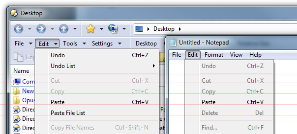
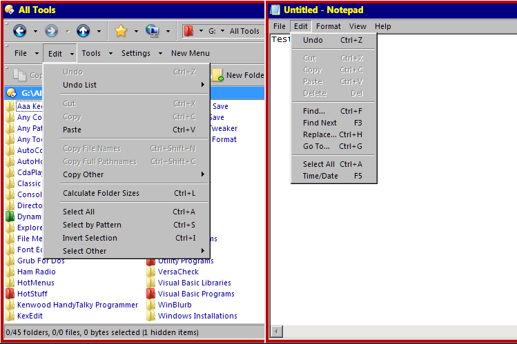
Without larger icons to pad things out, the default spacing of menu items in Opus is identical to the standard menu spacing used by any other app which uses the standard menu metrics and visual styles. Here you can see Opus and Notepad have identical menu item spacing:
Also, if you turn on Preferences / Toolbars / Appearance / Use Office 2003-style for toolbars then the spacing in Opus is more compact than normal.
If you're seeing something different, please post some example screenshots.
Leo, how nice to be speaking to a developer -- I had wondered, seeing all of your posts on this site, whether you were a developer. Again, thanks for the very quick reply.
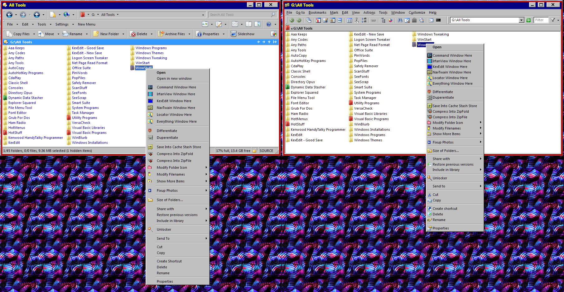
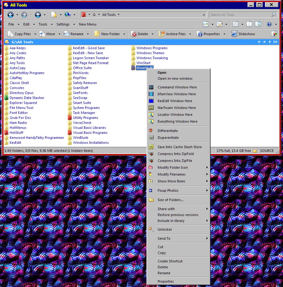
Attached are screenshots of a toolbar menu popup and of a right-mouse-button popup. The former shows standard Windows notepad at 17 pixels per item and Opus at 19 pixels per item (11% larger). The latter shows Windows at 18 pixels per item and Opus at 22 pixels (22% larger). In the case of the latter, as you can see, I snapped the non-Opus popup with a different explorer, just to get conformable images, but the Windows Explorer popup is identical at 18 pixels per item.
This is Win 7 64-bit. After all of the above, I wondered if the theme might have something to do with this. So I loaded straight Windows 7 Aero, and Opus and Notepad and the other were the same. I loaded straight Windows Classic, and the toolbar menus were the same but the Opus RMB popup is 20 pixels per item versus Windows Explorer (and the other explorer) 18.
I'd say there's something strange happening with the menu part of the looks-like-Windows-Classic-but-isn't theme you are using. Comparing Notepad to Opus in your screenshots, the menu item height is one pixel different.
Which tool are you using to apply the theme? Some of them override the standard menu-drawing code to change things, while not applying the same changes to the visual style metrics which programs like Opus will use to ask the OS how large to make menu items.
I can't vouch for how XYPlorer draws its menus, and I don't see Windows Explorer in any of your screenshots to compare how it draws its right-click context menus when they contain icons with the theme you are using.
As I buried in text above, Windows Explorer and the "looks-like-Windows-Classic-but-ins't" theme draw the right-mouse-button context menu identically. I took a snapshot, but as I had already prepared hte side-by-side example (somehow those pictures did appear, but later), I decided not to do that work again. The RMB menus are identical.
The other explorer is Xplorer2, not XYplorer.
What does Opus fetch when it looks at the system metrics to determine menu height? Nothing in the GetSystemMetrics leaps out at me as definitife (SM_CYMENU, SM_CYMENUSIZE, SM_CYMENUCHECK, SM_CYMENUSIZE, and SM_CYSIZE are all candidates), but the number might come from a completely different source. I can muck around here and try to find what is what, but a pointer would be helpful. The theme is modified from a Deviant Art theme, "Classic AE 2.5 Final" by ~Saarineames on Deviant Art (direct pointer http://saarineames.deviantart.com/art/Classic-AE-2-5-Final-248970467), using Windows Style Builder (sometimes called Vista Style Builder) to do the modification. Themes are applied with UxStule http://www.uxstyle.com/.
It's not the old-style GetSystemMetrics API but the visual styles APIs. However, having looked, what you're seeing with this theme is because Opus has a minimum menu height of 19 pixels when using visual styles (the minimum is smaller when not using visual styles, i.e. Windows Classic mode). The theme's metrics can make the menu items even larger if needed, but never smaller.
This is probably not something we will change, since the theme in question causes problems even with Microsoft's own apps (one example below; note the top-right particularly) and thus seems to size things smaller than themes are expected to size things. Also because relying too much on theme metrics is dangerous, because many themes do not specify them properly or consistently (in part due to a lack of documentation about which metrics should be specified and what they mean exactly). Changing the minimum may make things more compact with this theme but make them completely broken with another, and since we've not had complaints about any other themes, and the difference is only a pixel or two per menu item, that's not a risk we're likely to take, sorry.
Thanks for the clear answer, and I understand that if this is a hard-coded number you'd not want to change it, and I agree with the sense of your position. Nonetheless, I'll put Opus on the shelf for now, and continue with Xplorer2 (which also is excellent). Just would have liked to use Opus because of its more accessible customization.