Not sure what DO is comlaining about and i don't want to just ignore a problem but there wasn't an issue until this new release.
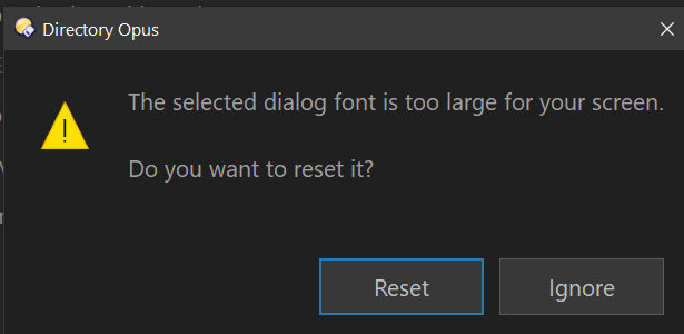
Not sure what DO is comlaining about and i don't want to just ignore a problem but there wasn't an issue until this new release.
What size is your dialog font set to in Preferences?
What resolution and scaling factor are you using?
You need to reduce the font size, reduce the scaling factor, or increase the resolution.
Size of which font? There are lots. Whatever the default was I added 4 to the size. 8 went to 12, 9 went to 13, etc.
Resolution 1920 x 1200
Scaling is at 133%.
I haven't cleared this error I didn't want to have to go through an reset them. What's ignore going to do?
The dialog font, as I said (and as the message says).
1920x1200 @ 133% scaling with 12/13 point fonts simply doesn't fit. You'll need to change something, not just for Opus but for a lot of software.
I don't know why the message didn't appear previously, but it should have. AFAIK we haven't changed how this stuff works recently.
I don't understand why you're so wedded to having the Preferences be a certain minimum size? Why not just put scollbars on the side and be re-sizable like every other window. That's kind of one of the Window's few selling points.
It is resizeable?
It is already resizable, but it has a minimum size.
Having multiple scrollbars side-by-side in a UI is bad (even if sometimes it's inevitable). We design everything so it will always fit on a reasonable minimum sized screen, and can grow larger if desired.
The minimum size chosen (at least the last time I checked) was the minimum that parts of Windows itself would need as well, assuming they're using the same font size you're using in Opus. That size was defined by Windows many years ago now, while screen sizes and resolutions have both been increasing rapidly vs cost.
We are not going to redesign the UI around this, sorry.
Because I'm getting truncated in my Filter Bar I've removed what used to be called the Window's Sidebar. I'm not thrilled at having to do that. At the same time I increased the % from 125 to 133. That's the cause of the error with the Font Size. It's not the font that's the problem but the Preferences window at it's max height can't get all the data on the display on some page. I'm guessing. No way Opus 12 was like this.
I went back to 125% that eliminated the error.
I highlighted the Preferences Dialogue box it all but takes up the entirety of my DO screen top to bottom. I can make it wider or higher but I can't make it shorter or thinner. It's hard to see where one begins and the other ends especially with the setting selection looking identical to the file lister which is why I outlined it in red. That's all the space I've got and the only exces I got is the Taskbar which I'\m not giiving up.
I still can't get the entire Filter Bar to fit.
Actually I can't believe I'm the only person having this issue. 17" laptops are getting rare most are 16" making it even harder to make this work. You can see it's not like the font even at the current size is large by any stretch. I might squeeze a little bit out of my Operation's bars.
Because your font and scale factor is too high for the resolution you're using. As I keep saying. It just isn't going to fit.
Nothing over 100% scaling and ~9pt fonts really makes sense at 1920x1080 or 1920x1200 type resolutions.
I have to be able to read it without straining.
Is there a way to change the border color of the prefernces and customization panels?
I'd recommend a larger monitor instead of increasing the size of things on a 1920x1200 screen. They cost very little these days.
Off-topic for this thread, but it's a system-wide Windows setting, under Personalization, Colors.
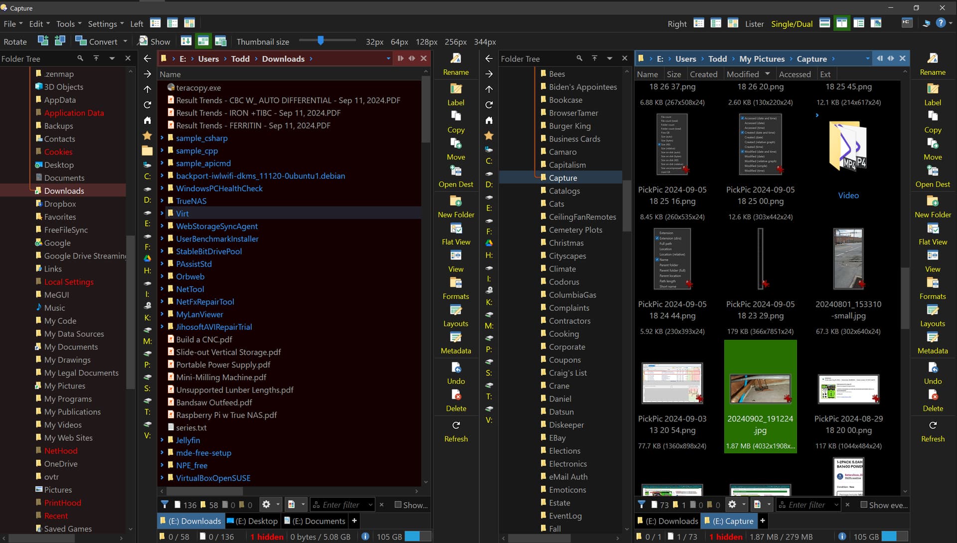
Here's the new 27" screen up from 17" still dual vertical does not have enough room to show the entire search bar. There is space after that's occupied by some vertical toolbars that could be shortened or on the leading side the Folder List could be shortened. For whatever reason the search toolbar isn't modifiable so I cannot remove anything to shorten it.
Have you reduced the font sizes? They still look very large in your screenshot. Increasing the screen size should let you reduce them.
Opus looks like below when maximized with default font sizes and a similar layout to your screenshot. There is plenty of space for everything:
Getting the new screen allowed me to up the resolution to 2560 x 1440 so that makes everything smaller. I reduced all fonts by 1 point. I can't go any smaller. Bigger screen slightly further away from me higher resolution plus the magnification factor which I set at 134% instead of 150% I think it was or maybe 200%.
The toolbars that are constrained by the filelist width are really the places where I could use more space. The location bar, the search bar and the status bar. They don't look too bad here but there are things I would move back to the location bar that I moved off to the operations bar. The status bar currently shows the Used Space but there are cases when some of the other fields get bigger that it gets pushed off. The search bar is already stressed any increases in field size there will push that Checkbox to show everything off the edge but more importantly the filters by file type is one I use quite a bit and it often gets squeezed out so there's no access to the type-your-own filter box or it becomes so small it's unusable and the list of extensions for some reason is just gone. They don't just truncate from the right but each field seems to get shrunk by some factor some fields more than others.
Maybe try with your dual displays set to horizontal rather than vertical.
Screen space is finite, and things take up space, at the end of the day you'll just have to accept that.