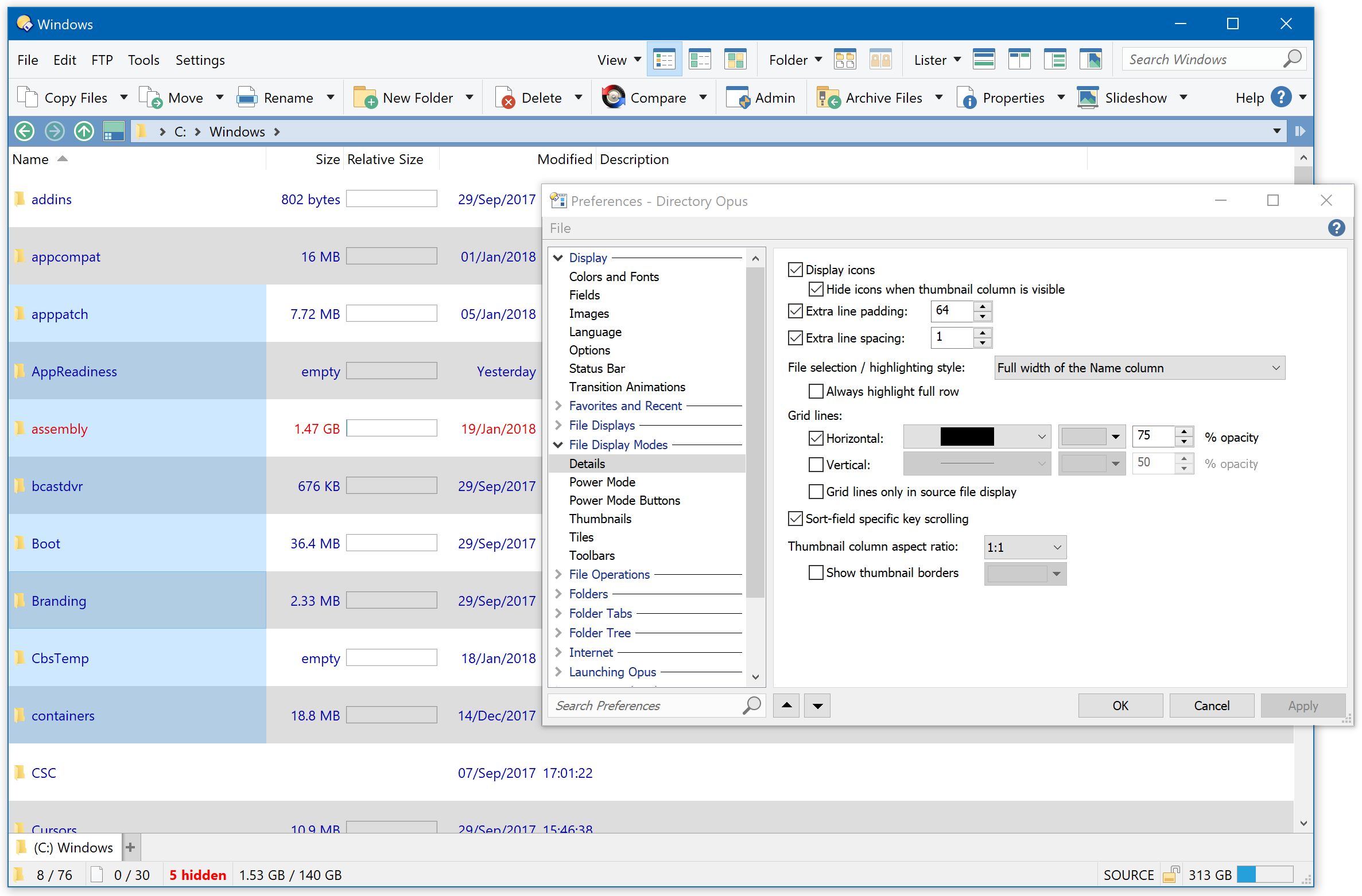
In 12.7.2 beta, we're adding an Extra Line Padding option for Details and Power modes, complementing the older Extra Line Spacing option.
-
Extra line padding: Lets you add additional padding inside each line, making each line taller and a larger area to click on. The padding you specify will be scaled if your config is used in a different DPI.
-
Extra line spacing: Lets you add additional spacing between each line. A particular use for this is to add one extra pixel between lines if you dislike the way selection boxes overlap (producing a thin line between each selected item) in some versions of Windows. If you add more than one pixel of spacing, you will start to get gaps between items where clicking them is like clicking the folder background. Unlike padding, the spacing value does not change when you move to different DPIs.
Here are some quick screenshots to demonstrate the two settings. These are from a 4K / 200% DPI screen, so you may need to click some or all of them to see the full details, and they will look larger than normal as the forum/browser displays them without DPI scaling.
The first three are the same as you would see in current versions of Opus with the same settings.
Normal (0 spacing, 0 padding):

Removed lines between selected items (1 spacing, 0 padding)
(The two lines you can still see indicate the item with keyboard focus. Those lines are always there, but normally hard to see with Windows 10's visual style because it produces similar lines between each item. With spacing set to 1, you can see the focus item much easier on Windows 10.)
More spacing produces gaps between items (9 spacing, 0 padding)
You probably don't want these gaps. Clicking them is like clicking the folder background.

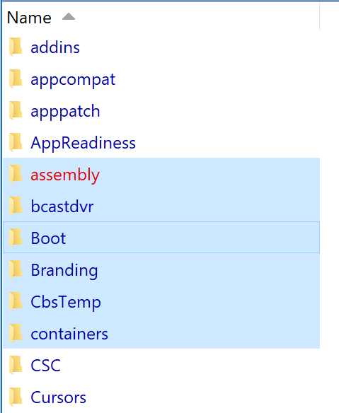
Padding, instead of spacing, increases the clickable height of each line (0 spacing, 9 padding)

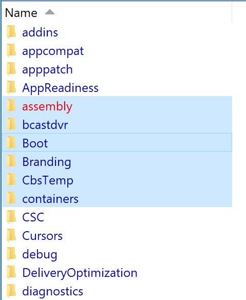
You can combine spacing and padding (1 spacing, 9 padding):
Lots of padding, and solid grid lines (1 spacing, 64 padding, solid lines):
This demonstrates the improvements we've made to how grid lines interact with the spacing and padding options, which will also be part of the 12.7.2 update.