How can I assign different colors to the File Display Background for the Source and Destination Listers ?
The background of the whole file display? You can't.
However, you can define different colours for the source & destination File Display Border (the bar above the file display itself, where the display's current path is shown).
H'mm that's a pity, and a surprise, most (all ?) of the other things I've wanted are either already there or easily done via customisation 
Because I'm keyboard centric I tend to glance at the screen, whereas mouse centric folks tend to look at the screen to follow the pointer. My pointer auto-locates to the bottom right corner and stays there much of the time. I'm accustomed to having different colours for the two file display areas in xPlorer2, and before that in FileBoss.
I don't see it as a mouse vs keyboard thing; the way the screen looks is the same to both types of user.
I'd say it's just something you need to get used to if you've been using things that work differently for a while before trying Opus. (Still, if you want a more conspicuous source/dest indicator, you could send in a request to GPSoftware Support, via the link in my sig. But I'd urge you to wait a while and see if it's still something you want after using the program for a bit longer.)
The three main visual cues about which side is active are:
- The file display border color.
- The color/style of selected items.
- The current-item ("keyboard focus") indicator.
(There's also a source/dest/off message in the status bar, but that's easy to overlook even if you know it's there.)
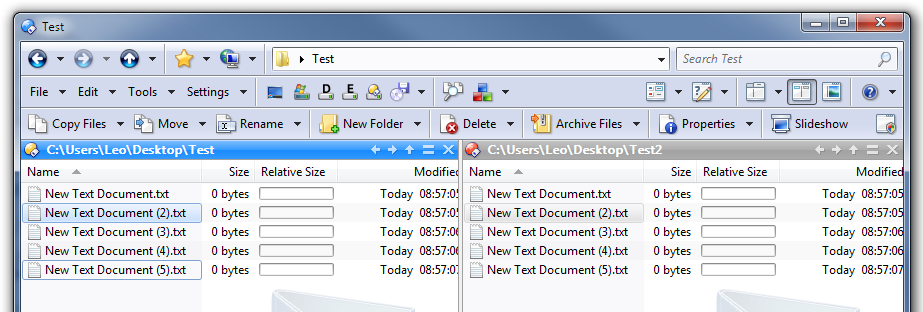
Here's my x2 screen, the left file list (white bg) is the source (active), the right file list (dirty yellow bg) is the target (inactive).
I suspect most would agree that in my example it's more obvious as to which the source and destination file lists. The white and dirty yellow are my colour choices.
X2 has a switch to turn off Aero effects within X2 itself, which I've done - but that's not as important as the different backgrounds for the two lists.
My default Visual Studio layout has side by side editors, with similar colors for active & inactive panes.
My digital asset management software layout has side by side folder tree & category panes, with similar colors indicating which of the two is active/inactive.
I have a multitab/two pane add-on for Office, where I use the same colors to differentiate between active and inactive panels.
You could say I'm fixated on having white & dirty yellow backgrounds in multipane apps ![]()
It not how the screen looks to the two sets of users, what matters is how the two sets of users look at the screen. - there's more than a semantic difference y'know.
The person who told me that kb & mouse users tend to look at the screen in a different ways was my niece. She told me mouse centric users tend to fixate their gaze on the screen, which she maintains is unhealthy. Whereas, keyboard centric users tend to move their gaze back & forth between their hands and the screen which she says is healthier. The white and dirty yellow were also suggested by my niece as being good colours to use. Oh, my niece is a Senior Opthamologist (eye surgeon) formerly of Moorfields, now a prof at a major teaching hospital down under. So I'm inclined to take notice of what she's says on such matters.
Also old blokes who cut their teeth on Ferranti Sirius etc, tend to regard the screen and mouse as just another passing fad ![]() Now where did I put that paper tape punch
Now where did I put that paper tape punch
rp
its really annoying that I cant edit my own posts
I didn't really need a screenshot to imagine what different coloured backgrounds would look like. ![]()
I agree it is more obvious but I still think it is obvious enough in Opus. If you disagree, send GPSoftware a feature request and it might get implemented.
(When I say "obvious enough", I mean it's always possible to make something more obvious. If we had flashing borders with animated kittens running around the outside it would be even more obvious than your screenshot, but that'd obviously be a bit too obvious. A line has to be drawn somewhere, and it seems fine to me where it is, but if you want it somewhere else then send in a feature request.)
Maybe ones can't touch-type. ![]() I still don't see what relevance it has to how the source/dest display is indicated, but it's not really important or worth arguing about.
I still don't see what relevance it has to how the source/dest display is indicated, but it's not really important or worth arguing about. ![]()
It's also annoying that so few people read the FAQ which explains why you can't. ![]()
If you want edits made, point them out either in a reply or a private message, and they will be made.
That sounds like a nanny state, make work racket to me mate.
Suggest you do what other phpBB boards do. Limit edits by time, i.e. only allow within say 15 mins of first being posted.
And/or only allow edits (by author) if its the most recent post in the thread.
San Fairy Ann - rp
Take it or leave it.
The reasons are explained in the FAQ and will not be changing (we've tried before and it's been a disaster every time), unless phpBB gives us better options in the future (e.g. to allow edits so long as a post hasn't been read by anyone else, which would be fine).
I have to wonder how we all cope with email and other systems that don't allow editing once you hit send...
posts in public bulletin boards, and private email messages (most often between acquainted parties) are totally different.
Besides my clunky SMTP/NNTP client injects a 10 minute delayed verify unless I force it to "Send Now", such treasures have been lost in the age of instant gratification.
And I long ago gave up on social media sites, IMO they're nothing but time wasters.
rp
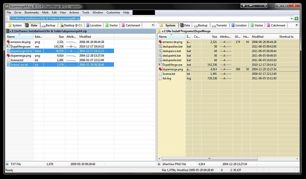
I am just test-driving Dopus 10. Amazing so far. But I am very curious about your screenshot: How did you manage to make your dest items look grey and the source items look blue? The color options only let me select one item color, regardless of source or destination!
Also, I tried the "Fade selected item colors when file display does not have focus," to make the items look different in source and destination, but it doesn't do anything in power view. This smells like a bug to me, because that option works in the other views, and used to work in Dopus 9 (Windows XP 32bit)
That's part of the Windows theme on Vista and above.
Power Mode fades the selection colours unless the window has keyboard focus. (Unlike the other modes, in Power Mode the active window may not have keyboard focus until given it explicitly. Push Ctrl to toggle this, or turn on Preferences / File Display Modes / Power Mode / Always in Keyboard Mode so it's always on and like the other modes.)
Ah, thank you for the insight. Switching power mode to "always in keyboard mode" fixed it!
I'd still say Dopus behaves strange when that option is not ticked, at least in dual view listers. In a new dual view lister, at first nothing is ever faded. If I now turn on keyboard mode on the left file list by pressing "ctrl," and then switch to the right, the left items are faded. But when I now switch back from the right to the left, by clicking the file display border, the right items are not faded. In order to have it fade both on the left and the right, I have to turn on keyboard mode manually once in both lists of the dual display lister, by pressing ctrl once on each side.
Power Mode is a bit strange, by definition. (Details Mode is the standard version of it.)
But I agree, I'm not sure that particular behaviour makes sense. I'm looking into if there's a good reason behind it.