Version 3 of my Dark Theme:
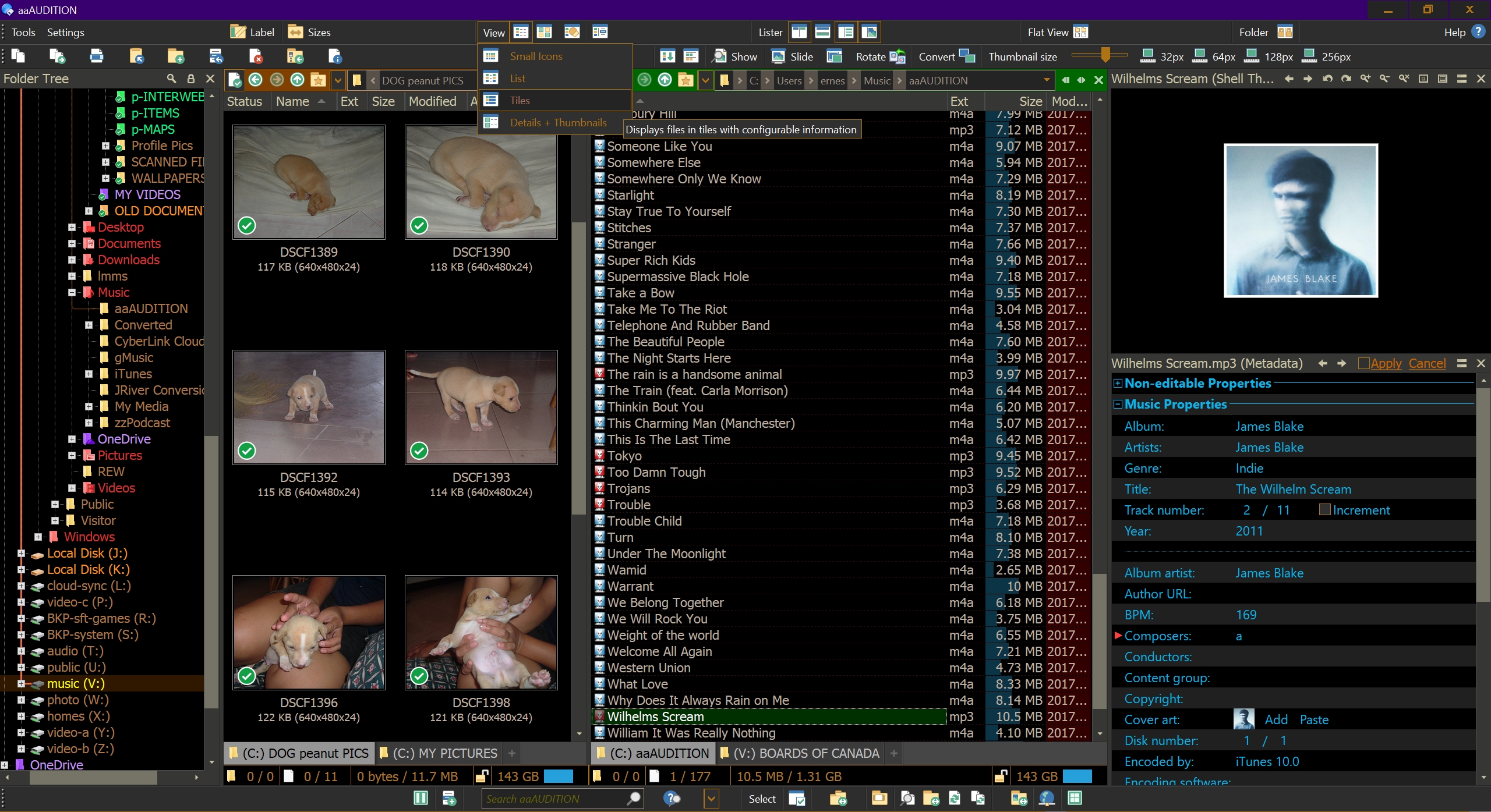
I've made several changes based from the many helpful suggestions and toolbars provided by Andy from DearOpus. I have not been able to read his entire guide but only a small portion of the tutorial website. I might make a few more changes and update this to version 4 when I get to finish reading most of his tutorials. Although it might take a long while for me build up my arsenal of renaming scripts.
I wanted all or most of the toolbar items to still show even while having two windows split open on the screen so I got rid of the drop down arrows and labels and replaced them with several shortcuts in order to access the drop down menu buttons quickly. I'm also not a programmer so didn't really have much use for a lot of the scripts Andy provided with his toolbars -- stripped much of the shortcuts to what I personally thought was useful to me.
[ I've FINALLY figured out and got the labels right! Note that these label colors are meant to be for a dark theme background and if you view these files/folders in a white or light file manager background they will look pale indeed. ]
dark theme dopus 12 v3.dlt (164.2 KB)
If you're interested in more than just the colors from the theme I've included the toolbars below:
Menu_two.dop (57.7 KB)
Operations_two.dop (69.3 KB)
Images_two.dop (44.7 KB)
You can install and try out my full config (7th iteration and hopefully LAST) if you really want to, BUT it's not recommended as it'll change EVERYTHING with your own settings and presets and you'll lose your saved layouts and tab groups -- so make sure to have a FULL back-up of your CONFIG to restore from:
ernest_Opus_Config_v3.7.ocb (514.5 KB)
Apparently the config does not include the two additional icons and two scripts -- actually now three that I've added (which actually seems to be included after all after checking):
icons.zip (46.4 KB)
Script source links:
Remember, I've made my color adjustments while using my custom Windows 10 high contrast settings so a few of the theme colors might not be as expected if you don't have that setting on [I also had to disable some icons from the drop down menus as my windows 10 high contrast settings caused some problems with the text displaying over the top of one another:
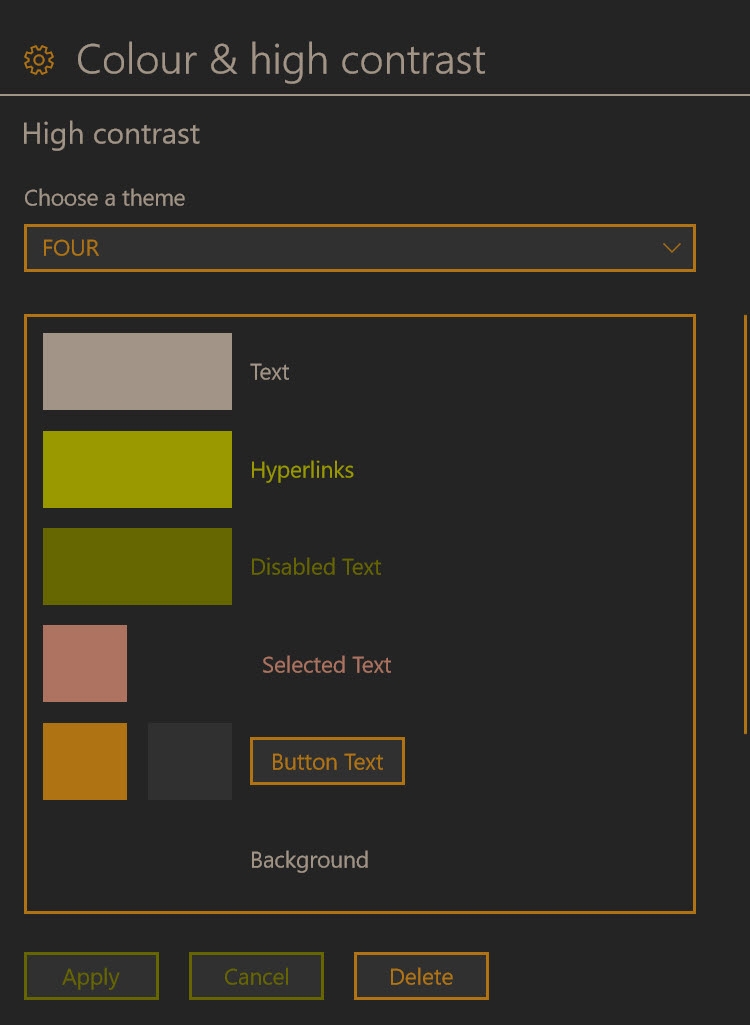
(I've only changed my color of the hyperlinks green rather than purple)
HIGH CONTRAST BLACK DEFAULT PLUS THE FF:
TEXT: #A19486 RGB: 161,148,134
HYPERLINKS: #999900 RGB: 153,153,0
DISABLED TEXT: #666600 RGB: 102,102,0
SELECTED TEXT BACKGROUND: #262626 RGB: 38,38,38
SELECTED TEXT: #AD7360 RGB: 173, 115,96
BUTTON TEXT BACKGROUND: #303030 RGB: 48,48,48
BUTTON TEXT: #B07314 RGB: 176,115,20
BACKGROUND: #262626 RGB: 38,38,38
I made lots of changes with the keyboard shortcuts to avoid conflicts with the default settings so please check the 'keyboard map'.
Well, I think that's about it.
I highly encourage anyone to head over at Andy's Dear Opus tutorial website as well (if you haven't already) as I've learned quite a lot from there these past few days and reworked my toolbars based from his own: http://www.dearopus.com/