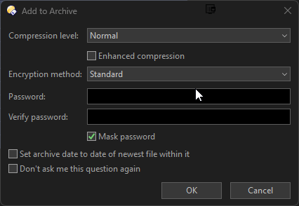
Opus 13.2:
Play attached animated GIF. Self-explanatory. Two options (or possibly more) are aligned on the same line and conflict with each other. UI Bug I think.
Opus 13.2:
Play attached animated GIF. Self-explanatory. Two options (or possibly more) are aligned on the same line and conflict with each other. UI Bug I think.
How are you opening that dialog? (The ways I'd normally open it would include a drop-down for selecting archive type at the top. Zip, 7Z, RAR, etc.)
Have you tried removing the tool that is adding an icon in the window titlebar? We're finding those tools mess up several of our dialogs.
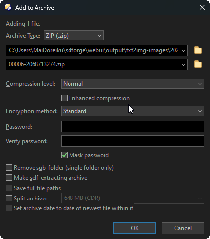
Right-click -> Add to Archive. It is DisplayFusion. I have already set DisplayFusion to not hook into the dopus process. But I have not disabled the titlebar buttons.
UI is still a little weird.
The checkboxes look too close to the edit control, although I don't see the same thing here.
I might depend on:
Let me know what yours are and I'll see if the same happens for me.
For what it's worth, this is how it looks for me (200% scaling and default font):
Many thanks! The overlap has been fixed for the next beta.

