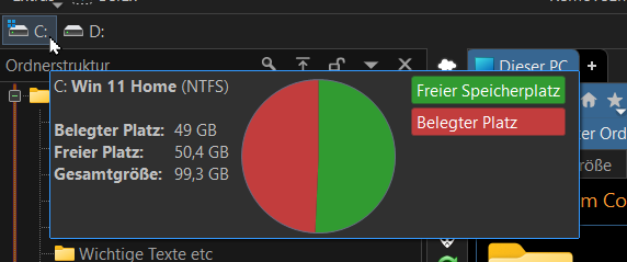
I must have missed the info about that new drives info pie chart, when we hover over a drive symbol. Was it mentioned anywhere? Also can't find it in the preferences. But very nice!
![]()
I must have missed the info about that new drives info pie chart, when we hover over a drive symbol. Was it mentioned anywhere? Also can't find it in the preferences. But very nice!
![]()
I didn't know about it either. ![]()
Thought this has always been here before, but noticed this today, too. Nice one
Could you guys shrink the status bar pie chart to the same size as the (amazing) drive chart pls. It's like half my screen right now.
What and where is the new chart? I did not come across it yet..
Please someone show it.. thank you! o)
You get it when you hover on a drive button unless you have tooltips disabled.
Aha, ok.. thanks! o) I don't seem to have these kind of buttons.. o)
If you really want to see it, turn on the Drives toolbar.
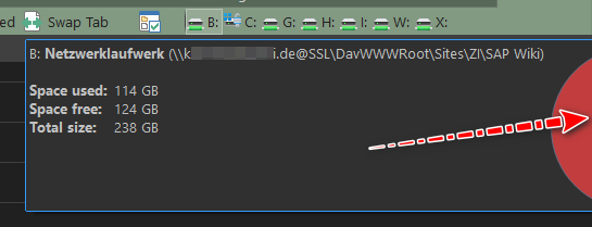
In a dual monitor setup, the new popup is cut off when the drive bar is located on the right side of the first monitor, e.g.
In the picture above, the popup is missing parts of the graph which are shown on the second monitor.
Maybe this could be tweaked like tooltips or context menus which adjust their position to entirely fit on the screen where they were initiated?
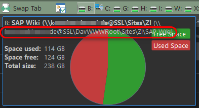
Edit, second request: As you might see on the picture above, when the path of the mapped drive is very long, the pie chart is placed too far aside to the right border.
Can this be adjusted, too, e.g. move the chart some pixels down, maybe align it with the first line "Space used 114 GB"?
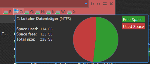
Here you can see a local drive instead where the pie chart is OK, IMO.