There was one (or the only one I found), but maybe they're not interesting with walking through all the settings and change it, or they all have large screen not a laptop FHD on 15.6" screen.
But it's not the point. Making font size too small when there are too many spaces, that's thing you could make it better.
I agree that the font size is too small, especially on my notebook. On my desktop it's not too bad, but a bigger font would be better. An option to set the size would be good, then users could set it to their liking.
I included a picture to show how small it is compared to the main program. The default text scale is 125%, and I feel all right with other programs.
I don't know if it follows Windows pattern or what, but there are a lot of text, a lot of options and a lot of spaces, why not make it bigger?
Btw I borrowed a big screen of my office and this is not my concern anymore, but it's much greater if that dialog has text bigger, Directory Opus itself is almost perfect IMO.
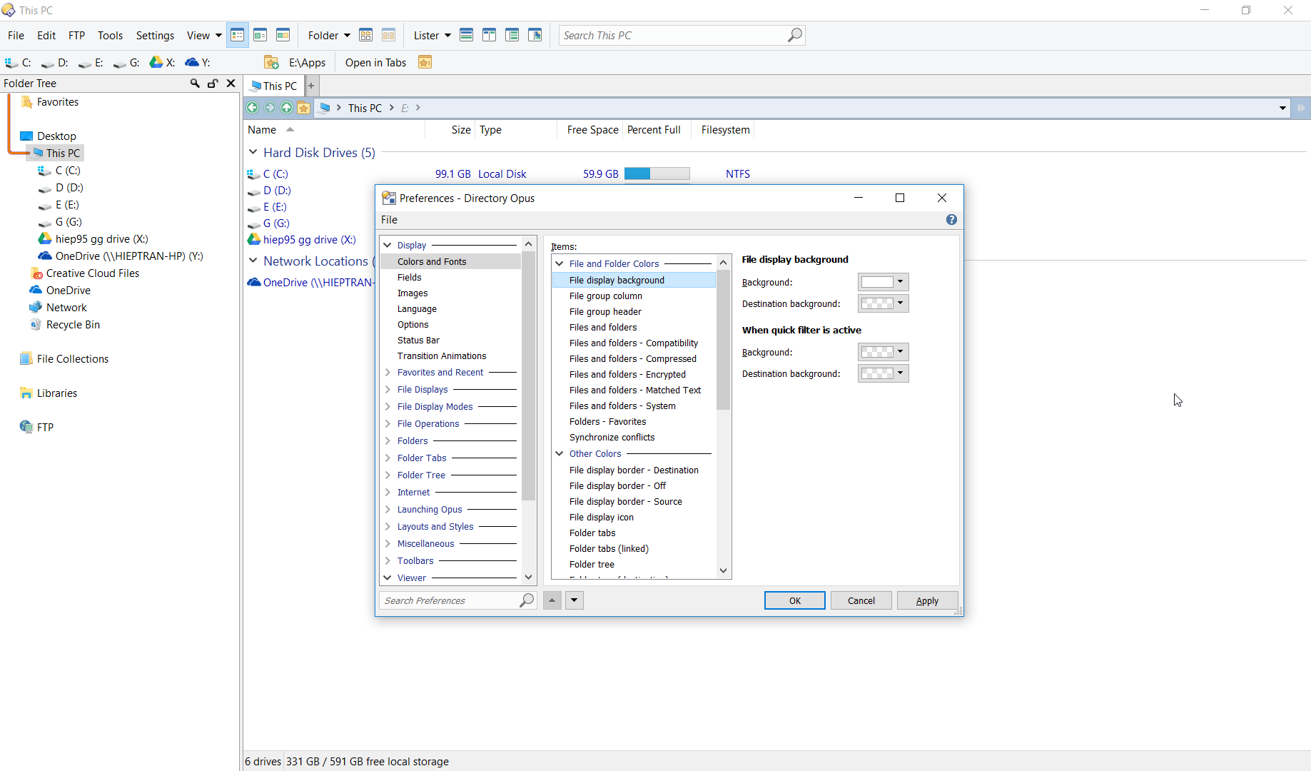
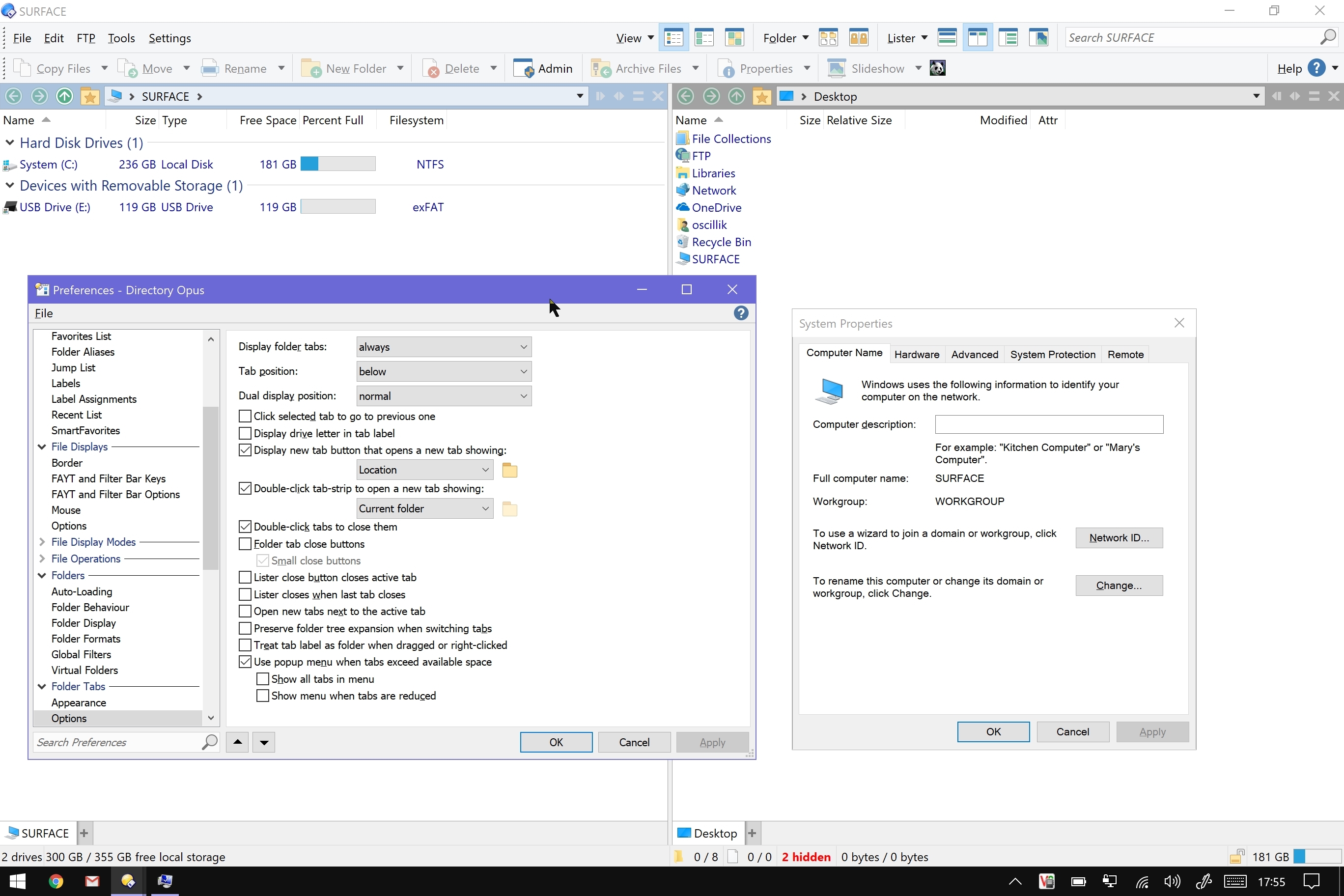
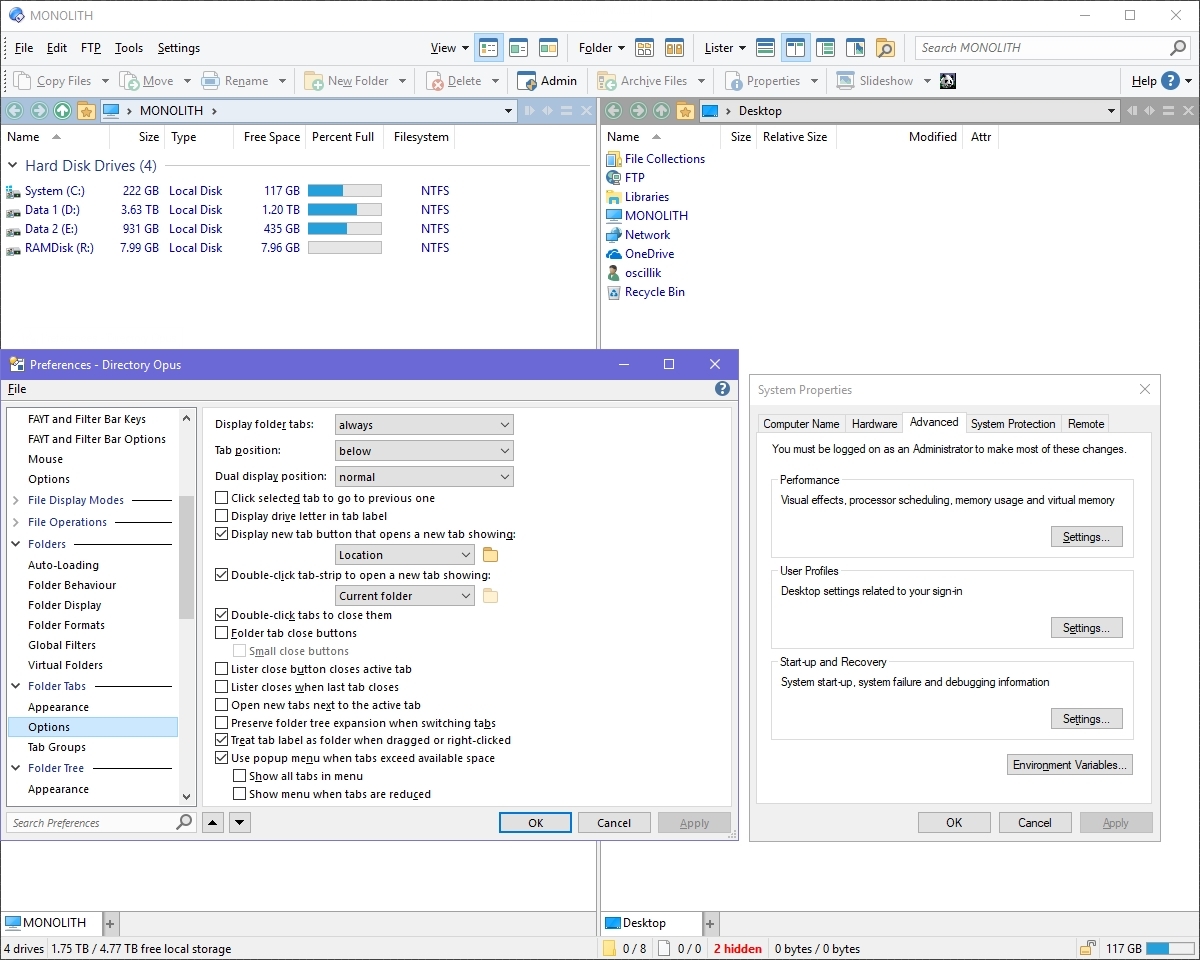
As Leo already states, the preferences dialog follows the system text scaling. Here are screenshots taken from my Surface Pro 4 (set at 200% scaling) and my main workstation (set at 100% scaling)
In the screenshots I have made sure to include examples of text in the lister, as well as the preferences dialogue, and the Windows 10 Advanced System control panel dialogue (as an example of a general Windows 10 system window).
So you're telling the preferences dialog text size is small because there is a system windows that uses that small text size. And we should set the text size as small as we can as long as it's readable?
No, preferences dialog contains a lot of options, and users should read it all before decided what to be clicked. Look at System Properties, there is nothing there, I know what I'm going to click without reading too much things.
I'm telling here is something this program can improve, not something this program not able to do. Obviously, bigger text is better.
Like I said, I have no problem with other programs at all, just DO preferences dialog.
Do you agree that bigger text for this dialog is better? Is there any disadvantages, any things hard? Like XYplorer, they make their preferences dialog large and easy to use.
It's not just a matter of changing the font size. All the dialogs would need to be re-layed out, which would be a huge amount of work. We use the standard, system dialog font for our dialogs. Any programs which don't use that font are in fact non-compliant with Windows UI guidelines.
Ok if you say so. I also think you should focus on other things first, this is my suggestion after all. But if you guys going to do, please put the guideline or design pattern aside. You can follow the guideline but don't follow it rigidly.