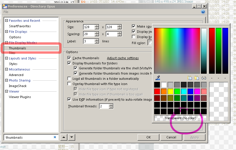
Instead, it just uses the color that is preset in the Viewer / Viewer Pane, and I don't see how to turn it off (when I choose the color to be used as a background, it doesn't have an option "don't use any color" like, for example, thumbnails). What am I doing wrong?
Sorry forgot to clarify - actually the preview pane does show the selected background image (in my case I'm using the chequered tile that is used for transparency in software like Photoshop etc), it's just that it the image tile disappears as soon as I click on an image (in the file list) and it gets replaced by the background colour.
That's by-design. The background image is only there when nothing else is displayed.
I was expecting that there will be an option for colour like there's in the thumbnails colour picker:
I think having an option for filling the background of preview pane and standalone viewer would be really handy for people who often work with images that use masks or transparencies, since that makes it much easier to see how transparencies behave without having to load Photoshop just for that. Maybe I could file a feature suggestion and see what happens.
Thanks for the clarification.
You can set the color under Preferences / Viewer / Standalone Viewer and Preferences / Viewer / Viewer Pane.
I often set mine to yellow to test alpha channels.
I know it can be set up there, but no matter what colour you select, there'll always be a few pictures with which it won't work well (and I work with lots of pictures every day). There's a reason why Photoshop (and other software - Illustrator, ProMotion etc) use a tiled pattern for that purpose (indicating transparency). As a funny coincidence, today I was working on a picture with lots of yellowish area with transparencies where having a yellow background wouldn't be very helpful.
I'll probably stick with Auto selected colour for now.
We'll add an option for the "checker board" fill to the next version.
Great - thanks so much!
Would it be possible to make it so that the two colours used for the squares are configurable - this is helpful because if the default checkboard is too dark or too contrasted sometimes it's hard to see things. Or if that is not practical to implement, maybe just having an option of having three presets (dark - brightness 15%,25%; medium - brightness 45%,55%; light - brightness 90%,95%) should be enough. Personally I mostly use two combinations (in the attachment) and they cover 99% of my cases. Just a suggestion based on my personal experience.
![]()
![]()
Actually after looking at this, it seems to be a little more complex than we first thought. We'll leave the idea on the suggestion list, but it won't make the next version unfortunately.
I understand - thanks for considering it!