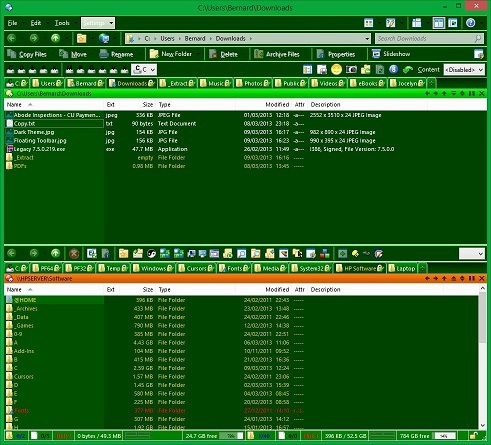
I set out to create a (mainly) dark theme, but have found some problems, which can be seen in the images below.
I use (and really like) Leo's HDD drive icons. There they are (what you can see of them ) in the fourth toolbar from the top in the first image. Has anyone found a solution for this?
I have set the Standard Toolbar Highlight and Shadow colours to be bright and light green respectively. I had expected that the highlight colour would be invoked when I rest my pointer on one of the toolbar icons or menus. As you can see in the main image, the Settings menu (the fourth one on the first toolbar) is highlighted, but is pale grey. Is there somewhere else I should be controlling this?
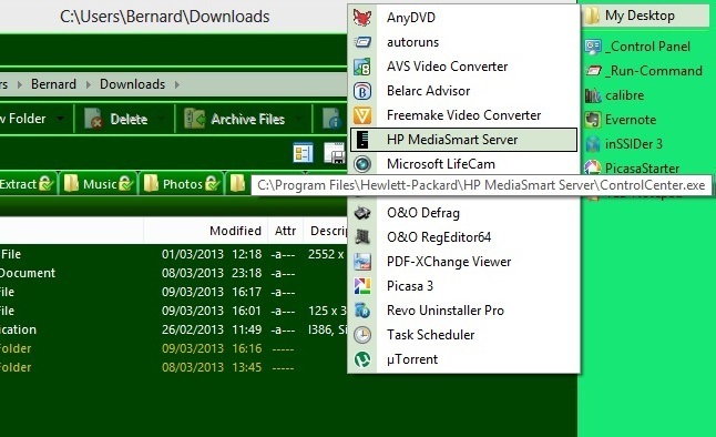
I have a floating desktop toolbar, which has a nested toolbar (My Desktop), which drops down when clicked (see second image). When I use light coloured backgrounds, the drop-down toolbar (which is white, and unresponsive to any attempt to change it) does, at least show the black text. When I change the desktop menu to a dark background with white text, the text on the drop-down toolbar changes to white, but its background colour stays white. If the drop-down toolbar inherited its background colour from the 'parent' toolbar, this problem would go away.
The file display header and scrollbar are white, and I cannot find a way to change them.
The Windows 8 colour scheme I selected is the closest I could come to the same green you see in Opus. In fact, the title bar colour in the first image is set by Windows 8.
That said, I have not found much in the way of visual style options in Win8. It seems to come down to Personalization > Color and Appearance, select a colour swatch, then adjust Hue, Saturation and Brightness. If you know of extra settings, I'd be grateful to learn about them.
For the menu background, turn off Preferences / Toolbars / Appearance / Use Office 2003-style for toolbars and then go to Customize -> Toolbars, select the toolbar, give it a background colour and turn on the Image is inherited by submenus.
Then you can have bright green menu backgrounds if you really want Opus to look like Kermit the Frog.
I have followed your instructions and we are 90% of the way there now.
It is not the backgrounds themselves that I want to be bright green. I want those to remain dark green, with white text, as in the first image. It is the highlight that indicates which menu item or icon my pointer is resting on that I want to be bright green. That is the one that was pale grey on the menu toolbar in the first image. Having made your suggested changes, I now have the menu backgrounds being inherited, dark green with white text as I wanted. The one item I have not been able to find is where I change the pointer highlight. At the moment, when I rest the pointer on a menu item or an icon, that item's background changes to a dark green, though very slightly less dark than the main background itself. I tried setting it by changing: Preferences / Display / Colors and Fonts / Other Colors / Standard Toolbar / Highlight, but the Highlight setting which I had expected to do the job seems to be ignored.
Have I misunderstood the function of that setting? Is there a setting which IS meant to do that job?
I appreciate the time you are putting in for me. Thanks.
OK. When you said 'Windows visual style', I assumed you were referring to the Windows setting: Control Panel / Personalization / Color?
Currently, using that setting, I have chosen the green colour patch designated 'Color 10', and the selected menu highlight is dark green. However, changing to any other colour patch, the selected menu highlight is still dark green. So, I guess I am wrong.
I have Googled 'Windows 8 visual style', and come up with lots of hits for themes that rely on patching Windows .dll files. Not what I am looking for.
I realise this is not an Opus question, but what Windows setting should I be using?
There isn't one, that's the problem. Microsoft don't want you changing how things look apart from a handful of visual styles that come with the OS. You have to use a tool like WindowBlinds, or one of the DLL hacks which allows you to install visual styles that Microsoft have not blessed themselves.
For some reason, any shade of green is a very personal choice. Had I chosen almost any other colour, it would have gone almost unnoticed.
This new dark scheme replaces one which was predominantly light green, and it attracted much the same reaction. I copied it in light blues for my wife, and that was generally approved of.
 ) in the fourth toolbar from the top in the first image. Has anyone found a solution for this?