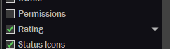
It was mentioned somewhere else about a rating evaluator column but I can't find it now.
That the Ratings stars don't always justify properly.
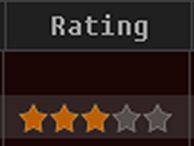
This is the default look of it. Pushing into the right side.
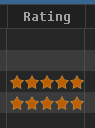
If I enable its appearance, and choose Left alignment:
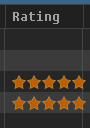
If I enable the appearance and choose 'Default' it's better. ... kind of.
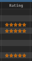
It has too much empty space and it's still not center, especially the header. And doesn't always show up like this; it's inconsistent. Sometimes it appears as my first example.
And its appearance entry has a little drop down arrow, don't know what that is.