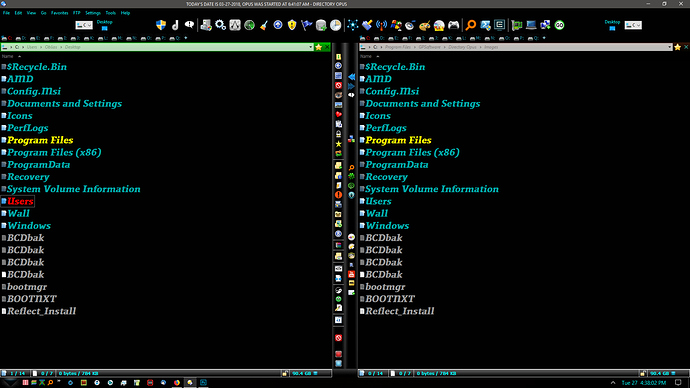
After working on the theme for my Opus, I think I've reached the point to where I'm happy with the looks. It may be too dark for some, but for me it works just fine. I get a lot less screen glare with this theme.
At the top, just to the right of center, are 8 icons that when clicked open up other toolbars, such as internet, system, docs, games, apps, sound progs, graphic progs, etc.
To the left of top center are other system specific button commands that I wanted to keep separate but handy.
Then the tab bar on each file lister has a tab for the root of each of my drives. Quick and easy for me to navigate that way.
Then down the center of the dual pane display I have 2 toolbars that contain most all of my file operation buttons. I like keeping those buttons right in the middle, where I can easily get to them from either side. For some reason, I find it easier having them in the middle, than up top.
Just thought I'd share the result of my customization efforts. Maybe give someone else some ideas to use in their setup.
Quick Note: After looking at the screenshot, I realized that I can probably do without those stark white drive buttons up top, on either side. I mean, I have open tabs already, no need for a drive button, right? So, consider those gone when you have a look...
