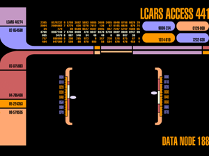
Star Trek, Knight Rider, Cylons... Those all describe animated strips made up of multiple red bars/blocks which move around on a black background. Do we have anything like that anywhere in the Opus UI? No.
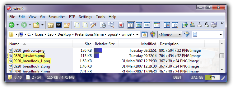
The file display borders use what I think most people describe as a candy-bar gradient, as made popular by OS X, but also clearly visible within the Windows Aero theme if you look at any standard button or scrollbar or, if you look closely, at the header bar at the top of any standard list control. You can turn those off, anyway.
The size gradients look like the free-space graphs in the Computer folder, which are part of the standard Windows Aero look & feel. Explorer shows similar graphs in places, and they're part of the Windows style guide (including the borders, FWIW).
We could add options to customise the size graphs, and we may in the future. (For a while I've also been thinking about extending the "gloss & gradients" option so instead of just on and off you can specify amounts in between, since with some colors the contrast is too much, but a bit less would look better than turning it off completely.) So we might improve that when we get a chance. But keep in mind that, even for stuff in the Prefs -> Advanced section, every option we add makes using the program more complex for everyone, and each option has an associated cost in terms of development, documentation, translation and ongoing costs in terms of testing and maintenance.
By all means shout at us and call us stupid If we change the entire Opus UI and force everyone to use new, non-standard new UI which is almost universally disliked (i.e. like Microsoft are doing with Visual Studio 2012) but, honestly, complaining in such strong terms and questionable analogies about the style of gradients used on a few bars, especially when they quite closely match the standard Windows Aero theme, is making a mountain out of a molehill and undermines your criticism.
I also don't think there have been more than two or three people asking for any one of these particular changes here at the forum. There are lots of different changes being discussed in this thread and the one linked, but let's not conflate them into a single request; different people are asking for different things here and there isn't a clear mandate yet. That doesn't mean we won't make things more configurable at some point, but it does mean that, with most people apparently quite happy with how things are, it's a lower priority issue You'll have to accept that, no matter how much the way those UI elements are shaded may offend you personally.