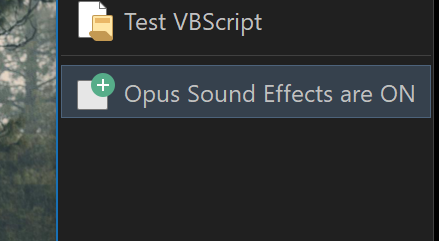
If the "Label state:" of the toolbar is On, then the two values in the @label:Val instruction are displayed for the button label when hovering.
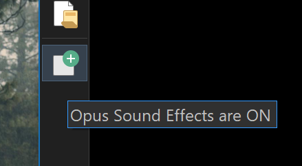
If the "Label state:" of the toolbar is Off, then the second value in the @label:Val instruction is shown for the button label when hovering - every time the button is pressed. The button functions but the button label values don't alternate.
Request: Distinguish between the tool bar label and the button label when hovering.
Preferred suggested fix: The button label when hovering should display even when the "Label state" for the toolbar is off.
Alternate fix: The text for the button should display for the button label when hovering.
Not sure I understand. Both possible values are displayed at once?
(I'd be easier to understand a more simple example, without it being wrapped in XML and lots of commands that aren't relevant to what we're talking about.)
Let me try again. Here is a schematic view of the code for a button with comments.
<?xml version="1.0"?>
<button 3dborders="no" backcol="none" display="label" icon_size="large" label_pos="right" textcol="none">
<label>Hide|Reveal Unselected Items</label>
<icon1>#selectinvert</icon1>
<function type="normal">
//Code for the @Label text
<instruction>@label:Val("$glob:UNSELECT")=="on" ? "Unselected Items are HIDDEN" : "All Items are UNHIDDEN"</instruction>
//Beginning of code to set up the toggle between action 1 and action 2
<instruction>@if:$glob:UNSELECT</instruction>
<instruction>@set glob:UNSELECT</instruction>
action 1
<instruction>@if:else</instruction>
action 2
//End of code to setting up the toggle between action 1 and action 2
//Code to update the @Label text
<instruction>@if:common</instruction>
<instruction>@toggle:update</instruction>
</function>
</button>
This code is context for what text gets displayed by the @Label instruction. I think the @Label instruction should take precedence over the "Label state" of the toolbar.
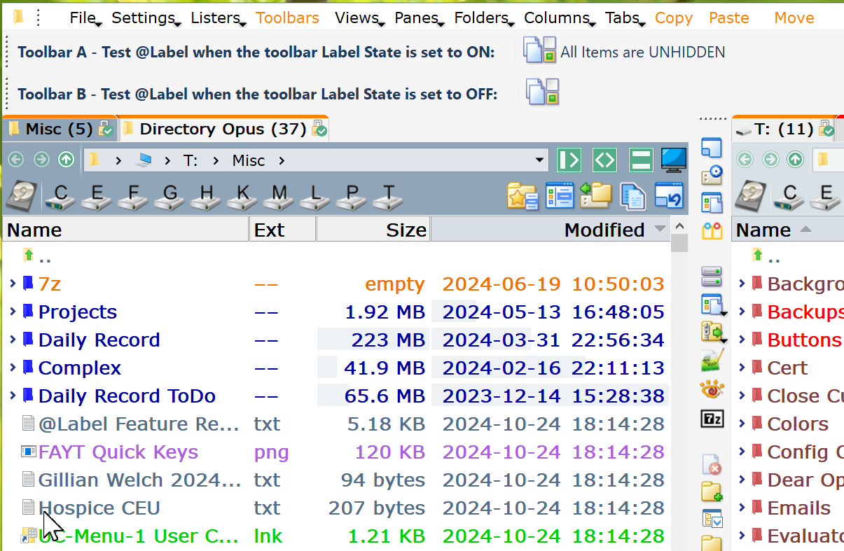
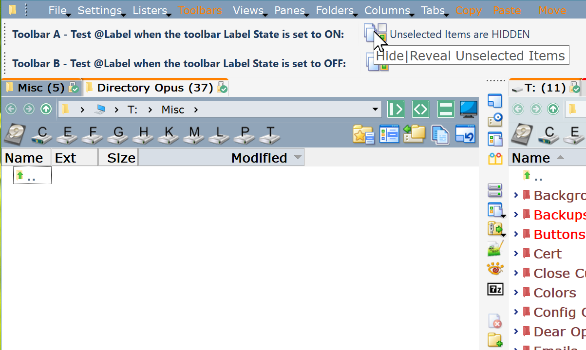
Here are two exactly the same tool bars except that one has Label State: On and the other Label State: Off. Pres the buttons and see the difference.
Take two buttons with exactly the same code, including a @label command with two values. The two buttons also have the exact same Label text and Description text. The problem is that the same code produces different results if the Label State for the toolbar is set to ON versus if the Label State for the toolbar is set to OFF.
The buttons do the same thing in that each toggles between all unselected items unhidden and all unselected items hidden.
In toolbar A, the button's label text shows hidden or unhidden.
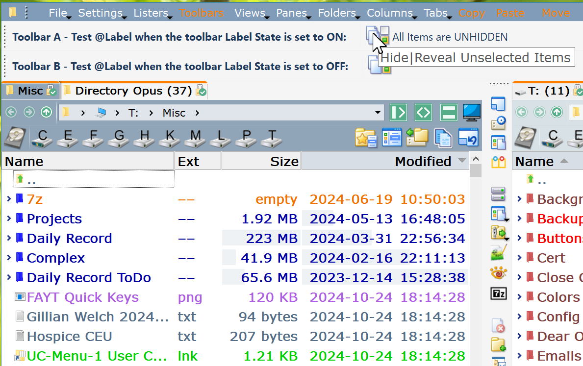
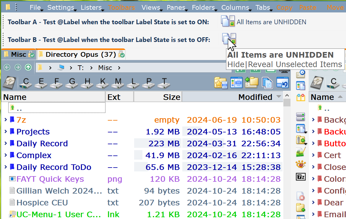
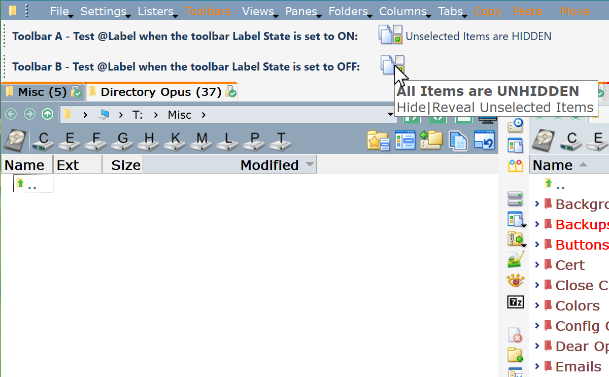
In toolbar B, the button's label text does not display since the toolbar Label State is set to OFF. The problem is that the button's hover text does not show the correct value as set by the @label - it always reads "Unselected Items are HIDDEN"
Fix: When the toolbar Label State is set to OFF, the button's hover text should toggle between the two @label values. Just like the button's label text.
A button's label text and hover text should match and should take the values from the @label setting.
Yes, the Description can be left blank. Whether it is blank or it has text, does not change the problem statement - In toolbar B, the button's hover text does not show the correct value as set by the @label - it always reads "Unselected Items are HIDDEN" when for the toolbar the Label state is set to OFF. It simply does not follow the @label values.