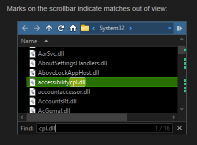
You got the little helper ticks on the scroll bar for a search:
Would be cool if there was a universal "scroll bar map". Like those ticks but can be used with anything. You could customize it to show points of interest in the folder. Like if you have expanded folders, a yellow tick will show other folders. Or will show the first file that has a different color applied to it. Or different statuses, different file types, whatever. Could be invoked per command line or by circumstance or always on per path etc.
A big chunky semi translucent scroll bar that is a map of the folder. Like Visual Studio's scroll bar map.
You could Alt click a tick to jump to that spot. There could be hotkeys for jump to prev/next tick.
The horizontal scroll bar could have helpers for the columns, maybe. We could add in the folder formats, if we want this column to appear in the scroll bar, and what color, etc.
4 Likes
That really sounds like a nice feature indeed!
I can imagine some sort of temp filedisplay 'bookmarks' that you can mark or unmark for easy access. Although I don't think the scrollbar is the most appropriate for showing that information, since it's kind of narrow. Maybe something like a new "MiniMap Bar," similar to what some text editors have.
2 Likes
Ya, true. Visual Studio's scroll bar map is epic.
Maybe we could decide when this map is shown. Could be invoked with command or circumstance, or folder format etc. We could customize what the ticks look like. Could be little lines across the bar instead of cubes. We could customize the scroll bar width, transparency, etc. Could be in combination with my 'page up/down scope' idea. Changing the scope could change what appears on the map. We could also have a mini map of the entire folder, when dragging it with the mouse, same as Visual Studio.
1 Like
This numb of an idea with more thought and experimentation put to it could be a major new in GUI tool. Perhaps the labels feature or metadata could play a part in order to leverage existing features.
1 Like
Thought experiment? It's been standard practice on other apps for a while now.
I'm thinking there could be areas of influence, instead of just ticks or lines.
This lister is currently grouped by rating.

Each green box represents a group. Click on a green box to jump the scroll to having the first file in the group at the top. Hover the mouse over the groups to reveal what each area's name is. Or with the 'modifier held down only'.
Right click the Up/Down scroll buttons to jump to prev/next item, by the scope. MM button to jump to top/bottom.
In this pic I had clicked on the status column and now it's sorted by status. (Bad colors, but just a mock up). Yellow is 'modified this week' red 'today' or whatever custom status.
The view bar (little grey one) is the current view handle. Shrinks to the scale.

Or instead of the scroll bar there could be an entire pane dedicated for this. On the right side, where the viewer is.
1 Like