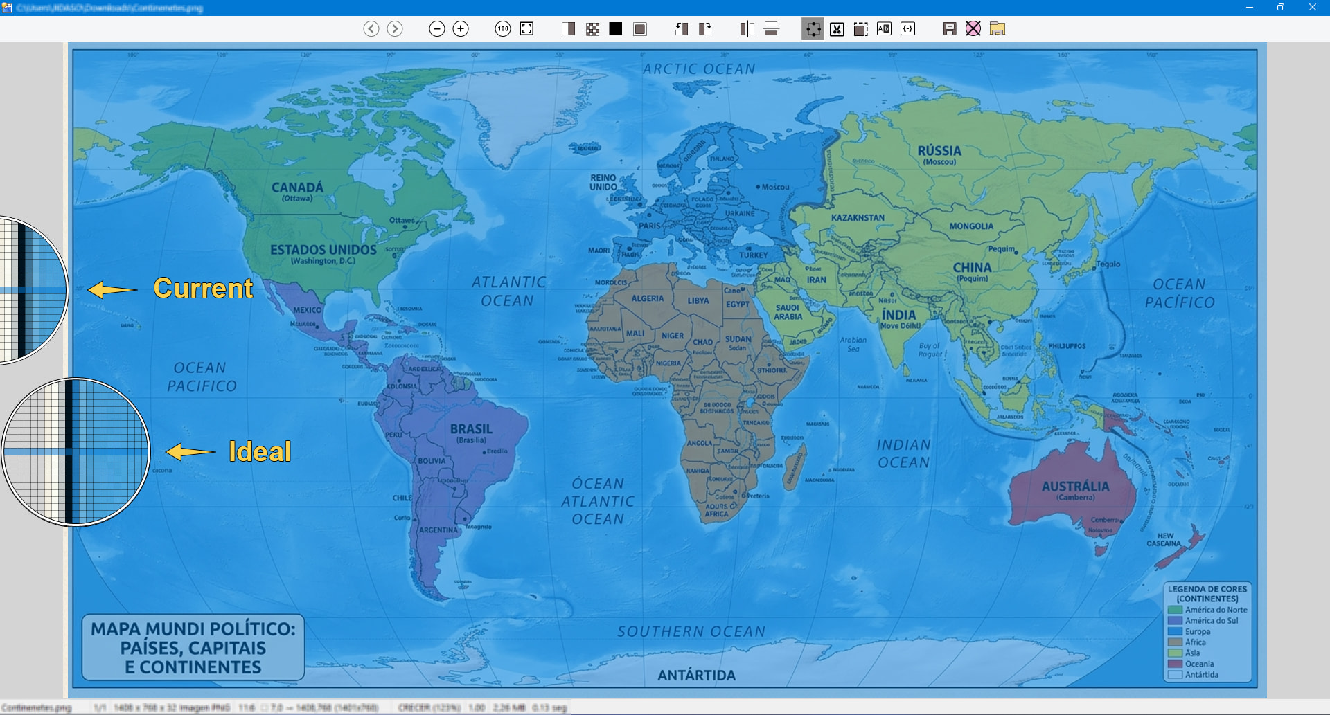
Lately, I have been using the Opus image viewer as my default viewer. This has given me the opportunity to get to know this excellent viewer much better. Even so, I would like to share a few observations that, in my humble opinion, could further improve the user experience.
-
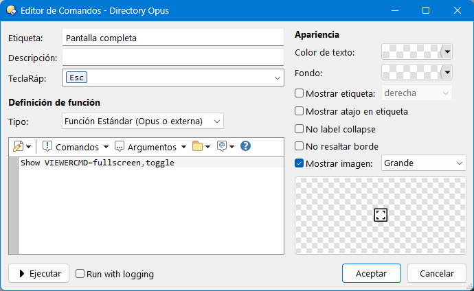
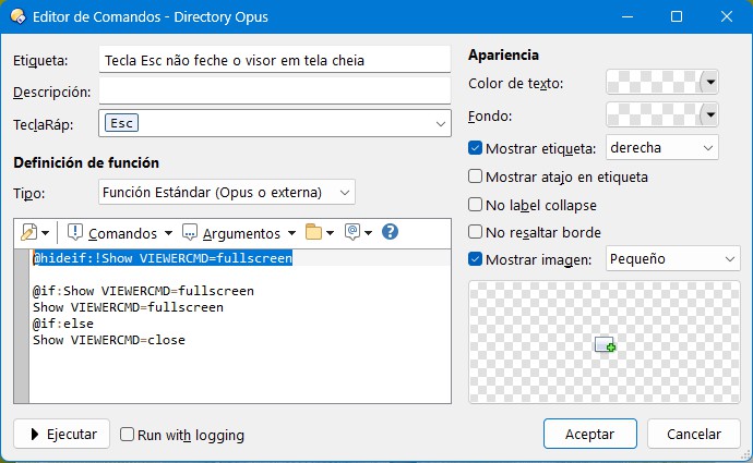
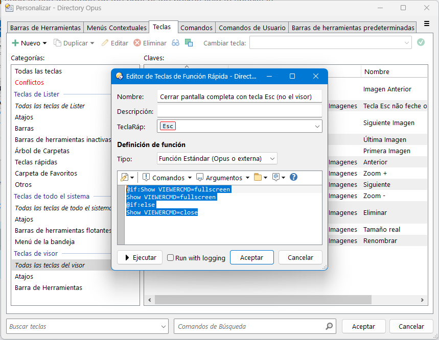
When viewing an image in full-screen mode, pressing the Esc key closes the viewer completely. Ideally, it should first exit full-screen mode while keeping the viewer open on the current image. In other words, if entering full-screen mode requires two steps: Open the viewer => Enter full-screen mode; then exiting should follow the reverse sequence: Exit full-screen mode => Close the viewer.
-
The command
Show VIEWERCMD=selectregionhas toggle behavior. It would be very useful ifShow VIEWERCMD=selectallalso supported toggle behavior. -
The command
Show VIEWERCMD=selectregionprovides several excellent ways to define the selection area, but they all require the selection to be specified in advance. It would be ideal if the command supported an argument such as Show VIEWERCMD=selectregion,mouse, allowing the selection to be made interactively with the mouse. In other words, when the button is pressed, no selection would be created immediately; instead, the mouse cursor would enter a click-and-drag selection mode, identical to the behavior currently available when holding down the Shift key over the image. -
When an area is selected (for example, for cropping), pressing the Esc key closes the viewer completely. Ideally, it should simply cancel the crop/selection mode while keeping the viewer open on the current image. This is the same behavior suggested above for full-screen mode.
-
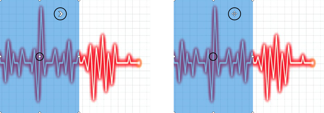
When an area is selected in an image, the selected region is overlaid with a light blue mask, following the classic Windows behavior used when selecting files. However, I believe it would be better if the selected area retained its original colors. With the current implementation, everything is fine while the entire selection is visible. However, when zooming in so that only part of the selected area is visible, the blue overlay can become confusing or make it more difficult to define the selection accurately, especially when the underlying image contains similar colors. Suggestion: Do not alter the colors of the selected area. I believe the selection handles alone are sufficient to clearly indicate the selected region.
-
When an area is selected (for example, for cropping), placing the mouse cursor inside the selected area still leaves the cursor in navigation mode. As a result, a single click inside the selection advances to the next image. Ideally, when the cursor is inside the selected area, it should switch to move mode: a single click would do nothing, while dragging would move the entire selection. This would provide the same behavior currently available through the center handle, but extended to the entire selected area.
-
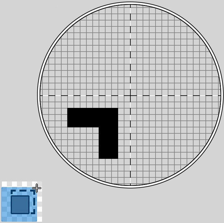
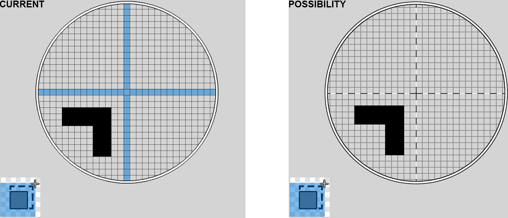
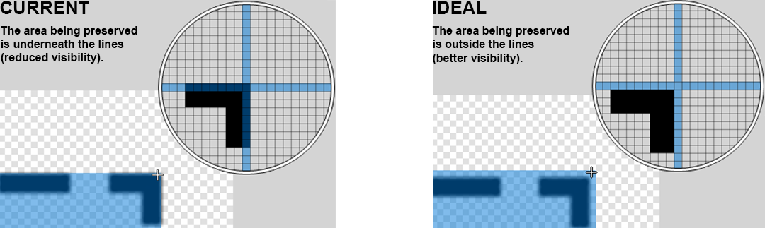
Opus's crop magnifier is a wonderful tool and provides almost surgical precision. However, because the crosshairs (+) are drawn as columns of pixels (making them relatively thick and prominent), they leave some uncertainty: Does the area beneath the crosshairs remain in the final image, or is it discarded? After using the tool, we learn that the area beneath the crosshairs is preserved. Ideally, the crosshairs should be true single-pixel lines, clearly defining which side of the boundary will be kept and which will be discarded. Even better, if the lines alternated between black and white dashes, they would remain clearly visible against virtually any color or brightness level, providing maximum contrast regardless of the image content.
-
Nevertheless, if the current design (crosshairs drawn as columns of pixels) is to be retained, it would be preferable for the area beneath the crosshairs, since it is visually obstructed, to be the portion that is discarded, allowing the area to be preserved to remain fully visible, without the crosshairs obscuring it.
Thank you very much!