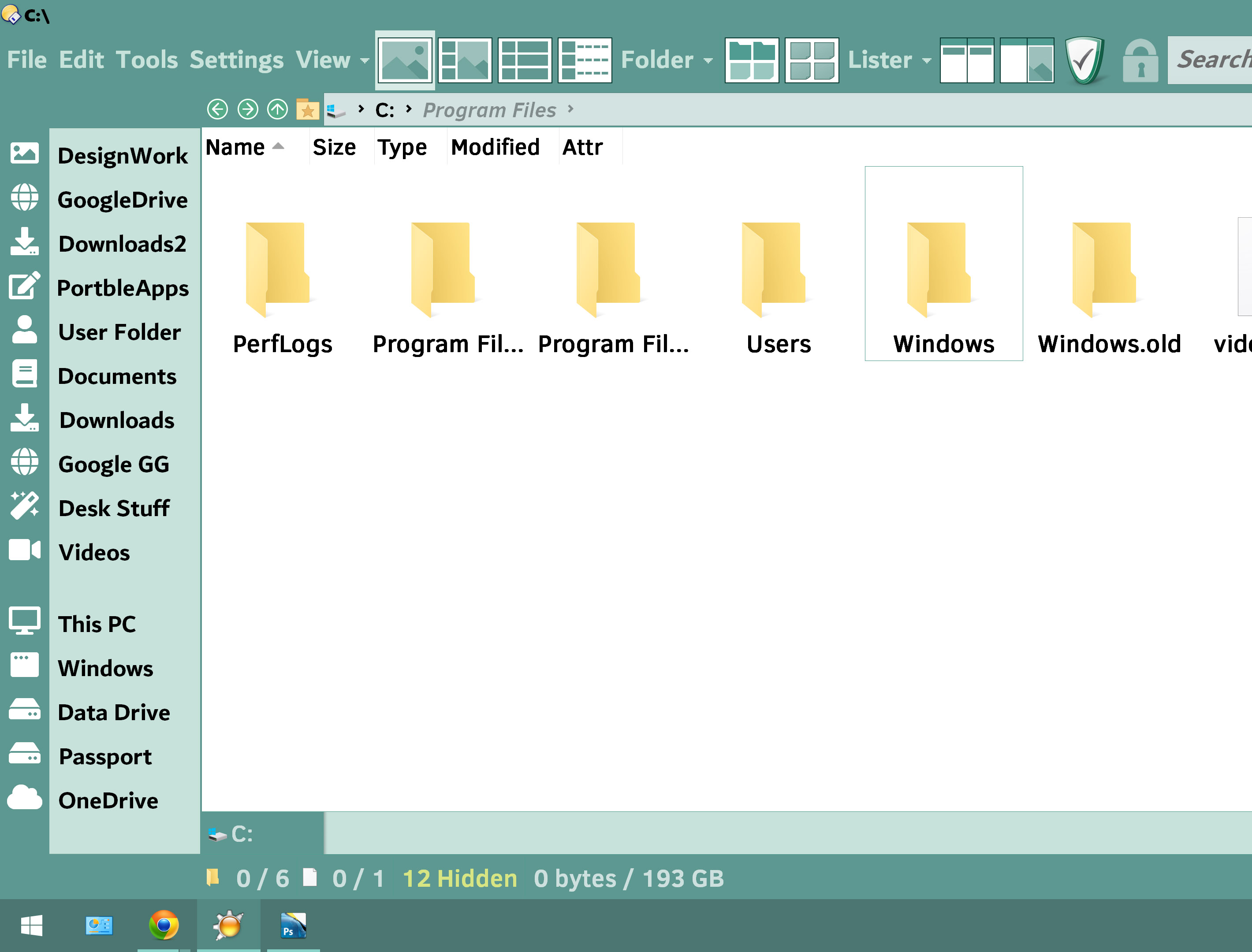
How to reduce the height of status bar??
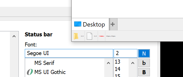
The font here is 14 points no matter how low i go the size remains the same so what decides the minimum status bar height??
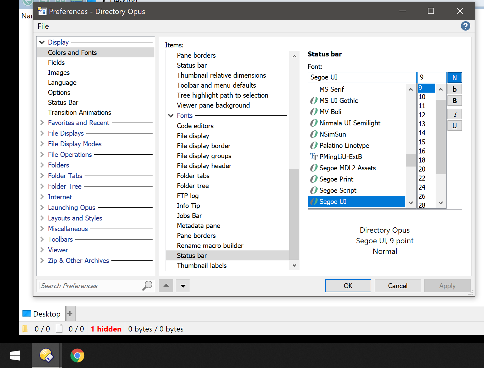
It won't go smaller than the size of a small icon, even if no icons are displayed in it currently.
If your screen's at 600% DPI it would be 
but its only 300% 
300% scaling is pretty enormous, even on a high density screen.
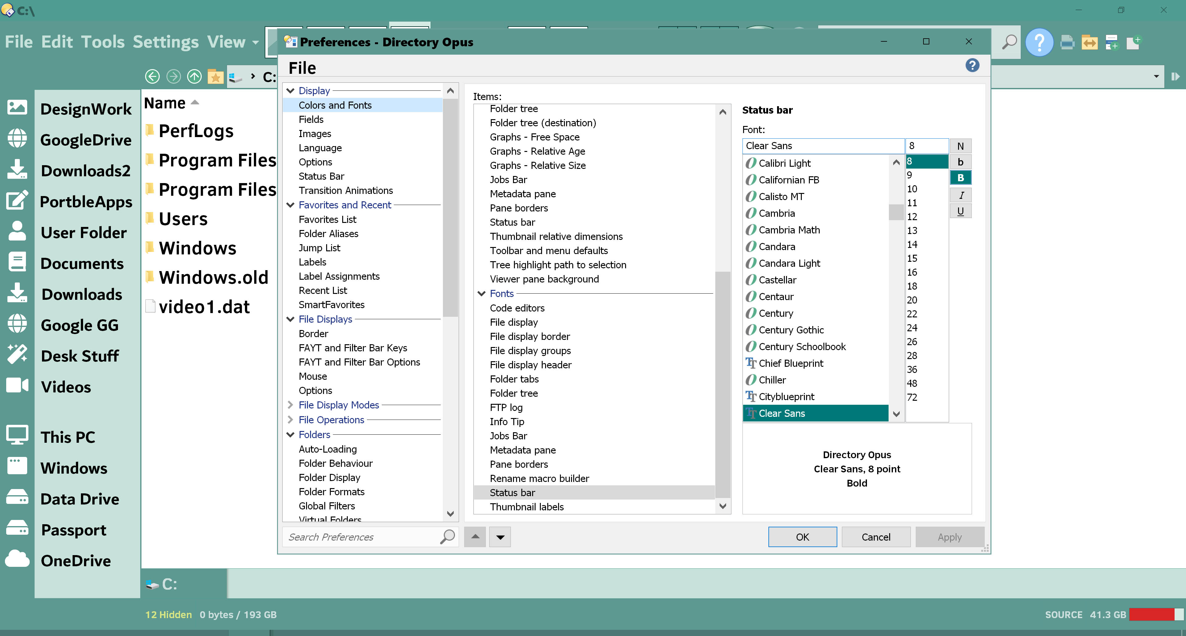
Standard small icon size in Windows is 16x16, multiplied by the scaling factor. So 48x48 if you're at 300%.
There's some padding added to that but it wouldn't increase the size to 100 pixels, so something else must be doing that. Maybe the font you're using has a very high line height. It probably does, looking at how your file display looks.
300% is windows recommended setting at 3840x2160 Resolution.
Also tried every other font arial, verdana Seg UI etc....but same results. Its about 20-25% smaller than my taskbar at present
The recommendation isn't tied to just the resolution, but also the screen's reported physical size and the distance it expects you to sit from it.
It's also completely wrong a lot of the time.
I have several screens which are the same 3840x2160 resolution and Windows chooses scaling factors from 150% (way too small) up to 300% (way too large), while 200% looks best to me.
It's only a recommendation, and it's often wrong. Even if the screen reports its physical size correctly, it's having to guess how far you're sitting from it.
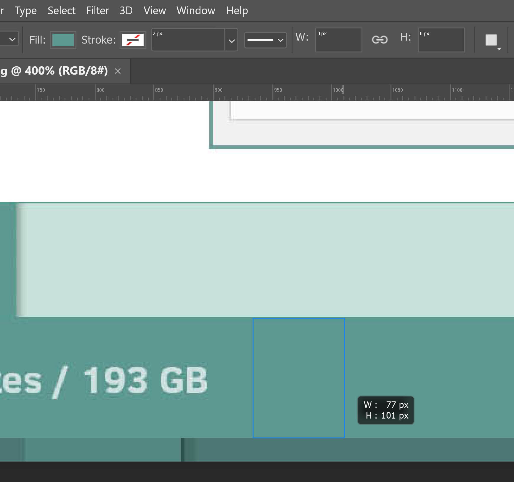
Here's what it looks like from a 3840x2160 screen at 200% scaling, with the default fonts:
If it looks weird with your font or scaling settings, it's because the font or scaling settings are weird. ![]()
What does File Explorer's status bar look like on your system, for comparison? It should be about the same height (assuming normal font choices).