To make Directory Opus look more like an actual file manager, I made myself (and the occasional guest user) a folder icon, alongside a borderless version, to use on the Taskbar. I figured I might as well just share it here:
Great icons, thank you!
I followed instructions, but I'm not sure I'll keep it like that.
The file explorer icon is just too degrading to these IMHO.
I'll have to think some, but I will find it appropriate use for them or rethink the file explorer icon.
Thanks!
Glad you like them! If you wish to have any slight changes made to it (e.g. a smaller Opus icon on top, or without the swooshes), let me know. As long as the changes are small, it won't take any time.
The idea was to keep it both similar to Opus (its elements being the same size as in the default icon) and close enough to a folder icon (fun fact: I used the Internal Flat Icon as a silhouette for it).
I made it mostly because my friend was really thrown off by not being able to find Explorer, which this solved, but I must admit that as close as I got to getting used to the default icon after 3-4 weeks myself, I never have to look for it since using this one.
I agree with him. I've become accustomed to having a rectangle shape for a file manager.
A circle looks off; especially being a-symmetrical. Too much yellow everywhere too.
The Opus white sun icons look good full size, but start to look strange being shrunk to icons.
But this particular icon set doesn't do it for me either. I just settled for the alternative windows explorer factory icon, for a lack of a better rectangular icon. The icon reflects its purpose well, as Opus replaces windows Cringeplorer anyway.
What would be really cool is if we could snip a pic of our Opus screen and decimate the resolution to make a nice looking icon out of exactly what our screen looks like when using it.
I like it. Hard to see the sun against the yellow folder though. Maybe more orange in the sun. ?
I converted it to png and ico. Dopus Square.zip (127.3 KB)
Thank you. Yes, so I didn't use it as an icon. I think I will study how to create an icon that can be used normally in the taskbar, and perhaps share it with you.
New Opus user here and this was exactly what I was looking for. Thanks Pro!
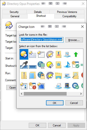
Do note that right-clicking on the taskbar icon did not seem to remember the new icon, but navigating to the Start Menu folder as suggested and following the same procedure did work.
Thank you. Definitely more user friendly. I understand the need to maintain a company logo, but it needs to be accessible for users to make the migration.
I believe it would be a cool feature if DOpus could control changing that icon resource themselves in a user-friendly way via Preferences. Self-modify the resource #N in .exe with a user-provided .ico? Not sure whether the system would immediately and perfectly react to it, but worth a try.

