Using three-buttons in some of my toolbars is very handy, but making them compact is complicated by the character limitations. For example, some button toolbar labels have as few as two-letters, but I cannot use full names for each of the underlying buttons since it expands the name far beyond what is intended.
For example, a three-button on the toolbar is named CP (copy) which contains a secondary button named "Copy from Clipboard." To keep the CP button compact, the secondary button is named "C-Clp" instead of "Copy from Clipboard." This makes it difficult to deduce the button functions (I tend to forget) and restricts the ability to keep the toolbar both compact and fully comprehensible. Assuming that there is no workaround, are there any plans to adjust this functionality?
No need to change anything regarding the usage of the 3-buttons, except for expanding the character title limit. Currently, the width of a 3-button title will expand according to the titles of the underlying buttons.
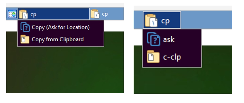
As shown in the graphic, the 3-button title on the right is compact (as desired), but can be difficult to decipher, especially if the button is not used regularly. Comparatively, the 3-button on the left is descriptive, but takes up a lot of space on the toolbar. Simply put, my request is to allow for long titles without adjusting the width of the button.
As you suggested, I will add long titles to the tooltips. However, it would be super convenient to add the capability of automatically enabling long titles to avoid having to take this extra step. Also, I can't simply drag existing buttons into a new 3-button without having to shorten the titles which is another step. I think that expanding this capability would add more convenience for users who prefer to minimize spacing between buttons in an expedient manner. Thank you for your feedback regarding this topic.
Where would those long titles be displayed? They won't fit in the button, unless the button is large enough (which is why it resizes to fit them now). If the button isn't resized, what would it display instead when it is clicked?
If they're only displayed in the tooltips, then they should only be set for the tooltips, and a shorter name still needs to be defined for the buttons. There isn't really any way to get around that, unless longer labels are automatically truncated.
If the button size was only determined by the top-level button, it would be more work for users setting up this kind of button, as they would have to test if the left/middle/right click labels actually fit or not. I don't think it makes sense, sorry.
Apparently, I was mistaken to believe that one could hover over a 3-button and obtain the title from the label, but now I understand that it is only derived from the tooltip. It would be convenient if the long title of the underlying labels could be obtained by hovering over the toolbar button when tooltips are not present. My preference would involve having the main button label exclusively determine the width of a 3-button, independent of the length of the 2-3 underlying labels, but I understand that its not configured in this manner.
Mainly, I was hoping to eliminate the extra steps of compacting long button titles and adding tooltips for 3-buttons. I really like this concept, but I think it could be somewhat easier to create, hence my suggestion. Well, I'll move on at this point and explore more of DOpus' capabilities.
My question is why is the width of the top-level button determined not by the width of the text in its label but by the width of the text in a sub-button.
I support what I take to be mkee's suggestion: let the width of the top-level button be determined by the width of the text in its label. Full stop.
Jinsight -- you summarized my request perfectly and provided more precise descriptions regarding the different buttons, so thanks!
To clarify, hovering the mouse over the 3-button does display the title when no tooltip is present. However, this is not particularly useful when the title has been shortened to 2-3 characters to conform to the width of the top-level button. Also, I occasionally prefer to use alternate or more descriptive text in a tooltip that differs from the title, which is another reason that I recommend allowing long titles for sub-buttons (without altering the width of the top-level button). This tends to be most handy, when editing buttons since one can gather the purpose of the button by the title, while obtaining additional information from the tooltip. Perhaps, this may seem impractical, but its the way I prefer to manage some of the toolbar buttons.
Because when you click the button, the sub-button's label is displayed.
And that is the only time it is displayed (other than when you are editing the toolbar).
So if you want that label to be shorter, just make it shorter. If you don't want it shorter, the button will be larger so it actually fits in the only place it's displayed.
I agree. The Button text (not sub-buttons) is better to determine the button size. It may also help to have a default setting for button size that users could change if they have a design preference or can tolerate bigger buttons on larger screens. I notice my desktop monitor can accommodate larger buttons, but I struggle to contain my preferred toolbar layout on my Surface Pro.
Thinking further, perhaps some setting options like those in the column settings would help. That is, automatic expansion to fit the screen size with set limits. Users could set complex or important buttons to larger widths so that they stand out or accommodate more complex labelling.
Perhaps users could select presets that match the different screen sizes. Or DOPUS could automatically select the toolbar size according to the screen resolution.
When I came across the button size changing from the sub-button labels, I discovered the tooltips. The hardest part was thinking of a meaningful label for the main button, and alerting the user that there are also different actions depending on the mouse button the user clicks.
In mkee's graphic, the width of the top-level button is smaller than the width of the text in the sub-button. Why can't the width of the top-level button be shorter still more?
The request is not entirely focused on the visibility of the sub-buttons, but improving the convenience of creating or moving the buttons in the toolbars. For example, let's say that I create a new 3-button, which includes the button "Move to Folder (Named after First File)." I would need to shorten the title to avoid taking up excess space on the toolbar, but this step would not be needed, if the main button "Move" took exclusive precedence over the sub-button titles. In essence, the toolbar 3-button would be restricted to 4 characters (m-o-v-e), rather than expanding to accommodate the nearly 40-character sub-button length.
Also, perhaps, I find that the 3-button is not as suitable as using a menu, so I would like to drag the sub-button into a menu without having to re-type the previous full title or having to rely on tooltips. I like to experiment with different button configurations, but wish to avoid needing to truncate or rename sub-buttons as they migrate from or back into menus.