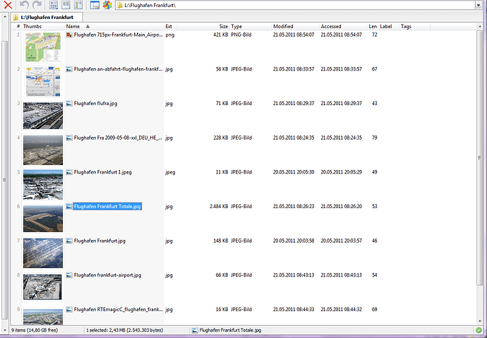
I suggest to add in the details view a thumb column in the "column select" menu(s).
It is comfortable to get the details information (inclusive thumbs) in a lister screen at a glance, now you have to hover over the filename
or to press CTRL for a second when selected a file to see just one thumb (of image file, not f.e. pdf).
Check out Tiles mode if you haven't already. That lets you combine any details you want beside thumbnails.
If you want to request thumbnails in Details mode, send a feature request to GPSoftware via the link in my sig.
What´s the use of tiny thumbnail pictures in details mode, anyway?
- In thumbnails mode the additional information is limited
- In tile mode i can customize which information i get, but from layout it is quite limited to get much information
and by far not so neat as if the information for each file is in one line as in details mode.
Additionally tile mode is intended to give information which is thought to be most interesting for the according file type. - In details mode it is by far quicker to customize which information you want, and column selection is identical for ALL filetypes.
Therefore it makes sense to have additionally to all the already possible columns the thumbs column too.
It would be a straight forward solution to get a quick summary of all files with the information which is most important for you.
PS: the thumbs should of course not be so small as the file type symbol in the current details view .
I think i get your point about having as much as possible information. But then again, i would rate the thumbnails as an
entirely image dedicated feature, that enables us to see the most important information, the preview. If you use your
thumbnails in details mode, like you said, not too small, then you will sacrifize space in height, because you maybe only have
ten rows visible instead of over fourty, etc.
I also often switch between thumbnails & details, but rarely need to use both at the same time. Also, ich could open
the same folder in both lister sides, one in thumbnails, the other in details. Not to forget, how customizable Opus is,
we can use wildcard formats & customize every folder. With over 120 columns types we can´t have all information at once,
anyway.
[quote="abr"] Also, ich could open the same folder in both lister sides, one in thumbnails, the other in details.
[/quote]
I have made a special layout to achieve this, a narrow tile side, and a broad details side.
But that's not optimal as you can imagine ( row hides differ)
of course row heights. 
The problem is, also, that there would be wasted space in quite every column, due to the thumbnails height. Maybe some
"magnifying glas" effect in details mode (a sort of "auto-popup", similar to pushing ctrl) would be nice. So we automatically
would have a thumbnail for the currently focussed item displayed without having wide rows.
Love it. That would be a really good view.
Even better if non-images are shown normally (without the extra row height).
