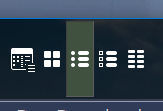
So, decided to see if increasing vertical height of horizontal toolbar would look more pleasing and noticed that, yes it does but the icon highlight state is making it look messy because it is using toolbar height instead of icon height (+ maybe a few pixels border ?)
Buttons are the height of the toolbar, and toolbars are the height of their tallest button.
(If they weren't, it would make clicking them harder when they're at the edge of the screen, like docked toolbars.)
Maybe an option in prefs/toolbars - highlight size per icon or per toolbar
For instance, 10 icons on a toolbar all of different sizes the highlight adjusts to each icon (plus border)
Jagged button edges look terrible. Why not fix the icons instead?
??? gone off topic here, what jaggies ? my awsome icons have no jaggies.
(obviously overworked, try and get some fresh air and make sure you get your daily steps done, 10,000 minimum per day)
Jagged as in the buttons would be different sizes and not line up with each other along a given toolbar.