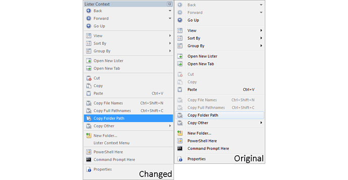
For some reason when I change the font colour of the context menu labels it changes how the whole menu looks. It can only ever be dark colours of any kind before it changes it's look and the font seems to scale down too for some inexplicable reason.
If you use anything other than a dark text color, Opus automatically stops using visual styles to draw the menus, because they are designed for dark text on light backgrounds.
The font is identical in both screenshots. The way things are spaced out is slightly different, which accumulates over a number of items.
This is covered about 20 seconds into part 2:
