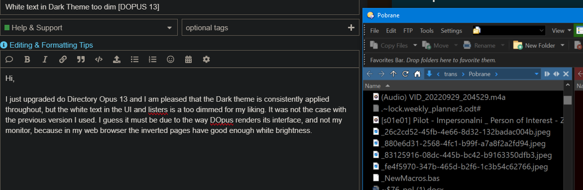
I just upgraded do Directory Opus 13 and I am pleased that the Dark theme is consistently applied throughout, but the white text in the UI and listers is a too dimmed for my liking. It was not the case with the previous version I used. I guess it must be due to the way DOpus renders its interface, and not my monitor, because in my web browser the inverted pages have good enough white brightness.
Is there I way, a setting somewhere to fix it? I have pasted a screenshot for comparison.
Preferences / Colors and Fonts / Directory Opus Colors
Preferences / Colors and Fonts / Windows Colors
The main file display colors are here:
Preferences / Colors and Fonts / Directory Opus Colors / Files and folders
Which versions are we talking about? Opus 12 didn't have a built-in dark theme, but if you were using a theme someone made, you can load the same theme into Opus 13. (If you installed 13 over 12, the colors you had before should have been preserved, too.)
Using another theme from the Themes area here at the forum is another option. Some of those have bright white text instead of light grey text.
Thanks for the help. Now brightness is fixed. Indeed the custom made theme from the earlier version was saved, but it somehow adopted the "dimmed" aspect of white fonts. Now that it is fixed, I am a happy user of Directory Opus, as I have been for more than a decade now.